- ASP.NET MVC
- Getting Started
- Configuring your MVC Application
- Adding NuGet Packages to your App
- Adding Controls
- Client-Side Support
- Globalization
-
Working with Controls
- Accordion
- Barcode
- CollectionView
- DashboardLayout
- Excel
- File Manager
- Financial Charts
- FlexChart
-
FlexGrid
- Key Features
- Quick Start
-
Work with FlexGrid
- Columns
- Custom Cell Template
- Custom Editors
- Data Binding
- Data Map
- Detail Row
- Disable Server Reading
- Editing
- Excel Import and Export
- Excel RTL Export
- Exclusive Value Search
- Filtering
- FlexGrid Selector
- Full Text Search
- Case-sensitive Search
- Grouping
- Header Focusability
- Keyboard Handling
- Merging
- Paging
- PDF Export
- Right To Left Rendering
- Scaffolding
- Selection Modes
- Star Sizing
- Styling and CSS
- TreeGrid
- Unbound FlexGrid
- Unobtrusive Validation
- Virtual Scrolling
- Transposed Grid
- FlexMap
- FlexPie
- FlexRadar
- FlexReport
- FlexSheet
- FlexViewer
- Gauge
- Input Controls
- MultiRow
- TransposedMultiRow
- OLAP
- Sunburst Chart
- TabPanel
- TreeMap
- TreeView
- Styling
- ASP.NET MVC Samples
- Release History
FlexGrid Selector
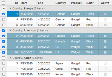
FlexGrid selector adds check boxes to every grid row for multiple row selection. This selection scheme can be very useful on mobile devices, which have no keyboards with shift and control keys for extended selections. The selector is represented by the Selector class which defines an extender used to set the FlexGrid selector. The Selector class can be used on header columns as well as regular scrollable/data columns. It works with both, flat and hierarchical views, where you can toggle the selected state for a row in flat view and toggle the selected state for entire groups at once in hierarchical views.

The following example demonstrates how the check boxes show and toggle the selected state for all items in the group with an additional checkbox added to the column header to toggle the selection for all the rows.
Controller
public ActionResult Index()
{
    return View(Sale.GetData(15));
}
View for the Controller
@model IEnumerable<Sale>
@*Instantiate FlexGrid and set its properties*@
@(Html.C1().FlexGrid<Sale>()
    .Id("ovFlexGrid").ShowGroupPanel(s => s
        .MaxGroups(Convert.ToInt32(4))
        .Placeholder("Please add columns for grouping here")
        .HideGroupedColumns(Convert.ToBoolean(false)))
    .AutoGenerateColumns(false)
    .Bind(Model)
    .PageSize(10)
    .CssClass("grid")
    .IsReadOnly(true)
    .Columns(bl =>
    {
        bl.Add(cb => cb.Binding("ID"));
        bl.Add(cb => cb.Binding("Start"));
        bl.Add(cb => cb.Binding("End"));
        bl.Add(cb => cb.Binding("Country"));
        bl.Add(cb => cb.Binding("Product"));
        bl.Add(cb => cb.Binding("Color"));
        bl.Add(cb => cb.Binding("Active"));
    })
    .Selector(sb => sb.ShowCheckAll(true))
)


