- ASP.NET MVC
- Getting Started
- Configuring your MVC Application
- Adding NuGet Packages to your App
- Adding Controls
- Client-Side Support
- Globalization
-
Working with Controls
- Accordion
- Barcode
- CollectionView
- DashboardLayout
- Excel
- File Manager
- Financial Charts
- FlexChart
-
FlexGrid
- Key Features
- Quick Start
-
Work with FlexGrid
- Columns
- Custom Cell Template
- Custom Editors
- Data Binding
- Data Map
- Detail Row
- Disable Server Reading
- Editing
- Excel Import and Export
- Excel RTL Export
- Exclusive Value Search
- Filtering
- FlexGrid Selector
- Full Text Search
- Case-sensitive Search
- Grouping
- Header Focusability
- Keyboard Handling
- Merging
- Paging
- PDF Export
- Right To Left Rendering
- Scaffolding
- Selection Modes
- Star Sizing
- Styling and CSS
- TreeGrid
- Unbound FlexGrid
- Unobtrusive Validation
- Virtual Scrolling
- Transposed Grid
- FlexMap
- FlexPie
- FlexRadar
- FlexReport
- FlexSheet
- FlexViewer
- Gauge
- Input Controls
- MultiRow
- TransposedMultiRow
- OLAP
- Sunburst Chart
- TabPanel
- TreeMap
- TreeView
- Styling
- ASP.NET MVC Samples
- Release History
Styling FlexGrid
The appearance of the FlexGrid control is defined using CSS classes which represent different grid elements such as row, column, cell etc. You can customize these classes to change the appearance of the FlexGrid control.
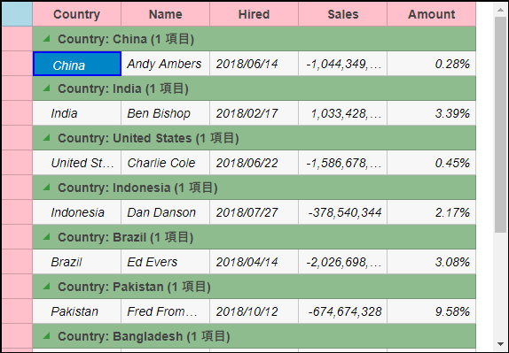
In this example, we customize the default CSS rules to make the following customization to the grid's appearance:
- FlexGrid border.
- Background color for topLeft, columnHeader, rowHeader cells and GroupRow.
- ColumnHeader text is centered aligned.
- Font style italic for alternative rows.
- Solid border for selected cells.
- Sort icon color.
- Collapsed/Expand Group Icon color.
- Font color for FlexGrid editor.
These custom CSS rules can be applied to the FlexGrid by applying a CSS class to the FlexGrid control using the CssClass property. This property applies the CSS rules to the non-header cells in a row or column. Similarly, you can apply CSS rules to all the cells, including headers, in a column or row using CssClassAll property.
The following image shows how the FlexGrid control appears after applying styles using custom CSS.
Add Custom Stylesheet
Create a new ASP.NET MVC application. Once you have created the application, a Content folder is created in the Solution Explorer after adding the view to the application. To add a custom style sheet in your application, follow these steps:
In the Solution Explorer, right-click the Content folder.
From the context menu, select Add | Style Sheet. The Specify Name for Item dialog appears.
Set name of the style sheet (for example:
app.css)and click OK.Replace the default code of app.css file with the code given below.
.custom.wj-flexgrid{
        border: black 2px solid;
        border-radius: 0;
        margin-top:15px;
    }
    .custom .wj-topleft .wj-cell {
        background: lightblue;
    }
    .custom .wj-colheaders .wj-cell {
        background: pink;
        text-align:center !important;
    }
    .custom .wj-rowheaders .wj-cell {
        background: pink;
    }
    .custom .wj-alt{
        font-style:italic;
    }
    .custom .wj-group:not(.wj-state-selected):not(.wj-state-multi-selected) {
        font-weight: bold;
        background-color: darkseagreen;
    }
    .custom .wj-glyph-down-right{
        color:green;
    }
    .custom .wj-glyph-right{
        color:green;
    }
    .custom .wj-state-selected{
        border: blue 2px solid;
    }
    .custom .wj-state-multi-selected {
        border: blue 2px solid;
    }
    .custom .wj-grid-editor{
        color:blue;
    }
    .custom .wj-glyph-up {
        color: blueviolet;
    }
    .custom .wj-glyph-down{
        color:blueviolet;
    }
Styling.cshtml
@model IEnumerable<Person>
<div>
    <div style="width:90%;margin:0 auto;">
        @(Html.C1().FlexGrid()
            .Id("flexGrid")
            .CssClass("custom")
            .Width("575px")
            .Height("900px")
            .KeyActionTab(C1.Web.Mvc.Grid.KeyAction.Cycle)
            .Bind(b => b.Bind(Model).GroupBy("Country"))
            .Height(400)
            .AutoGenerateColumns(false)
            .Columns(c =>
            {
                c.Add().Binding("Country").Header("Country").Width("100");
                c.Add().Binding("Name").Header("Name").Width("100");
                c.Add().Binding("Hired").Header("Hired").Width("100").IsRequired(false);
                c.Add().Binding("Sales").Format("n").Width("100");
                c.Add().Binding("Amount").Format("p2").Width("100");
            })
        )
    </div>
</div>


