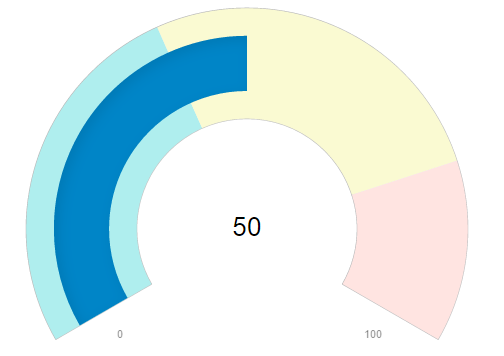
You can add colors and borders to the gauge and its elements to make it visually attractive. The following code examples demonstrate how to set different styling properties to customize the RadialGauge.
The following image shows how the RadialGauge appears after its appearance is customized.

The following code example demonstrates how to customize the gauge in ASP.NET MVC Edition using Razor. The example uses the sample created in the RadialGauge Quick Start section.
| HTML |
Copy Code
|
|---|---|
<c1-radial-gauge min=0 max=100 value=35 start-angle=-20 sweep-angle=220
         show-text=C1.Web.Mvc.ShowText.None width="300px" height="180px" auto-scale="true"
         show-ticks="false" show-tick-text="false"
         needle-shape=C1.Web.Mvc.NeedleShape.Rectangle needle-length=C1.Web.Mvc.NeedleLength.Middle>
    <c1-gauge-range min="0" max="40" color="red"></c1-gauge-range>
    <c1-gauge-range min="40" max=80 color="yellow"></c1-gauge-range>
    <c1-gauge-range min="80" max="100" color="green"></c1-gauge-range>
</c1-radial-gauge>
|
|