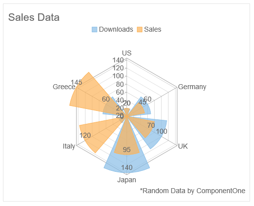
You can add a title to the FlexRadar control by setting its Header property. Besides a title, you may also set a footer for the chart by setting the Footer property. You can also style the header and footer text with the help of HeaderStyle and FooterStyle properties.
The image below shows how the FlexRadar appears, after these properties have been set.

The following code illustrates the use of Header, HeaderStyle, Footer, and FooterStyle properties for adding a title and footer to the FlexRadar.
| HTML |
Copy Code
|
|---|---|
<c1-flex-radar binding="Downloads" binding-x="Country" header="Sales Data" footer="*Random Data by ComponentOne height="400px" width="500px" chart-type="Column" legend-position="Top"> <c1-flex-radar-title-style c1-property="FooterStyle" halign="right"> </c1-flex-radar-title-style> <c1-flex-radar-title-style c1-property="HeaderStyle" halign="left"> </c1-flex-radar-title-style> <c1-items-source source-collection="Model" /> <c1-flex-radar-series name="Downloads" /> <c1-flex-radar-series name="Sales" binding="Sales" /> |
|