- Getting Started
- Configuring your MVC Application
- Adding NuGet Packages to your App
- Adding Controls
- Client-Side Support
-
Working with Controls
- Accordion
- Barcode
- CollectionView
- DashboardLayout
- File Manager
- Financial Charts
- FlexChart
-
FlexGrid
- Key Features
- Quick Start
-
Work with FlexGrid
- Columns
- Custom Cell Template
- Custom Editors
- CSV Export
- Data Binding
- Data Map
- Detail Row
- Disable Server Reading
- Editing
- Excel Import and Export
- Excel RTL Export
- Exclusive Value Search
- Filtering
- FlexGrid Selector
- Full Text Search
- Case-sensitive Search
- Grouping
- Header Focusability
- Keyboard Handling
- Merging
- Paging
- PDF Export
- Right To Left Rendering
- Selection Modes
- Star Sizing
- Styling and CSS
- TreeGrid
- Unbound FlexGrid
- Unobtrusive Validation
- Virtual Scrolling
- FlexGrid ASP.NET Core Tags
- Tutorials
- Transposed Grid
- FlexMap
- Flex Pie
- Flex Radar
- Flex Report
- Flex Sheet
- Flex Viewer
- Gauge
- Input Controls
- Multi Row
- TransposedMultiRow
- OLAP
- Sunburst Chart
- Tab Panel
- Tree Map
- TreeView
- Globalization
- Styling
- ASP.NET MVC Samples
- ReleaseHistory
Star Sizing
You can use XAML-style star sizing to implement flexible layouts with the FlexGrid. The sample below uses Star sizing specified in the width property of the object.
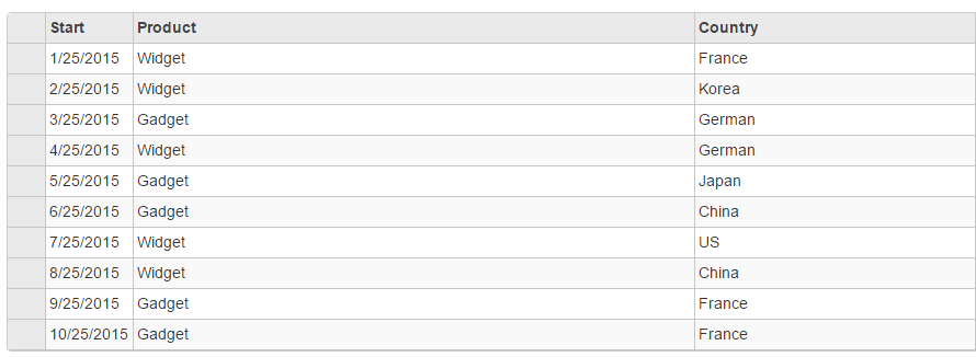
This grid has three columns. The first is 80 pixels wide and can be resized between 40 and 160 pixels. The other two have widths of 2* and *, and cannot be resized using the mouse. The width proportions of the columns remain unchanged even on resizing the first column or the whole grid.
The following image shows how the FlexGrid appears on applying star sizing on the columns using the Width property. The example uses Sale.cs model added in the QuickStart section.

The following code examples demonstrate how to apply star sizing to the columns of the FlexGrid:
StarSizingController.cs
public ActionResult StarSizing()
{
    return View(Sales.GetData(10));
}
StarSizing.cshtml
@using TagFlexGrid.Models
@using C1.Web.Mvc.Grid
@model IEnumerable<Sale>
<c1-flex-grid auto-generate-columns="false" class="grid" is-read-only="true">
    <c1-flex-grid-column binding="Start" width="80" max-width="160" min-width="40"></c1-flex-grid-column>
    <c1-flex-grid-column binding="Product" width="2*" allow-resizing="false"></c1-flex-grid-column>
    <c1-flex-grid-column binding="Country" format="c" width="*"></c1-flex-grid-column>
    <c1-items-source source-collection="@Model"></c1-items-source>
</c1-flex-grid>


