
- Getting Started
- Configuring your MVC Application
- Adding NuGet Packages to your App
- Adding Controls
- Client-Side Support
-
Working with Controls
- Accordion
- Barcode
- CollectionView
- DashboardLayout
- File Manager
- Financial Charts
- FlexChart
-
FlexGrid
- Key Features
- Quick Start
-
Work with FlexGrid
- Clip String
- Columns
- Custom Cell Template
- Custom Editors
- CSV Export
- Data Binding
- Data Map
- Detail Row
- Disable Server Reading
- Editing
- Excel Import and Export
- Excel RTL Export
- Exclusive Value Search
- Filtering
- FlexGrid Selector
- Case-sensitive Search
- Full Text Search
- Grouping
- Header Focusability
- Keyboard Handling
- Merging
- Paging
- Overlays
- PDF Export
- Right To Left Rendering
- Selection Modes
- Star Sizing
- Resize
- Styling and CSS
- TreeGrid
- Unbound FlexGrid
- Unobtrusive Validation
- Virtual Scrolling
- FlexGrid ASP.NET Core Tags
- Tutorials
- Transposed Grid
- FlexMap
- Flex Pie
- Flex Radar
- Flex Report
- Flex Sheet
- Flex Viewer
- Gauge
- Input Controls
- Multi Row
- TransposedMultiRow
- OLAP
- Sunburst Chart
- Tab Panel
- Tree Map
- TreeView
- Globalization
- Styling
- ASP.NET MVC Samples
- ReleaseHistory
TreeGrid
FlexGrid supports hierarchical data, that is items that have lists of sub items. To use FlexGrid as a TreeGrid with hierarchical data sources, set the ChildItemsPath property to the name of the data element that contains the child elements. The FlexGrid automatically scans the data and builds the tree.
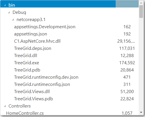
The example below uses a sample folder structure of ASP.NET MVC Edition project. You can display the tree view structure of any folder by providing its path in the ChildItemsPath property.
The following image shows how the FlexGrid appears after setting the ChildItemsPath property.
The following code examples demonstrate how to enable TreeGrid in the FlexGrid:
Add a Model
- Add a new class to the folder Models (for example:
TreeItem.cs). See Adding controls to know how to add a new model. - Add the following code to the new model to define the tree view structure of a sample folder.
| Colorized Example Code From File | /innovasys/documentx2024/configuration/widgets/resources/icons/delete.gif) |
|---|
        Code from File
        Your code content will appear in this box in Preview or when the help system is built
        File Name (full path and filename or path and filename relative to project):
        PROJECTS\TreeGrid\TreeGrid\Models\TreeItem.cs
        Leave the Region field below blank if you want to use the whole file. See the Widget Content from a File Topic in the online help for more info on marking named sections in example code files.
        Region:
        treeitem
Type your example code here. It will be automatically colorized when you switch to Preview or build the help system.
Add a controller and a view
Controller code
public IActionResult Index()
{
    var list = Folder.Create(Directory.GetCurrentDirectory()).Children;
    return View(list);
}
View code
@using TreeGrid.Models
@model IEnumerable<TreeItem>
<style>
    .wj-flexgrid {
        height: 400px;
        background-color: white;
        box-shadow: 4px 4px 10px 0px rgba(50, 50, 50, 0.75);
        margin-bottom: 12px;
    }
    .custom-flex-grid .wj-header.wj-cell {
        color: #fff;
        background-color: #000;
        border-bottom: solid 1px #404040;
        border-right: solid 1px #404040;
        font-weight: bold;
    }
    .custom-flex-grid .wj-cell {
        background-color: #fff;
        border: none;
    }
    .custom-flex-grid .wj-alt:not(.wj-state-selected):not(.wj-state-multi-selected) {
        background-color: #fff;
    }
    .custom-flex-grid .wj-state-selected {
        background: #000;
        color: #fff;
    }
    .custom-flex-grid .wj-state-multi-selected {
        background: #222;
        color: #fff;
    }
</style>
<script>
    c1.documentReady(function () {
        wijmo.Control.getControl("#grid").rows.defaultSize = 25;
    });
</script>
<c1-flex-grid id="grid" class="custom-flex-grid" width="500px"
              child-items-path="Children" auto-generate-columns="false"
              allow-resizing="None" headers-visibility="None" selection-mode="ListBox">
    <c1-items-source source-collection="@Model"></c1-items-source>
    <c1-flex-grid-column binding="Header" width="*"></c1-flex-grid-column>
    <c1-flex-grid-column binding="Size" width="80" align="center"></c1-flex-grid-column>
</c1-flex-grid>