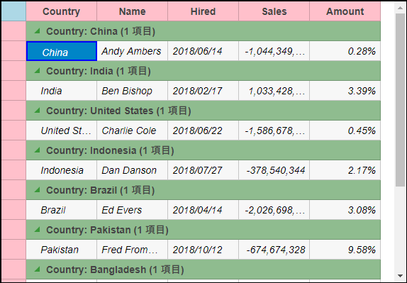
The appearance of the FlexGrid control is defined using CSS classes which represent different grid elements such as row, column, cell etc. You can customize these classes to change the appearance of the FlexGrid control.
In this example, we customize the default CSS rules to make the following customization to the grid's appearance:
These custom CSS rules can be applied to the FlexGrid by applying a CSS class to the FlexGrid control using the CssClass property. This property applies the CSS rules to the non-header cells in a row or column. Similarly, you can apply CSS rules to all the cells, including headers, in a column or row using CssClassAll property.
The following image shows how the FlexGrid control appears after applying styles using custom CSS.

Create a new ASP.NET MVC application. Once you have created the application, a Content folder is created in the Solution Explorer after adding the view to the application. To add a custom style sheet in your application, follow these steps:
app.css) and click OK.| app.css |
Copy Code
|
|---|---|
.custom.wj-flexgrid{ border: black 2px solid; border-radius: 0; margin-top:15px; } .custom .wj-topleft .wj-cell { background: lightblue; } .custom .wj-colheaders .wj-cell { background: pink; text-align:center !important; } .custom .wj-rowheaders .wj-cell { background: pink; } .custom .wj-alt{ font-style:italic; } .custom .wj-group:not(.wj-state-selected):not(.wj-state-multi-selected) { font-weight: bold; background-color: darkseagreen; } .custom .wj-glyph-down-right{ color:green; } .custom .wj-glyph-right{ color:green; } .custom .wj-state-selected{ border: blue 2px solid; } .custom .wj-state-multi-selected { border: blue 2px solid; } .custom .wj-grid-editor{ color:blue; } .custom .wj-glyph-up { color: blueviolet; } .custom .wj-glyph-down{ color:blueviolet; } |
|
Styling.cshtml
| Razor |
Copy Code
|
|---|---|
@model IEnumerable<Person>
<div>
    <div style="width:90%;margin:0 auto;">
<c1-flex-grid id="flexGrid" auto-generate-columns="false" class="custom" width="575px" height="900px"
    key-action-tab="Cycle">
    <c1-items-source source-collection="@Model" group-by="Country"></c1-items-source>
    <c1-flex-grid-column binding="Country" header="Country" width="100"></c1-flex-grid-column>
    <c1-flex-grid-column binding="Name" header="Name" width="100"></c1-flex-grid-column>
    <c1-flex-grid-column binding="Hired" header="Hired" width="100" required="true"></c1-flex-grid-column>
    <c1-flex-grid-column binding="Sales" format="n" width="100"></c1-flex-grid-column>
    <c1-flex-grid-column binding="Amount" format="p2" width="100"></c1-flex-grid-column>
</c1-flex-grid>
    </div>
</div>
|
|