- Getting Started
- Configuring your MVC Application
- Adding NuGet Packages to your App
- Adding Controls
- Client-Side Support
-
Working with Controls
- Accordion
- Barcode
- CollectionView
- DashboardLayout
- File Manager
- Financial Charts
- FlexChart
-
FlexGrid
- Key Features
- Quick Start
-
Work with FlexGrid
- Columns
- Custom Cell Template
- Custom Editors
- CSV Export
- Data Binding
- Data Map
- Detail Row
- Disable Server Reading
- Editing
- Excel Import and Export
- Excel RTL Export
- Exclusive Value Search
- Filtering
- FlexGrid Selector
- Full Text Search
- Case-sensitive Search
- Grouping
- Header Focusability
- Keyboard Handling
- Merging
- Paging
- PDF Export
- Right To Left Rendering
- Selection Modes
- Star Sizing
- Styling and CSS
- TreeGrid
- Unbound FlexGrid
- Unobtrusive Validation
- Virtual Scrolling
- FlexGrid ASP.NET Core Tags
- Tutorials
- Transposed Grid
- FlexMap
- Flex Pie
- Flex Radar
- Flex Report
- Flex Sheet
- Flex Viewer
- Gauge
- Input Controls
- Multi Row
- TransposedMultiRow
- OLAP
- Sunburst Chart
- Tab Panel
- Tree Map
- TreeView
- Globalization
- Styling
- ASP.NET MVC Samples
- ReleaseHistory
Grouping
Grouping refers to combining rows based on column values. When grouping is applied to a grid, it automatically sorts the data, splits it into groups, and adds collapsible group rows above or below each group.
FlexGrid supports column-wise grouping of grid data through the CollectionView class as a datasource. You can configure group description by using the GroupBy method in view. You can also add grouping using JavaScript by adding GroupDescription objects to the collectionView.groupDescriptions property. Here, the column for grouping the grid data is specified in the code.
You can customize the text displayed in group header rows using the GroupHeaderFormat property. By default, it displays the name of the group, followed by the current group and the number of items in the group. To format the aggregated data in the group header for a particular column, you can set the format property on each Column object.
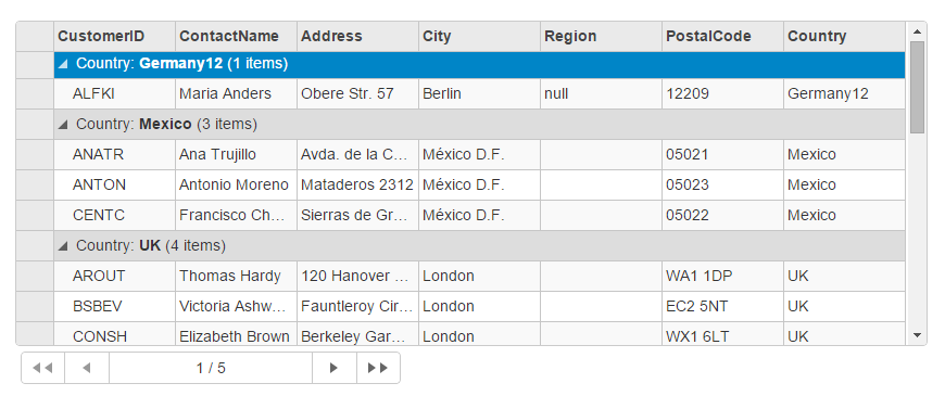
The following image shows how the FlexGrid appears on using the GroupBy method. The example uses table, Customer from the NWind.mdb database.

The following code examples demonstrate how to enable Grouping in the FlexGrid:
GroupingController.cs
public ActionResult Grouping()
{
    var nwind = new C1NWindEntities();
    return View(nwind.Customers);
}
Grouping.cshtml
@using C1.Web.Mvc.Grid
@using TagFlexGrid.Models
@model IEnumerable<Customer>
<c1-flex-grid id="pagingGrid" height="350px" is-read-only="true" show-groups="true"
              auto-generate-columns="false" group-by="Country">
    <c1-items-source source-collection="@Model"></c1-items-source>
    <c1-flex-grid-column binding="CustomerID" ></c1-flex-grid-column>
    <c1-flex-grid-column binding="ContactName"></c1-flex-grid-column>
    <c1-flex-grid-column binding="Address"></c1-flex-grid-column>
    <c1-flex-grid-column binding="City"></c1-flex-grid-column>
    <c1-flex-grid-column binding="Region"></c1-flex-grid-column>
    <c1-flex-grid-column binding="PostalCode" format="p0"></c1-flex-grid-column>
    <c1-flex-grid-column binding="Country"></c1-flex-grid-column>
</c1-flex-grid>
@Html.Partial("_Pager", "pagingGrid")
Group Summary
FlexGrid allows you to show data summaries for the whole grid or for each group by setting the Aggregate property on the columns. This property lets you aggregate the data for each column and show the group aggregates in the group header for that column. By default, the group aggregate or group summary is displayed at the top. However, you can change the display location of group aggregate by using GroupSummaryPosition property. The GroupSummaryPosition property allows you to customize the display location of aggregate Group summaries by using the GroupSummaryPosition enumeration. This enumeration provides the flexibility to choose between top and bottom positions to display the group summary row.
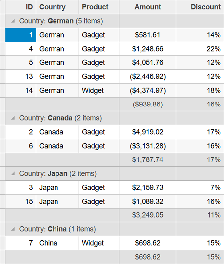
The following image showcases how the group rows contain the sum of the 'Amount' and the average of 'Discount' columns for each group.

The following code showcases how to show group summary or aggregate and set its position. This example uses the data from the Sale.cs class which is used in the Quick Start topic.
Controller Code
public IActionResult Index()
{
    return View(Sale.GetData(15));
}
View Code
@using C1.Web.Mvc.Grid
@model IEnumerable<Sale>
<c1-flex-grid auto-generate-columns="false" is-read-only="true" group-by="Country" group-summary-position="Bottom">
    <c1-items-source source-collection="@Model"></c1-items-source>
    <c1-flex-grid-column binding="ID"></c1-flex-grid-column>
    <c1-flex-grid-column binding="Country"></c1-flex-grid-column>
    <c1-flex-grid-column binding="Product"></c1-flex-grid-column>
    <c1-flex-grid-column binding="Amount" format="c" aggregate="Sum"></c1-flex-grid-column>
    <c1-flex-grid-column binding="Discount" format="p0" aggregate="Avg"></c1-flex-grid-column>
</c1-flex-grid>


