- Getting Started
- Configuring your MVC Application
- Adding NuGet Packages to your App
- Adding Controls
- Client-Side Support
- Working with Controls
- Globalization
- Styling
- ASP.NET MVC Samples
- ReleaseHistory
Styling TreeView
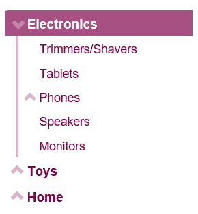
The TreeView control allows to customize its appearance using CSS. You can create your own custom CSS and then apply it to the TreeView control using CssClass property. The following image shows how the TreeView control appears after using a custom CSS class.
The example uses CssClass property to apply custom cascading styling sheets in the TreeView control. The below example code uses Property model added in the QuickStart section.
Add Custom Stylesheet
Create a new ASP.NET MVC application. Once you have created the application, a Content folder is created in the Solution Explorer after adding the view to the application. To add a custom style sheet in your application, follow these steps:
In the Solution Explorer, right-click the Content folder.
From the context menu, select Add | Style Sheet. The Specify Name for Item dialog appears.
Set name of the style sheet (for example:
app.css)and click OK.Replace the default code of app.css file with the code given below.
.wj-treeview {
    font-size: 120%;
    margin-bottom: 8px;
}
/* custom tree styles */
.custom-tree.wj-treeview {
    color: #80044d;
}
    /* default nodes */
    .custom-tree.wj-treeview .wj-node {
    }
    /* level 0 and deeper nodes */
    .custom-tree.wj-treeview .wj-nodelist > .wj-node {
        font-size: 120%;
        font-weight: bold;
    }
    /* level 1 and deeper nodes (smaller font, vertical line along the left) */
    .custom-tree.wj-treeview .wj-nodelist > .wj-nodelist > .wj-node,
    .custom-tree.wj-treeview .wj-nodelist > .wj-nodelist > .wj-nodelist {
        font-size: 110%;
        font-weight: normal;
        border-left: 4px solid rgba(128, 4, 77, 0.3);
    }
    /* level 2 and deeper nodes (smaller font, thinner border) */
    .custom-tree.wj-treeview .wj-nodelist > .wj-nodelist  > .wj-nodelist > .wj-node,
    .custom-tree.wj-treeview .wj-nodelist > .wj-nodelist  > .wj-nodelist > .wj-nodelist {
        font-size: 100%;
        font-style: italic;
        opacity: 0.8;
        border-left: 2px solid rgba(128, 4, 77, 0.3);
    }
    /* expanded node glyph */
    .custom-tree.wj-treeview .wj-nodelist .wj-node:before {
        content: "\e114";
        font-family: 'Glyphicons Halflings';
        top: 4px;
        border: none;
        opacity: .3;
        transition: all .3s cubic-bezier(.4,0,.2,1);
    }
    /* collapsed node glyph */
    .custom-tree.wj-treeview .wj-nodelist .wj-node.wj-state-collapsed:before,
    .custom-tree.wj-treeview .wj-nodelist .wj-node.wj-state-collapsing:before {
        transform: rotate(-180deg);
        transition: all .3s cubic-bezier(.4,0,.2,1);
    }
    /* selected node */
    .custom-tree.wj-treeview .wj-node.wj-state-selected {
        color: white;
        background: rgba(128, 4, 77, 0.70);
    }
The example code changes the collapse/expand icons, uses different font sizes depending on node level, and adds a vertical bar to the left of the level one nodes.
Styling.cshtml
@using <ApplicationName.Models>
@model Property[]
<c1-tree-view class="custom-tree"
        display-member-path="Header" child-items-path="Items"
        source="Model"></c1-tree-view>


