- Getting Started
- Configuring your MVC Application
- Adding NuGet Packages to your App
- Adding Controls
- Client-Side Support
- Working with Controls
- Globalization
- Styling
- ASP.NET MVC Samples
- ReleaseHistory
Theming
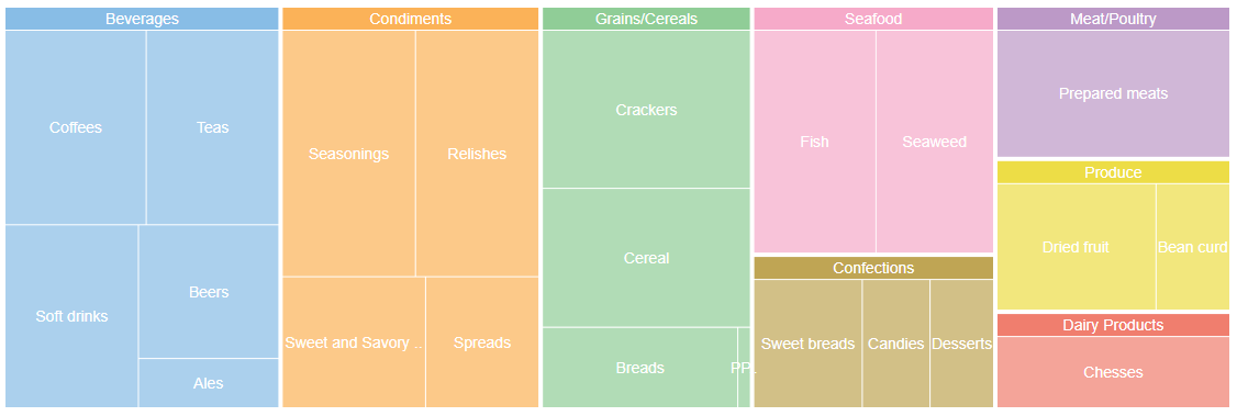
The TreeMap chart control allows you to customize its appearance by using the Palette property. You can set a collection value to this property. The collection item type could be System.Drawing.Color or C1.Web.Mvc.TreeMapItemStyle.
The following image shows how a TreeMap control appears after applying a theme using Palette property.

The below example code uses FoodSale.cs model added in the QuickStart section.
Themeing.cshtml
@model IEnumerable<FoodSale>@{
    var colors = new List<string> { "#88bde6", "#fbb258", "#90cd97", "#f6aac9", "#bfa554", "#bc99c7", "#eddd46", "#f07e6e", "#8c8c8c" };
}
<c1-tree-map binding="Sales" binding-name="Category,SubCategory"
             palette="@colors">
    <c1-items-source source-collection="Model"></c1-items-source>
    <c1-flex-chart-datalabel position="Center" content="{name}"></c1-flex-chart-datalabel>
</c1-tree-map>


