
Standalone Designer
ActiveReports provides the standalone designer application ActiveReports.Designer.exe, which supports all types of reports - Page, RDLX, RDLX Dashboard, and Section. The application can be launched by installing the ActiveReports installer package. The standalone designer application appears with an RDLX layout by default.
You can run the standalone report designer application by selecting the ActiveReports 20 Designer from the Start menu, or by running the ActiveReports.Designer.exe from the C:\Program Files (x86)\MESCIUS\ActiveReports 20\Tools\ location.
The standalone designer application can be used to create a report layout, save it in .rpx or .rdlx format and then load it in the WinForms Viewer application to view the report.
Design area
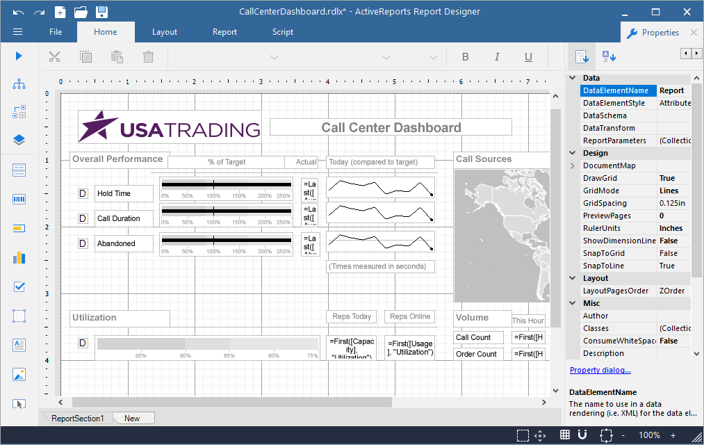
The UI of ActiveReports designer application consists of the following regions:
Quick Access Toolbar
The Quick Access Toolbar contains a set of quickly accessible commands such as Undo, Redo, New, Open, and Save. It is located on the top-left corner of the app.

Toolbox
The Toolbox contains a set of elements including the Report controls.
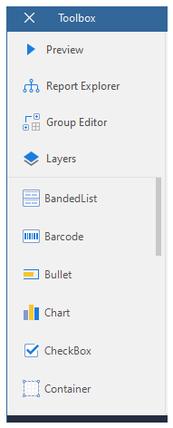
The key elements of the Toolbox are listed below:
Preview: Shows report preview.
Report Explorer: Provides an overview of the hierarchy of added report items and allows managing data sources, parameters, embedded images, embedded stylesheets, etc.
Group Editor: Shows Column and Row group hierarchies of Tablix members for currently selected Tablix data region. You can also switch between Horizontal and Vertical mode.
Layers: Provides options to add or remove layers and send the Layer back or bring it to the front. You can edit or customize any element only in the layer in which it was added.
Report Controls: Report controls to be used while creating a report, such as BandedList, Barcode, Bullet, Chart, CheckBox, Container, FormattedText, Image, InputField, Line, List, Map, Shape, Sparkline, Subreport, Table, TableOfContents, Tablix and TextBox.
Ribbon

The Ribbon contains the following tabs:
File: Contains options to create, open, save reports or exit the designer. It also contains the version information in the About option.
Home: Consists of report editing options such as cut, copy, paste, and delete. It also provides shortcuts for text formatting such as font, font size, font color, and horizontal and vertical text alignments.
Layout: Contains options to align to grid, size to grid, bring to front, send to back and other sizing and spacing options.
Report: Contains options to define report parameters, embedded images, report properties, and add or remove header and footer (RDLX report), and change report stylesheets. It also contains option to create and manage report parts in case of RDLX report.
Script: Allows you to embed Visual Basic .NET or C# script in reports.
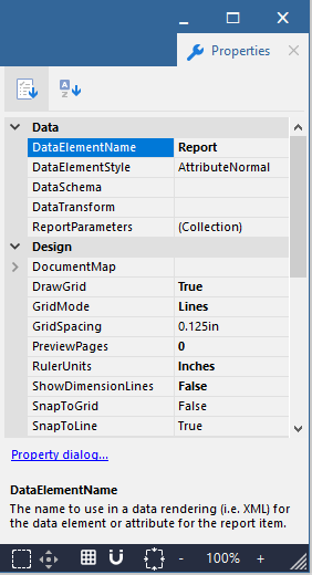
Properties panel
The Properties tab is located on the right-hand side of the app. Click the tab to view the Properties panel, which displays the properties of the selected report element. If more than one element is selected, only their common properties are shown.
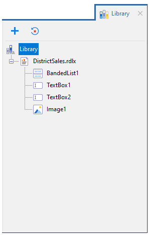
Library panel
The Library panel, located on the right-hand side of the app, is disabled by default. See Enable Report Library for details. Click the tab to view the Library panel, which allows adding reports to the designer along with its data source, dataset, parameter, etc. The elements of the reports added in the library can be used in creating a report.
Status bar
The Status bar appears like a horizontal bar at the bottom of the designer app.

The key elements of the status bar are listed below:
Grid Mode: Shows or hides the grid. Grids help in accurate placements of controls.
Zoom Support: Changes the zoom level of the design area by using zoom in (+) and zoom out (-) buttons, or by using shortcuts [Ctrl] + [+] to zoom in and [Ctrl] + [-] to zoom out.
Grid Settings: Includes the following settings:
Grid Size - Changes the size of the grid. The value should be between 0.025in and 2in.
Snap to Grid- Allows the selected control to snap to the grid at set locations.
Snap to Lines - Allows the selected control to snap to the vertical or horizontal lines relative to the position of other controls.
Dimension Lines - Displays the dimensions of the element when it is being resized.
Actual Size: Restores the actual size of the report.
Pan Mode: Easy report navigation by dragging it up or down.
Select Mode: Selects all the elements in the selected area.
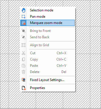
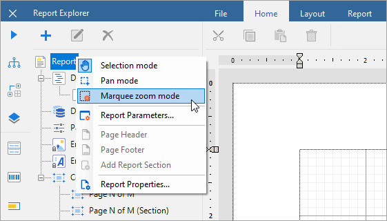
Marquee Zoom Mode
The Marquee zoom mode allows using the cursor to draw a rectangular area on the report design area for zooming in. This zoom mode provides you with a view that zooms in exactly the box that you have selected, so we recommend using it for any situation where exact zooming is important.
The maximum zoom value is 400%.
You can activate the Marquee zoom mode in the Designer in the following ways:
On the report design surface: Right-click the report design surface and select Marquee zoom mode from the context menu.
In the Report Explorer: Right-click Report or any report item below and select Marquee zoom mode from the context menu.
To use the Marquee zoom mode:
Move your mouse to the desired starting point on the design surface.
Click and drag to draw a rectangle around the area you want to zoom into.
Release the mouse button to apply the zoom. The view will automatically scale to fit the selected region.
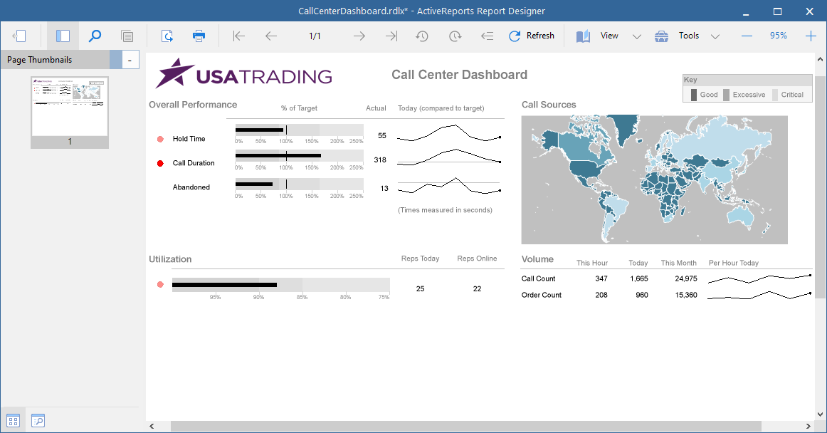
Preview
When the user clicks the Preview button, a Preview window opens up as shown below:
The Preview toolbar consists of the following elements:
Back: Back to the designer.
Side Panel: Includes the following elements:
Page Thumbnails - Displays thumbnails of all the report pages in the side panel.
Search Results - Searches any word or phrase.
Find: Opens Find window to find any word or phrase.
Copy: Copies the selected text on clipboard.
Export: Exports report to various formats like csv, json, jpeg, etc.
Print: Prints the report.
First Page: Navigates to the first page of the report.
Previous Page: Navigates to previous page. Page Number: Navigates to the specific page of the report.
Next Page: Navigates to the next page.
Last Page: Navigates to the last page of the report.
Backward: Navigates to the page you accessed before the current page.
Forward: Navigates to the page from where you accessed the current page.
Refresh: Refreshes the report.
View: You can select the following view modes from the dropdown list:
Single Page - Shows one page of a report at a time.
Continuous - Shows all pages of the report one below the other.
Galley - Shows RDLX reports by removing automatic page breaks and displaying data in a single scrollable page.
Multipage - Shows multiple pages at one glance in a tabular format.
Tools: Includes the following elements:
Pan - Easy report navigation by dragging it up or down.
Selection - Select report element(s).
Snapshot - Captures a snapshot and saves it on clipboard.
Zoom Support: Changes the zoom level of the design area by using zoom in (+) and zoom out (-) buttons, or by using shortcuts [Ctrl] + [+] to zoom in and [Ctrl] + [-] to zoom out.
Keyboard Shortcuts
The following shortcuts are available in the Standalone Designer.
Keyboard Shortcut | Action | |
|---|---|---|
Designing | Ctrl + A | Selects all cells in the Table and Tablix controls. In the List, Body and Container controls, selects all controls in the current container. |
Ctrl + O | Opens the Open report dialog. | |
Ctrl + S | Opens the Save report dialog. | |
Ctrl + Z | Undoes the last action. | |
Ctrl + Y | Redoes the last action. | |
Ctrl + X | Cuts text and controls. | |
Ctrl + C | Copies text and controls. | |
Ctrl + V | Pastes text and controls. | |
Ctrl + rotate mouse wheel | Changes the zoom level of the report designer view. The view content zooms in or out, centered on where the mouse pointer is located. | |
Del | Deletes text and controls. | |
Left, Right, Up, Down arrow keys | Moves the visible area of the page in the corresponding direction. In the Table, navigates between the cells. When controls inside List and Container controls and in the Body of the report are selected, arrow keys allow moving controls by grid-size. In the Chart Control, arrow keys move data-fields and category-fields. | |
Tab | Navigates in the forward direction between the cells in the Table and Tablix controls. When controls inside List and Container controls and in the Body of the report are selected, Tab key switches between controls in the forward direction. | |
Shift + Tab | Navigates in the backward direction between the cells in the Table and Tablix controls. When controls inside List and Container controls and in the Body of the report are selected, Shift + Tab switches between controls in the backward direction. | |
Shift + rotate mouse wheel | Scrolls horizontally. | |
Rotate mouse wheel | Scrolls vertically. | |
Formatting | Ctrl + B | Makes the text bold. |
Ctrl + I | Makes the text italic. | |
Ctrl + U | Underlines the text. | |
Ctrl + L | Aligns text to the left. | |
Ctrl + E | Aligns text to the center. | |
Ctrl + R | Aligns text to the right. | |
Ctrl + J | Aligns text justified. | |
Ctrl + T | Aligns text to the top. | |
Ctrl + M | Aligns text to the middle. | |
Ctrl + H | Aligns text to the bottom. | |
Previewing (F5) | Ctrl + F | Finds a text in the report. |
Ctrl + E | Exports the report. | |
Ctrl + P | Prints the report. | |
Ctrl + S | Switches view mode to Single page. | |
Ctrl + M | Switches view mode to Continuous. | |
Ctrl + I | Switches view mode to Multiple page. | |
Shift + rotate mouse wheel | Scrolls horizontally. | |
Rotate mouse wheel | Scrolls vertically. |