
- Introduction
- Report Readers
-
Report Authors
- Standalone Designer
- WebDesigner
- Report Types
-
Report Controls
-
Report Controls in Page/RDLX Report
- BandedList
- Barcode
- Bullet
-
Chart
- Chart Wizard
- Chart Smart Panels and Adorners
-
Plots
- Column and Bar Charts
- Area Chart
- Line Chart
- Pie and Doughnut Charts
- Scatter and Bubble Charts
- Radar Scatter and Radar Bubble Charts
- Radar Line Chart
- Radar Area Chart
- Spiral Chart
- Polar Chart
- Gantt Chart
- Funnel and Pyramid Charts
- Candlestick Chart
- High Low Close Chart
- High Low Open Close Chart
- Range Charts
- Gauge Chart
- Axes
- Legends
- Customize Chart Appearance
- Trendlines
- Classic Chart
- CheckBox
- Container
- ContentPlaceHolder (RDLX Master Report)
- FormattedText
- Image
- InputField
- Line
- List
- Map
- Matrix
- Overflow Placeholder (Page report only)
- Shape
- Sparkline
- Subreport
- Table
- Table of Contents
- Tablix
- TextBox
- Report Controls in Section Report
-
Report Controls in Page/RDLX Report
- Report Wizard
- Data Binding
- Design Reports
- DevOps
- Developers
- Samples
- Troubleshooting
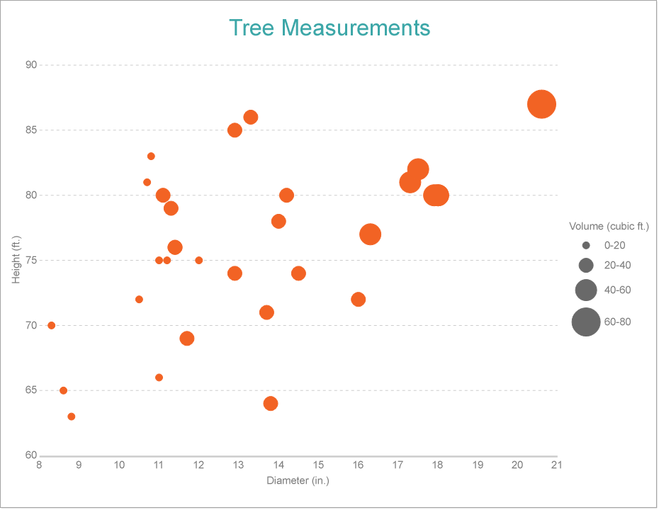
Create Bubble Chart
This walkthrough creates a Bubble Chart. The chart shows the correlation between the height, diameter, and volume of the trees. The final chart appears like this:
Create a Report
In the ActiveReports Designer, create a new RDLX report and follow the New Report wizard to bind the report to data. You can also perform data binding later using the Report Data Source dialog accessed from the Report Explorer.
Connect to a Data Source
In the Report Data Source dialog, select the General page and enter the name of the data source.
Under Type, select 'Json Provider'.
Go to the Content tab under Connection and set the type of JSON data to 'Embedded'.
In the Select or type the file name or URL or enter the data to be embedded field, enter the following data:
JSON Data
[
  {
    "Girth": 8.3,
    "Height": 70,
    "Volume": 10.3
  },
  {
    "Girth": 8.6,
    "Height": 65,
    "Volume": 10.3
  },
  {
    "Girth": 8.8,
    "Height": 63,
    "Volume": 10.2
  },
  {
    "Girth": 10.5,
    "Height": 72,
    "Volume": 16.4
  },
  {
    "Girth": 10.7,
    "Height": 81,
    "Volume": 18.8
  },
  {
    "Girth": 10.8,
    "Height": 83,
    "Volume": 19.7
  },
  {
    "Girth": 11,
    "Height": 66,
    "Volume": 15.6
  },
  {
    "Girth": 11,
    "Height": 75,
    "Volume": 18.2
  },
  {
    "Girth": 11.1,
    "Height": 80,
    "Volume": 22.6
  },
  {
    "Girth": 11.2,
    "Height": 75,
    "Volume": 19.9
  },
  {
    "Girth": 11.3,
    "Height": 79,
    "Volume": 24.2
  },
  {
    "Girth": 11.4,
    "Height": 76,
    "Volume": 21
  },
  {
    "Girth": 11.4,
    "Height": 76,
    "Volume": 21.4
  },
  {
    "Girth": 11.7,
    "Height": 69,
    "Volume": 21.3
  },
  {
    "Girth": 12,
    "Height": 75,
    "Volume": 19.1
  },
  {
    "Girth": 12.9,
    "Height": 74,
    "Volume": 22.2
  },
  {
    "Girth": 12.9,
    "Height": 85,
    "Volume": 33.8
  },
  {
    "Girth": 13.3,
    "Height": 86,
    "Volume": 27.4
  },
  {
    "Girth": 13.7,
    "Height": 71,
    "Volume": 25.7
  },
  {
    "Girth": 13.8,
    "Height": 64,
    "Volume": 24.9
  },
  {
    "Girth": 14,
    "Height": 78,
    "Volume": 34.5
  },
  {
    "Girth": 14.2,
    "Height": 80,
    "Volume": 31.7
  },
  {
    "Girth": 14.5,
    "Height": 74,
    "Volume": 36.3
  },
  {
    "Girth": 16,
    "Height": 72,
    "Volume": 38.3
  },
  {
    "Girth": 16.3,
    "Height": 77,
    "Volume": 42.6
  },
  {
    "Girth": 17.3,
    "Height": 81,
    "Volume": 55.4
  },
  {
    "Girth": 17.5,
    "Height": 82,
    "Volume": 55.7
  },
  {
    "Girth": 17.9,
    "Height": 80,
    "Volume": 58.3
  },
  {
    "Girth": 18,
    "Height": 80,
    "Volume": 51.5
  },
  {
    "Girth": 18,
    "Height": 80,
    "Volume": 51
  },
  {
    "Girth": 20.6,
    "Height": 87,
    "Volume": 77
  }
]
For more information, see the JSON Provider topic.
Go to the Connection String tab and verify the generated connection string by clicking the Validate DataSource

icon.Click OK to save the changes and open the DataSet dialog.
Add a Dataset
In the Dataset dialog, select the General page and enter the name of the dataset, 'Measurements'.
Go to the Query page and enter the following query to fetch the required fields:
$.[*]Click OK to save the changes.
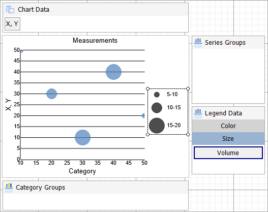
Create Basic Structure of Chart
We will use the Chart Wizard dialog to configure chart data values and basic customization. If you have a dataset added to your report, on Chart's drag-drop operation, the wizard appears. See the topic on Chart Wizard for more information. You can make further adjustments to the chart after you exit the wizard by accessing the properties of chart elements through dialogs, property panels, and adorners.
Drag-drop Chart data region onto the design area. The New Chart dialog appears with an option to select the query and the plot type.
Select the Query as the dataset name (Measurements) and the Plot Type as 'Bubble'.
Click Next to configure data values. We will define three data values to show the 'Girth', 'Height', and 'Volume' of the trees.
Under Configure Chart Data Values, add the following two values from the drop-down, set the corresponding aggregates and captions, and click Next.
Field Caption [Girth] X [Height] Y [Volume] Size Skip the Configure Chart Data Groupings.
Click Next and Choose Report Colors from Theme and Style, and preview your chart.
Now that the basic structure of your chart is ready, let us add more meaning to the chart using the properties via the Chart Panels, Adorners, and Property Panel.
Add Customizations to Chart
Y-Axis
- To open the smart panel for advanced Y-axis settings, right-click 'Y Axis' on the Report Explorer and choose Property Dialog.
- Go to the Title page and set the following properties:
- Title: Height (ft.)
- Font > Size: 12pt
- Font > Color: Gray
- Go to the Labels page and set the following properties:
- Font > Size: 12pt
- Font > Color: Gray
- Go to the Line page and uncheck the Show Line option.
- Go to the Major Gridline page and set the Grid Interval to '5'.
- Set the following properties under Grid appearance.
- Show Grid: Check-on
- Grid Interval: 5
- Show grid: Check-on
- Grid appearance > Width: 0.25pt
- Grid appearance > Color: #cccccc
- Grid appearance > Style: Dashed
- Go to the Scale page and set the following properties:
- Scale Type: Linear
- Minimum scale value: 60
- Click OK to complete setting up the Y-axis.
X-Axis
- To open the smart panel for advanced X-axis settings, right-click 'X Axis' on the Report Explorer and choose Property Dialog.
- Go to the Title page and set the following properties.
- Title: Diameter (in.)
- Font > Size: 12pt
- Font > Color: Gray
- Go to the Labels page and set the following properties.
- Font > Size: 12pt
- Font > Color: Gray
- Go to the Line page and set the following properties.
- Color: #cccccc
- Width: 2pt
- Click OK to complete setting up the X-axis.
Legend Data
- In the Legend Data, right-click Color and from the adorner, click Edit.
- Go to the Title page and set the following properties.
- Title: Volume (cubic ft.)
- Font > Size: 12pt
- Font >Color: Gray
- Go to the Appearance page and set the following properties.
- Font > Size: 12pt
- Background Fill Color > Icon Color: DimGray
- Click OK to complete setting up the chart legend.
Chart Header
- To open the smart panel for the chart header, right-click 'Header' on the Report Explorer and choose Property Dialog.
- Go to the General page and set Title to 'Tree Measurements'.
- Go to the Font page and set the properties as below.
- Size: 24pt
- Color: #3da7a8
- Click OK to complete setting up the chart header.
You may want to resize the chart.type=note
Note: We use stub data at design time and not real data. So to view the actual final chart, you need to view the chart on the preview.
- Once you are done with configuring and customizing the chart, press F5 to preview the report.