
- Introduction
- Report Readers
-
Report Authors
- Standalone Designer
- WebDesigner
- Report Types
-
Report Controls
- Report Controls in Page/RDLX Report
- Report Controls in Section Report
- Report Wizard
- Data Binding
- Design Reports
- DevOps
- Developers
- Samples
- Troubleshooting
Chart Smart Panels and Adorners
Smart panels are the dialogs that group commonly used properties of the chart elements using tabs and groups. ActiveReports provides you with the smart panels for the chart elements. These smart panels can be accessed from the Report Explorer. You need to select the chart element you want the smart panel to show and click the Property dialog link on the Properties pane.
Chart Smart Panel
The Chart Smart Panel can also be accessed from the context menu when selecting a Chart on the design area.
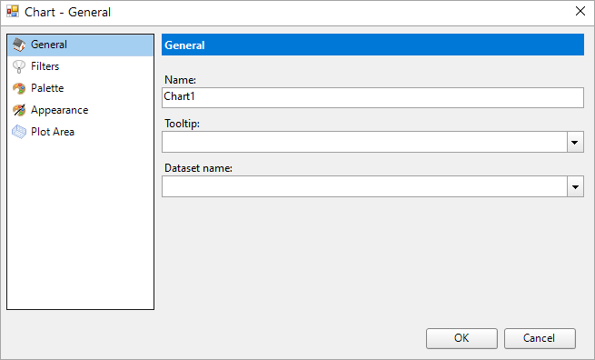
General
Name: A name for the chart that is unique within the report. This name is displayed in the Document Outline and in XML exports.
Tooltip: A textual label for the report item used to include TITLE or ALT attributes in HTML reports.
Dataset name: Select a dataset to bind to the chart. The combo box is populated with all of the datasets in the report's dataset collection.
Filters
Add a new filter by specifying the Expression, Operator, and Value.
Expression: Enter the expression to use for evaluating whether data should be included in the group.
Operator: Select from the following operators to decide how to compare the expression to the left with the value to the right.
Equal Only choose data for which the value on the left is equal to the value on the right.
Like Only choose data for which the value on the left is similar to the value on the right.
For more information on using the Like operator, see the MSDN Web site.
NotEqual Only choose data for which the value on the left is not equal to the value on the right.
GreaterThan Only choose data for which the value on the left is greater than the value on the right.
GreaterThanOrEqual Only choose data for which the value on the left is greater than or equal to the value on the right.
LessThan Only choose data for which the value on the left is less than the value on the right.
LessThanOrEqual Only choose data for which the value on the left is less than or equal to the value on the right.
TopN Only choose items from the value on the left which are the top number specified in the value on the right.
BottomN Only choose items from the value on the left which are the bottom number specified in the value on the right.
TopPercent Only choose items from the value on the left which are the top percent specified in the value on the right.
BottomPercent Only choose items from the value on the left which are the bottom percent specified in the value on the right.
In Only choose items from the value on the left which are in the array of values specified on the right.
Selecting this operator enables the Values list at the bottom.
Between Only choose items from the value on the left which fall between the pair of values you specify on the right. Selecting this operator enables two Value boxes instead of one.
Value: Enter a value to compare with the expression on the left based on the selected operator. For multiple values used with the Between operator, the lower two value boxes are enabled.
Values: When you choose the In operator, you can enter as many values as you need in this list.
Palette
Select a palette for the chart from the list of pre-defined palettes, including the Custom palette.
Appearance
Border
Style: Select a border style from the list of available options.
Width: Choose a width value between 0.25pt and 20pt for the thickness of the borderlines.
Color: Choose a Web or Custom color to use for the borderlines.
Background Fill Color: Choose a color to fill the background of the chart.
Plot Area
Border
Style: Choose an enumerated style for the border.
Width: Choose a width value between 0.25pt and 20pt.
Color: Select a Web or Custom color.
Background Fill Color: Select a Web or Custom color.
Padding: Set padding values - Top, Left, Right, and Bottom, for the chart.
Chart Header and Chart Footer Smart Panels
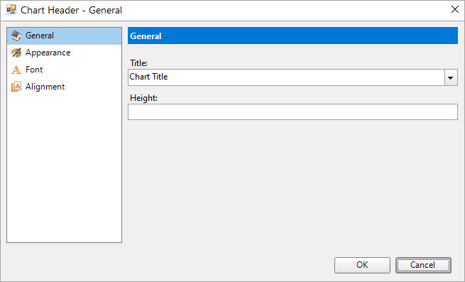
General
Title: Enter an expression or text to use for the chart header/footer.
Height: Set the height of the chart header/footer in percent.
Appearance
Border
Style: Select a border style from the list of available options.
Width: Choose a width value between 0.25pt and 20pt for the thickness of the borderlines.
Color: Choose a Web or Custom color to use for the borderlines.
Background Fill Color: Choose a Web or Custom color to fill the background of the chart header/footer.
Font
Family: Choose the font family name for the header/footer text.
Size: Choose the size in points for the header/footer text font.
Style: Choose one from the enumerated styles for the text font.
Weight: Choose from Lighter, Thin, ExtraLight, Light, Normal, Medium, SemiBold, Bold, ExtraBold, Heavy, and Bolder.
Color: Select a Web or custom color for the font.
Decoration: Choose from None, Underline, Overline, LineThrough, and DoubleUnderline.
Alignment
Horizontal Alignment: Choose Left, Center, or Right.
Vertical Alignment: Choose Top, Middle, or Bottom.
Padding: Set the padding values - Top, Left, Right, and Bottom, for the chart header/footer.
Chart Axis Smart Panel
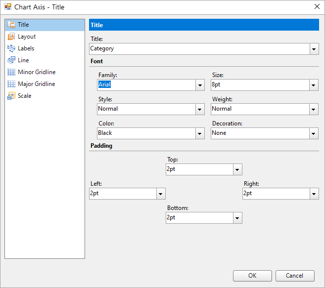
Title
Title: Enter an expression or text to use for the chart axis title.
Font
Family: Choose the font family name for the chart axis title.
Size: Choose the size in points for the chart axis title.
Style: Choose one from the enumerated styles for the text font.
Weight: Choose from Lighter, Thin, ExtraLight, Light, Normal, Medium, SemiBold, Bold, ExtraBold, Heavy, and Bolder.
Color: Select a Web or custom color for the font.
Decoration: Choose from None, Underline, Overline, LineThrough, and DoubleUnderline.
Padding: Set the padding values - Top, Left, Right, and Bottom, for the chart axis title.
Layout
Overlapping Labels Mode: Select Auto or Show to specify whether the labels can be overlapped.
Size
Height: Set the height in percent relative to the overall chart height.
Width: Set the width in percent relative to the overall chart width.
MaxHeight: Set the maximum height in percent relative to the overall chart height.
MaxWidth: Set the width in percent relative to the overall chart width.
Position
Reversed: Select this check box to reverse the direction of the axis -top to bottom, or right to left.
Origin: Value or ordinal number, at which an axis crosses the perpendicular axis.
Position: Select from Far, Near, or None for the label position.
Labels
General
Show Labels: Select this checkbox to have the axis labels displayed.
Format: The formatting string used to render dates and numbers.
Angle: Rotation angle for the axis label. The angle is measured in degrees with valid values from -90 to 90.
Writing mode: The horizontal (lr-tb) or vertical direction (tb-rl) of the label text. The default value is lr-tb (left to right top to bottom). If set to tb-lr (top to bottom left to right), the chart axis labels appear vertically.
Label Row Count: Sets the number of rows for axis labels, ranging from 1 to 10 for a multi-row arrangement. This property is supported in Column, Area, Line, Scatter, Bubble, Candlestick, High Low Close, High Low Open Close, Range Column, and Range Area charts, for X-Axis.
Appearance
Font
Family: Choose the font family name for the chart axis label.
Size: Choose the size in points for the chart axis label.
Style: Choose one from the enumerated styles for the text font.
Weight: Choose from Lighter, Thin, ExtraLight, Light, Normal, Medium, SemiBold, Bold, ExtraBold, Heavy, and Bolder.
Color: Select a Web or custom color for the font.
Decoration: Choose from None, Underline, Overline, LineThrough, and DoubleUnderline.
Padding: Set the padding values - Top, Left, Right, and Bottom, for the chart axis label.
Line
Show Line: Select this checkbox to have the axis line shown.
Appearance
Color: Select a Web or Custom color.
Width: Specify the width of the axis line in points.
Style: Choose from an enumerated style for the axis line.
Minor Gridline
Grid Interval: Set the interval at which you want to show minor grid lines or tick marks or both.
Grid Appearance
Show grid: Select this check box to show minor grid lines for the axis.
Color: Select a color for the grid line.
Width: Enter a width value between 0.25pt and 20pt.
Style: Choose one from the enumerated styles for the gird line.
Tick mark appearance
Position: Select the tick mark position from None, Inside, Outside, or Cross.
None: No tick mark is displayed.
Inside: Tick marks are displayed inside the axis.
Outside: Tick marks are displayed outside the axis.
Cross: Tick marks are displayed crossing the axis.
Size: Specify the length of the minor grid tick marks.
Color: Select a Web or Custom color.
Width: Specify the width of the tick mark in points.
Style: Choose from an enumerated style for the minor grid tick mark.
Major Gridline
Grid Interval: Set the interval at which you want to show major grid lines or tick marks or both
Grid Appearance
Show grid: Select this check box to show major grid lines for the axis.
Color: Select a color for the grid line.
Width: Enter a width value between 0.25pt and 20pt.
Style: Choose one from the enumerated styles for the gird line.
Tick mark appearance
Position: Select the tick mark position from None, Inside, Outside, or Cross.
None: No tick mark is displayed.
Inside: Tick marks are displayed inside the axis.
Outside: Tick marks are displayed outside the axis.
Cross: Tick marks are displayed crossing the axis.
Size: Specify the length of the major grid tick marks.
Color: Select a Web or Custom color.
Width: Specify the width of the tick mark in points.
Style: Choose from an enumerated style for the major grid tick mark.
Scale
Scale Type: Select the axis scale from Linear, Logarithmic, Ordinal, or Percentage.
Minimum scale value: Leave this value blank to allow the data to determine the minimum value to use.
Maximum scale value: Leave this value blank to allow the data to determine the maximum value to use.
Logarithmic base: The axis logarithmic base for the logarithmic scale type.
See Axes for more information.
Chart Plot Smart Panel
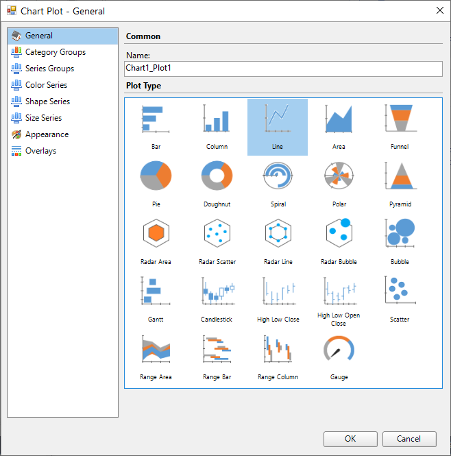
General
Name: Enter the chart plot name.
Plot Type: Select a chart plot type from the following available types:
Bar | Column | Line | Area | Funnel |
|---|---|---|---|---|
Pie | Doughnut | Spiral | Polar | Pyramid |
Radar Area | Radar Scatter | Radar Line | Radar Bubble | Bubble |
Gantt | Candlestick | High Low Close | High Low Open Close | Scatter |
Range Area | Range Bar | Range Column | Gauge |
See Plots topic for more information.
Data Series
General tab
Name: Name of the category group or series group.
Value: Add data series expression.
Caption: Add caption for the data series expression
Tooltip: Set the tooltip for the data series, a field, constant, or an expression.
Format: Set the format of the tooltip's value.
Styles tab
Common > Opacity: The opacity of the data series plot.
Line Style: Set the style for the line representing the data series plot.
Lable Connecting Line: Set the style for the label's line.
Labels tab
Set the labels for the data points.
Point Labels
Value: The value of the data label.
Format: The format of the data label's value.
Text Position: Position of the text that you can choose as Auto, Center, Inside, or Outside.
Offset: Percentage offset of the data point.
Background Color: Data label's background color.
Font: Set font and the appearance for the data label.
Border: Set the border for the data label.
Action tab
Action type: Action to perform when the user clicks on the data points. See the Interactivity topic on more information.
Category/Series Groups
General tab
Name: Name of the category group or series group.
Group on >Expression: The expression based on which categories/series should be grouped.
Label: The text for the category group label.
Filters tab
Filters
Add a new filter by specifying the Expression, Operator, and Value.
Expression: Enter the expression to use for evaluating whether data should be included in the group.
Operator: Select from the following operators to decide how to compare the expression to the left with the value to the right.
Value: Enter a value to compare with the expression on the left based on the selected operator. For multiple values used with the Between operator, the lower two value boxes are enabled.
Values: When you choose the In operator, you can enter as many values as you need in this list.
Sorting tab
Expression: A field used for sorting.
Direction: Choose the data sorting direction from Ascending or Descending.
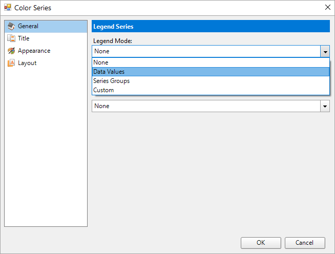
Color Series
Specify the series for the color legend.
Legend Mode: Specify the mode depending on which the color legend is applied to the chart.
Data Values: Data points are colored based on the data values.
Series Groups: Data points are colored based on the series groups.
Custom: To set custom legend, you should set the expression for the legend series in Custom Expression.
Action Type: Chart color action. See the Interactivity topic on more information.
Shape/Size Series
Specify the series for the shape or size legend to display on each data point.
Legend Mode:
Series Groups: Data points are colored based on the series groups.
Custom: To set custom legend, you should set the expression for the legend series in Custom Expression.
Appearance
Clipping Mode: The Clipping Mode determines how a plot extends within the plot area. The ClippingMode can be set to:
Fit: Utilizes the free space to fit the plots within the plot area
Clip: Clips off the excess plot lengths (e.g. bar or column lengths) toward the right or the bottom
Offset: The Offset is the percentage relative by which the plots should move to the right or the bottom side, respectively.
Overlapping Labels Mode: Select the mode to handle overlapping labels.
Auto - specifies that overlapping labels are handled automatically.
Hide - specifies that overlapping labels should be hidden.
Show - specifies that overlapping labels should be displayed.
Reposition (available in pie and doughnut charts only) - specifies that labels should be repositioned automatically to avoid overlapping.
Overlays
See Trendlines topic for more information.
General tab
Caption: Enter the chart overlay name.
Type: Set the type of the overlay by selecting it from the predefined list.
Display: Select the display position from Front or Back.
Appearance tab
Border
Style: Select a border style from the list of available options.
Width: Choose a width value between 0.25pt and 20pt for the thickness of the borderlines.
Color: Choose a Web or Custom color to use for the borderlines.
Config tab
Axis: Specify the axis, to which the overlay belongs.
Detail Level: Specify if the overlay calculation should include the entire dataset or each detail group.
Field: Set the field name for the overlay to use.
Aggregate: Set the reference line aggregate function.
Legend Label: Enter the legend label text.
Chart Color Legend Smart Panel
General
Legend Mode: Specify the mode depending on which the color legend is applied to the chart.
Data Values: Data points are colored based on the data values.
Series Groups: Data points are colored based on the series groups.
Custom: To set custom legend, you should set the expression for the legend series in Custom Expression.
Title
Title: Enter an expression or text to use for the chart legend.
Font
Family: Choose the font family name for the chart legend.
Size: Choose the size in points for the chart legend.
Style: Choose one from the enumerated styles for the text font.
Weight: Choose from Lighter, Thin, ExtraLight, Light, Normal, Medium, SemiBold, Bold, ExtraBold, Heavy, and Bolder.
Color: Select a Web or custom color for the font.
Decoration: Choose from None, Underline, Overline, LineThrough, and DoubleUnderline.
Appearance
Border
Style: Select a border style from the list of available options.
Width: Choose a width value between 0.25pt and 20pt for the thickness of the borderlines.
Color: Choose a Web or Custom color to use for the borderlines.
Font
Family: Choose the font family name for the chart legend.
Size: Choose the size in points for the header/footer text font.
Style: Choose one from the enumerated styles for the text font.
Weight: Choose from Lighter, Thin, ExtraLight, Light, Normal, Medium, SemiBold, Bold, ExtraBold, Heavy, and Bolder.
Color: Select a Web or custom color for the font.
Decoration: Choose from None, Underline, Overline, LineThrough, and DoubleUnderline.
Background Fill Color: Choose a Web or Custom color to fill the background of the chart legend.
Layout
Hide Legend: Select this checkbox to hide the chart legend.
Position: Select an enumerated value from Bottom, Left, Right, or Top to determine the position of the legend relative to the chart area.
Orientation: Select the legend orientation from Horizontal or Vertical.
Size
MaxHeight: Sets the maximum height in percent relative to the overall chart height.
MaxWidth: Sets the maximum width in percent relative to the overall chart width.
Padding: Set the padding values - Top, Left, Right, and Bottom, for the chart legend.
See Legends topic for more information.
Chart Data - Category Groups Smart Panel
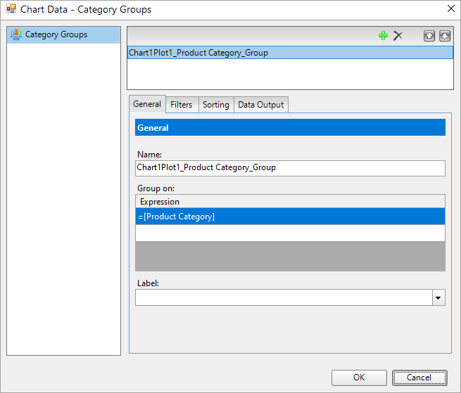
For the available settings, see Category/Series Groups section.
Chart Data - Series Groups Smart Panel
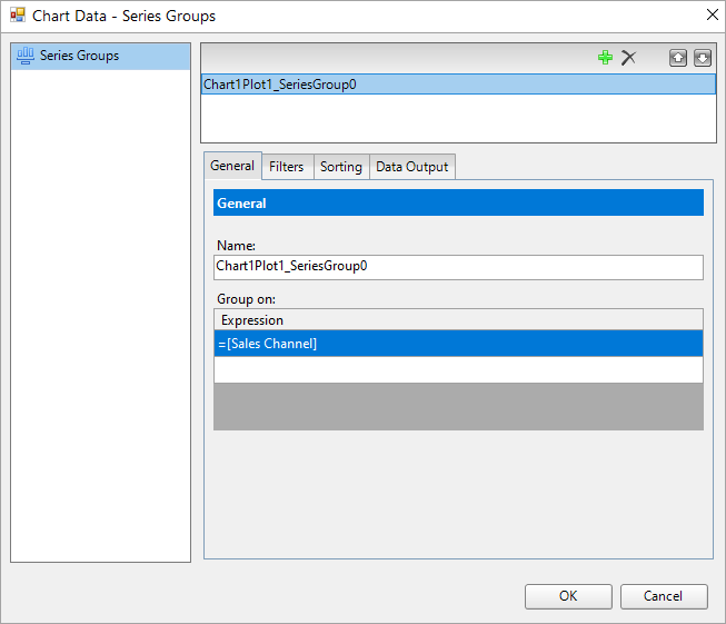
For the available settings, see Category/Series Groups section.
Chart Data - Series Values Smart Panel
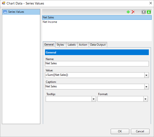
For the available settings, see Data Series section.
Adorners
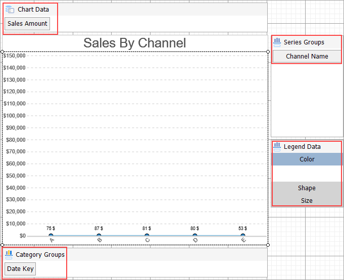
Adorners are visual indicators for quick actions that are required for displaying data on chart.
Chart Data Adorner
The Chart Data adorner lets you add, edit, and delete chart data series.
Add: Adds a stub data series to plot, with Name, Values, and Captions set to “Series{index}”. The data series can also be added using the drag-drop action.
Data adorner items take the name specified in DataSeries.Name property. This property has no effect on rendering; it is visible during the design time to give a more meaningful or a short name to Data Series as needed and in data exports (CSV/XML).
On the other hand, the caption has an effect on the rendering. In the Color Series settings, the legend displays the name supplied in the Caption property.
Edit: Opens Chart Data - Series smart panel.
Delete: Deletes the data series.
Series/Category Groups Adorner
The Series/Category groups adorner lets you manage the series or category groups.
Add: Adds a stub series/category group with a name equal to
“ChartPlot{plot_index}_SeriesGroup{group_index}” or “ChartPlot{plot_index}_CategoryGroup{group_index}”
and a single group expression equal to “SeriesGroup{index}” “CategoryGroup{index}”. You can also use the drag-drop action to add a series/category group.
Edit: Opens the Series/Category groups smart panel for the selected series/category group.
Delete: Deletes the selected series/category.
Legend Data Adorner
Depending on the type of plot, different legend series are available. See the Legends topic for more information. The legends displayed in the Legend Data adorner, the Color, Shape, and Size, depend on the plot type.
Edit: Opens the legend series smart panel. See Chart Color Legend Smart Panel section for details.
Reset: Resets series to default state.