
- Introduction
- Report Readers
-
Report Authors
- Standalone Designer
- WebDesigner
- Report Types
-
Report Controls
-
Report Controls in Page/RDLX Report
- BandedList
- Barcode
- Bullet
-
Chart
- Chart Wizard
- Chart Smart Panels and Adorners
-
Plots
- Column and Bar Charts
- Area Chart
- Line Chart
- Pie and Doughnut Charts
- Scatter and Bubble Charts
- Radar Scatter and Radar Bubble Charts
- Radar Line Chart
- Radar Area Chart
- Spiral Chart
- Polar Chart
- Gantt Chart
- Funnel and Pyramid Charts
- Candlestick Chart
- High Low Close Chart
- High Low Open Close Chart
- Range Charts
- Gauge Chart
- Axes
- Legends
- Customize Chart Appearance
- Trendlines
- Classic Chart
- CheckBox
- Container
- ContentPlaceHolder (RDLX Master Report)
- FormattedText
- Image
- InputField
- Line
- List
- Map
- Matrix
- Overflow Placeholder (Page report only)
- Shape
- Sparkline
- Subreport
- Table
- Table of Contents
- Tablix
- TextBox
- Report Controls in Section Report
-
Report Controls in Page/RDLX Report
- Report Wizard
- Data Binding
- Design Reports
- DevOps
- Developers
- Samples
- Troubleshooting
Radar Line Chart
Radar Line Charts are plot types useful to depict ordered measurements of single or multiple variables across different category ranges. A radar line chart arranges categories radially and connects corresponding points with straight lines. The data values are represented by Symbols or shapes laid out across radial lines and connected via straight or curved lines.
Radar Line Chart with Multiple Values
A radar line chart can be used to depict measurements of one or multiple variables across various category ranges. For example, the Radar Line Plot with Multiple Values can be used to display two types of average ratings for many movie genres.
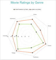
Radar Line Chart with Multiple Values
Radar Line Chart with Multiple Lines
A multiple-line radar chart lets you split data values into subcategories for finer analysis. For instance, the Radar Line with Multiple Lines chart can be used to depict average movie ratings in different countries for several movie genres. See Radar Line Chart with Multiple Lines walkthrough to learn how to create this chart.
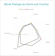
Radar Line Chart with Multiple Lines