
- Introduction
- Report Readers
-
Report Authors
- Standalone Designer
- WebDesigner
- Report Types
-
Report Controls
-
Report Controls in Page/RDLX Report
- BandedList
- Barcode
- Bullet
-
Chart
- Chart Wizard
- Chart Smart Panels and Adorners
-
Plots
- Column and Bar Charts
- Area Chart
- Line Chart
- Pie and Doughnut Charts
- Scatter and Bubble Charts
- Radar Scatter and Radar Bubble Charts
- Radar Line Chart
- Radar Area Chart
- Spiral Chart
- Polar Chart
- Gantt Chart
- Funnel and Pyramid Charts
- Candlestick Chart
- High Low Close Chart
- High Low Open Close Chart
- Range Charts
- Gauge Chart
- Axes
- Legends
- Customize Chart Appearance
- Trendlines
- Classic Chart
- CheckBox
- Container
- ContentPlaceHolder (RDLX Master Report)
- FormattedText
- Image
- InputField
- Line
- List
- Map
- Matrix
- Overflow Placeholder (Page report only)
- Shape
- Sparkline
- Subreport
- Table
- Table of Contents
- Tablix
- TextBox
- Report Controls in Section Report
-
Report Controls in Page/RDLX Report
- Report Wizard
- Data Binding
- Design Reports
- DevOps
- Developers
- Samples
- Troubleshooting
Area Chart
An Area Chart is similar to a line chart that is connected using line segments. The Area Chart arranges a period horizontally, connects them by line, encodes values into points, and fills the area between the line segments and x-axis with color. An area plot is a good chart option when you want to observe the volume change over a period. It gives the summation of the quantitative data.
Stacked Area Chart
A Stacked Area chart is a type of area chart that helps in breaking down data values into subcategories by placing corresponding area subsections on top of each other. The Create Stacked Area Chart walkthrough showcases plotting the Net Sales over a year with stacked areas for each Product Category.
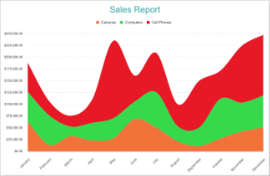
Stacked Area
Stacked Percentage Area Chart
A Percentage Stacked Area chart combines the stacked area and the Percentage axis scale. Apart from showing changes in data values, the chart can also show each subcategory's contribution to a total. The Create Stacked Percent Area Chart walkthrough showcases plotting the percentage share of Product Categories in Net Sales.
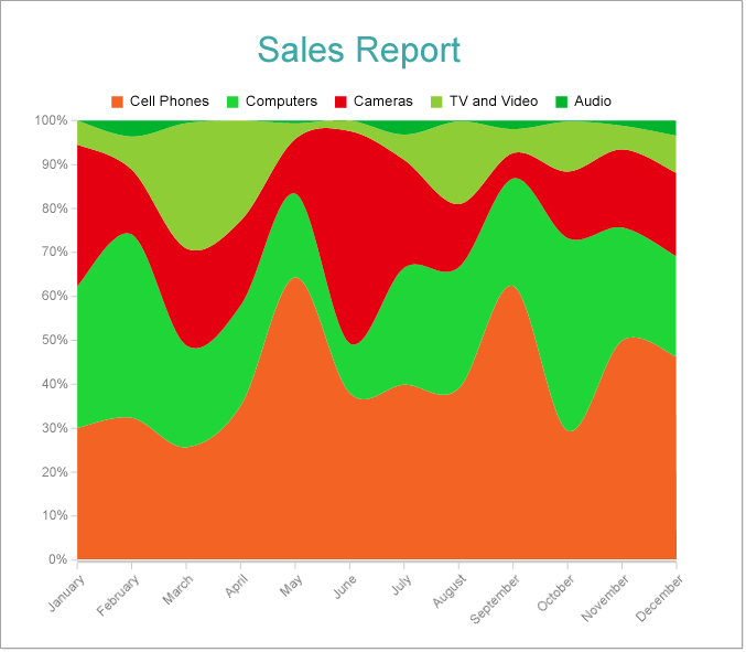
Percentage Stacked Area
Clustered Area Chart
A Clustered Area chart is used to break down data values into subcategories for granular analysis. For example, the Clustered Area Chart can be used to depict the total sales changes over a year segregated into clustered areas per product category.
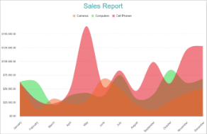
Clustered Area Chart