Pie charts are circular charts that display the contribution of each category which is represented by a slice. Each and every slice represents a category of data that makes up the whole pie. A pie chart is able to provide information at a glance itself. For example, you can use a pie chart to compare growth areas within a business such as profit and turnover.
A doughnut chart is like a pie chart with a center hole. It encodes the data values into rings divided into segments. For instance, a donut chart can be used to display a survey of book sales in various genres in a bookstore.
A Single Value Pie chart visualizes parts of a single data value. For instance, the Single Value Plot can be used to show the contribution of product categories in Net Sales. See Create Pie Chart walkthrough to learn how to create this chart.
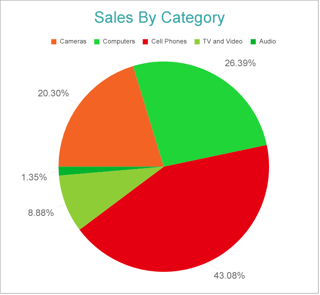
A Multiple Value Pie or Doughnut chart can be used to display various values divided into common parts using a Doughnut or Pie plot. For example, the Doughnut Plot can be used to show the contribution of product categories into Discounts, Returns, and Unit Cost. See Create Doughnut Chart walkthrough to learn how to create a 
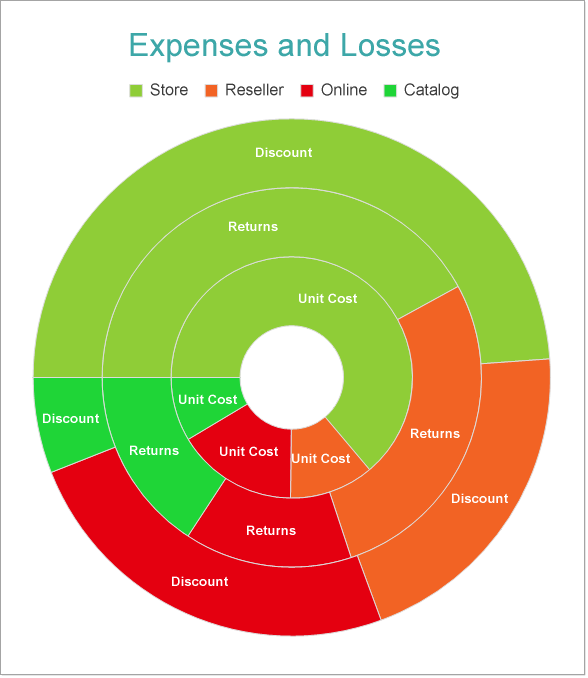
Multiple Value Doughnut Chart.
A Circular Bar chart places doughnut segments adjacent to each other. For instance, the Circular Bar Chart can be used to depict the contribution of sales channels into Net Income. See Create Circular Bar Chart walkthrough to learn how to create a this chart.
The Pie and Doughnut Plot properties discussed below can be accessed from the Properties Panel on selecting the Chart > Plot from the Report Explorer. You can access some of the important properties from the Plot's Smart Panel too. See Chart Smart Panels topic for more information. Both the Properties Panel and the Smart Panel can be accessed by right-clicking the plot in the design area.
Indicates the color used to fill the chart area.
The action to perform when the Pie Plot is clicked. The action can be a hyperlink, a bookmark, or a drill-through.
The data labels for each Pie Chart.
The line style for the borders. Includes LineColor, LineStyle, and LineWidth properties for customization.
The name of the plot. By default, a chart containing a single plot has the plot name as 'Plot1'.
Contains the tooltip template settings. You can choose from the list of predefined settings or set your own in the Expression Editor.
The Clipping Mode determines how a plot extends within the plot area. The ClippingMode can be set to
Inner radius of the plot is the percentage relative to the chart's outer radius. It defines the hole size in the center of the disk
The Line Aspect determines the line style that connects data points.
The Opacity determines the opacity of areas filled with color. 100% opacity means that the plot fill color is opaque while 0% opacity means that the plot fill color is completely transparent.
Overlays property is a collection for superimposing the data trend on a plot. For more information, see Trendlines topic.
Rules control the appearance of plots based on specified conditions. For more information on conditions, see Rules topic.
Represents how null or empty values should be shown in the plot - Gaps (default), Connected, or Zeros.
Indicates the arc angle that defines the clockwise rotation of the plot. A full rotation makes 360 degrees.
Indicates the arc degrees from 0 to 360 which decides the length of the arc occupied by the plot.
Determines whether to display multiple data fields as a single data field. By default, the property is set to 'False'.
The BarSettings specifies the bar-style settings.
The Color Encoding enables the color legend of the Details or Category Encoding. It includes the following properties:
Action
The action to take when the color legend is clicked.
Aggregate
Aggregates the value of Color expression.
ShowValuesName
If set to True, the legend is displayed based on the value specified in Details encoding or Color encoding.
Values
The Values is the collection where the value of the Color expression is specified. However, the Pie Plots take the first item from the collection.
The Details Encoding breaks down the data values into subcategories and produces additional groups. The Details property is the collection of items and each item includes the following properties that define the Details encoding:
The Values encoding specifies the data values and represents the collection of items and each item includes the following properties.
Type
The Type property provides 'Simple' and 'Complex' options to choose from. However, for Pie Plots, 'Simple' is acceptable.
Value
The Value property is the collection and usually takes a bound field. However, the Pie Plots take the first item from the collection.
Aggregate
To show aggregated values such as Average, Count, and Sum instead of individual values, specify an Aggregate function.
The Text Encoding provides support of any dataset field in chart labels and tooltips and allows displaying additional info on the chart. When two text encodings are added, they are displayed by default with the ";" delimiter. A text encoding includes the following properties:
Aggregate
Aggregates the value of the Text expression.
Target
Specifies whether this text is for a Label or a Tooltip Label. The label format is controlled with the chart's Labels > Template property or Tooltip Template property.
The Template property can use both the predefined values and the added text encoding fields, for example:
Count:{Text0}
Sum:{valueField.value}
Template Key
A unique key, used in the chart plot's Labels > Template and Tooltip Template to access the text encoding value.
Value
A field, constant or expression to be displayed.