
Label
The Label control is available in Section reports and is very similar to the Section report's TextBox control, just that the Label control takes only the static text. The main difference between the two controls is the Angle property of the Label control, and the following properties of the TextBox control: CanGrow, CanShrink, CountNullValues, Culture, DistinctField, OutputFormat, SummaryFunc, SummaryGroup, SummaryRunning, and SummaryType.
type=note
Note: The CrossPlatform and the legacy GDI modes have different typography, so some text in migrated reports (for example, text without spacing, text with non-ASCII characters, etc.) may not appear correctly in the report preview. For the correct text rendering, you must manually update the report layout (for example, change the control's size).
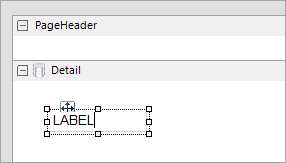
Edit Mode
Double-clicking the Label control changes its mode to edit mode. In the edit mode, you can enter text directly in the control, or you can enter text in the Text property in the Properties panel.
You can format text in the Label control in edit mode using the designer toolbar, or you can modify properties in the Properties panel. Formats apply to all of the text in the control. Text formatting changes from the Properties panel immediately appear in the control, and changes made in the toolbar are immediately reflected in the Properties panel.
type=note
Note: The TextBox and Label controls, unlike ReportInfo control, do not support page-related expressions.
Important Properties
Clicking the four-way arrow selects the control and reveals its properties.
| Property | Description |
|---|---|
| Angle | Gets or sets the angle (slope) of the text within the control area. Set the Angle property to 900 to display text vertically. |
| CharacterSpacing | Gets or sets the space between characters in points. |
| DataField | Gets or sets the field name from the data source to bind to the control. |
| HyperLink | Gets or sets a URL to which the viewer navigates when the user clicks the label at run time. The URL becomes an anchor tag or a hyperlink in HTML and PDF exports. |
| LineSpacing | Gets or sets the space between lines in points. |
| MinCondenseRate | Specifies the minimal rate of the text horizontal scaling in percentages. Should be between 10 and 100. |
| MultiLine | Gets or sets a value indicating whether to allow text to break to multiple lines within the control. |
| ShrinkToFit | Gets or sets a value indicating whether to decrease the font size so that all of the text shows within the boundaries of the control. |
| Style | Gets or sets a style string for the label. |
| Text | Gets or sets the text to show on the report. |
| TextJustify | Specifies how to distribute text when the Alignment property is set to Justify. With any other Alignment setting, this property is ignored. |
| VerticalAlignment | Gets or sets the vertical position of the label's text within the bounds of the control. |
| VerticalText | Indicates whether to render the label's text vertically. |
| WrapMode | Indicates whether a multi-line label control wraps words or characters to the beginning of the next line when necessary. |
Label Dialog Properties
General
Name: Enter a name for the label that is unique within the report. This name is displayed in the Document Outline and in XML exports. You can only use underscore (_) as a special character in the Name field. Other special characters such as period (.), space ( ), forward slash (/), backslash (\), exclamation (!), and hyphen (-) are not supported.
Tag: Enter a string that you want to persist with the control. If you access this property in code, it is an object, but in the Properties panel or Property dialog, it is a string.
Visible: Clear this check box to hide the control.
DataField: Select a field from the data source to bind to the control.
Text: Enter static text to show in the label.
HyperLink: Enter a URL to use in the Viewer HyperLink event. The URL automatically converts to an anchor tag or hyperlink in PDF and HTML exports.
Appearance
Background Color: Select a color from the list to use for the background of the label.
Angle: Use the slider to set the degree of slope for the text within the control area.
Font
Name: Select a font family name or a theme font.
Size: Choose the size in points for the font.
Style: Choose Normal or Italic.
Weight: Choose from Normal or Bold.
Color: Choose a color to use for the text.
Decoration: Select check boxes for Underline and Strikeout.
GDI Charset: Enter a value to indicate the GDI character set to use. For a list of valid values, see MSDN Font.GDICharSet Property.
GDI Vertical: Select this checkbox to indicate that the font is derived from a GDI vertical font.
Format
Line spacing: Enter a value in points to use for the amount of space between lines.
Character spacing: Enter a value in points to use for the amount of space between characters.
Multiline: Select this check box to allow text to render on multiple lines within the control.
Textbox height
Can shrink text to fit fixed size control: Specify whether to decrease the text font to fit the control size.
Minimal rate of text horizontal shrinking (in %): Specify the percentage to which the text should be shrunk horizontally.
Text direction
RightToLeft: Select this check box to reverse the text direction.
Vertical text: Select this check box for top to bottom text.
Alignment
Vertical alignment: Choose Top, Middle, or Bottom.
Horizontal alignment: Choose Left, Center, Right, or Justify.
Justify method: Choose Auto, Distribute, or DistributeAllLines.
type=note
Note: Setting the Horizontal alignment property to Justify enables the Justify method property options.
Wrap mode: Choose NoWrap, WordWrap, or CharWrap to determine whether and how text breaks to the next line.
Padding
Enter values in points to set the amount of space to leave around the label.
- Top
- Left
- Right
- Bottom
Keyboard Shortcuts
In edit mode, you can use the following keyboard shortcuts.
| Key Combination | Action |
|---|---|
| Enter | New line. |
| Alt + Enter | Saves modifications and exits edit mode. |
| Esc | Cancels modifications and exits edit mode. |