
- Introduction
- Report Readers
-
Report Authors
- Standalone Designer
- WebDesigner
- Report Types
-
Report Controls
-
Report Controls in Page/RDLX Report
- BandedList
- Barcode
- Bullet
-
Chart
- Chart Wizard
- Chart Smart Panels and Adorners
-
Plots
- Column and Bar Charts
- Area Chart
- Line Chart
- Pie and Doughnut Charts
- Scatter and Bubble Charts
- Radar Scatter and Radar Bubble Charts
- Radar Line Chart
- Radar Area Chart
- Spiral Chart
- Polar Chart
- Gantt Chart
- Funnel and Pyramid Charts
- Candlestick Chart
- High Low Close Chart
- High Low Open Close Chart
- Range Charts
- Gauge Chart
- Axes
- Legends
- Customize Chart Appearance
- Trendlines
- Classic Chart
- CheckBox
- Container
- ContentPlaceHolder (RDLX Master Report)
- FormattedText
- Image
- InputField
- Line
- List
- Map
- Matrix
- Overflow Placeholder (Page report only)
- Shape
- Sparkline
- Subreport
- Table
- Table of Contents
- Tablix
- TextBox
- Report Controls in Section Report
-
Report Controls in Page/RDLX Report
- Report Wizard
- Data Binding
- Design Reports
- DevOps
- Developers
- Samples
- Troubleshooting
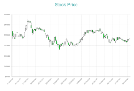
Candlestick Chart
Candlestick charts are plot types used by traders to analyze the possible price changes in trading. Or, let's put it this way, that the CandleStick chart is perhaps a trader's best friend, for the reason that it provides a visual representation of the magnitude of price fluctuations. Without a shadow of a doubt, Candlestick plots never fail to depict the investor sentiment. The relationship between the supply and demand in the trade market comes out really well via the CandleStick pattern.
A Candlestick chart includes a rectangle with a dividing long line projecting from the top and bottom (of the same rectangle), which displays the high and low values. This chart type is also useful to show the opening and closing price points in trading scenarios. So, when the open value is greater than the close value, the rectangle appears filled with the color of the background.
Candlestick Chart