
CrossSectionBox
In section reports, you can use the CrossSectionBox report control to display a frame that runs from a header section through its related footer section, spanning all details that come between.
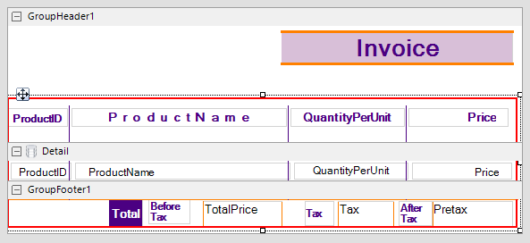
You can place the CrossSectionBox control in the header section in the designer. On adding the control in the footer section, it automatically associates itself with the related header section in the Report Explorer. The control automatically spans intervening sections to end in the related footer section. Move and sizing handles for cross-section controls are not available; you need to use Properties panel instead.
Important Properties
Clicking the four-way arrow selects the control and reveals its properties.
| Property | Description |
|---|---|
| Radius | Sets the radius of each corner for the RoundRect shape type. You can select Default, TopLeft, TopRight, BottomLeft or BottomRight. Selecting Default sets the radius of all the corners of the CrossSectionBox control to a specified percentage. Default value is 0 (pt). |
| BackColor | Sets the back color. |
type=warning
Caution:
- The CrossSectionBox and CrossSectionLine are not supported in multi-column reports where a GroupHeader section has the ColumnLayout property set to True.
- The CrossSectionBox and CrossSectionLine controls are drawn across multiple sections. Therefore, it is not possible to change the control's appearance, etc. in the event of a section. The appearance of the CrossSection control can be dynamically changed only in the ReportStart event.
CrossSectionBox Dialog Properties
You can set the CrossSectionBox properties in the CrossSectionBox dialog. To open it, with the CrossSectionBox selected on the report, under the Properties panel, click the Property dialog link.
General
Name: Enter a name for the control that is unique within the report. This name is displayed in the Document Outline and in XML exports. You can only use underscore (_) as a special character in the Name field. Other special characters such as period (.), space ( ), forward slash (/), backslash (\), exclamation (!), and hyphen (-) are not supported.
Tag: Enter a string that you want to persist with the control. If you access this property in code, it is an object, but in the Properties panel or Property dialog, it is a string.
Visible: Clear this check box to hide the control.
Appearance
Line style: Select a line style to use for the borderline. You can set it to Transparent, Solid, Dash, Dot, DashDot, DashDotDot, or Double.
Line weight: Enter the width for the borderline.
Line color: Select a color to use for the borderline.
Background color: Select a color to use for the background of the picture control.
CloseBorder: Select the checkbox to close the borders.
type=note
Note: The CloseBorder property is only available for CrossSectionBox control placed in Section report's Group Header and Group Footer.
Rounded Rectangle: Specify the radius for each corner of the CrossSectionBox individually. Drag the handlers  available at each corner of the CrossSectionBox to set the value of the radius at each corner.
type=note
Note: To enable specific corners, check the checkbox available near each corner of the CrossSectionBox control.
Use the same radius on specified corners: Select this option to apply the same radius to all selected corners of the CrossSectionBox.
Use different radius on specified corners: Select this option to apply a different radius to each selected corner of the CrossSectionBox.