
- Introduction
- Report Readers
-
Report Authors
- Standalone Designer
- WebDesigner
- Report Types
-
Report Controls
-
Report Controls in Page/RDLX Report
- BandedList
- Barcode
- Bullet
-
Chart
- Chart Wizard
- Chart Smart Panels and Adorners
-
Plots
- Column and Bar Charts
- Area Chart
- Line Chart
- Pie and Doughnut Charts
- Scatter and Bubble Charts
- Radar Scatter and Radar Bubble Charts
- Radar Line Chart
- Radar Area Chart
- Spiral Chart
- Polar Chart
- Gantt Chart
- Funnel and Pyramid Charts
- Candlestick Chart
- High Low Close Chart
- High Low Open Close Chart
- Range Charts
- Gauge Chart
- Axes
- Legends
- Customize Chart Appearance
- Trendlines
- Classic Chart
- CheckBox
- Container
- ContentPlaceHolder (RDLX Master Report)
- FormattedText
- Image
- InputField
- Line
- List
- Map
- Matrix
- Overflow Placeholder (Page report only)
- Shape
- Sparkline
- Subreport
- Table
- Table of Contents
- Tablix
- TextBox
- Report Controls in Section Report
-
Report Controls in Page/RDLX Report
- Report Wizard
- Data Binding
- Design Reports
- DevOps
- Developers
- Samples
- Troubleshooting
Polar Chart
The Polar plot arranges categories along the circumference of a circle and encodes data values into sectors along radial lines. The Polar plot is suitable for comparing data values across categories using a circular shape. The categories can be further split to represent data values as clusters or stacks.
There are different types of Polar charts, which are elaborated below:
Simple Polar Chart
A Simple Polar chart displays one value for each category. See Create Simple Polar Chart walkthrough showcases plotting the Sales Amount per Product Category.
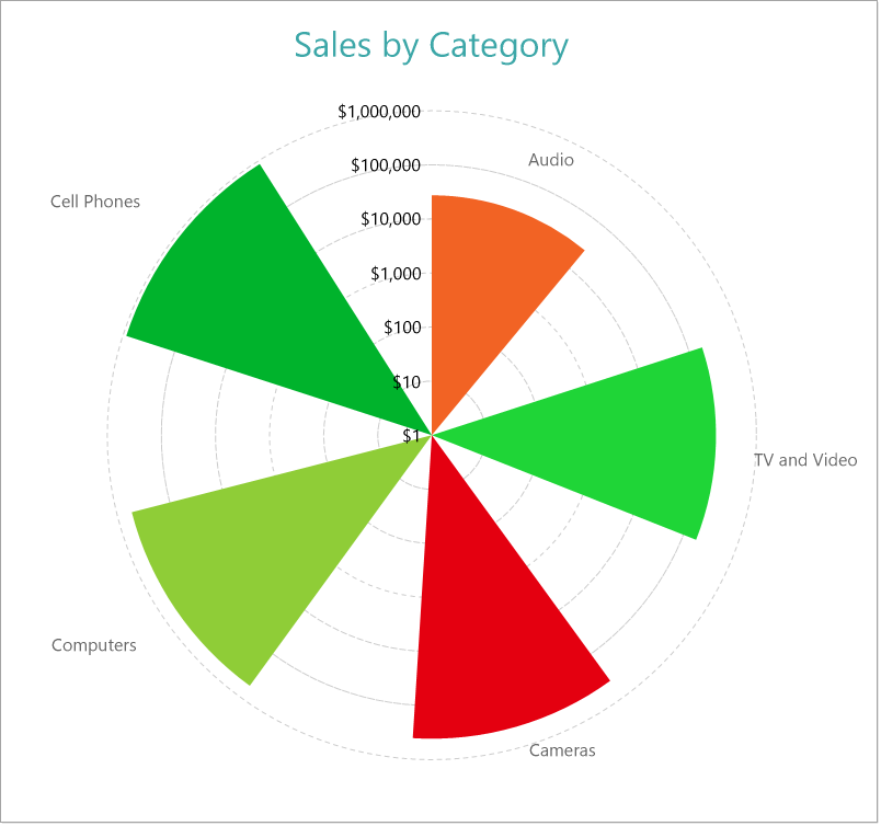
Simple Polar Chart
Clustered Polar Chart
A Clustered Polar chart splits the values into subcategories by placing corresponding circular sectors adjacent to each other within the containing category. The Create Clustered Polar Chart walkthrough showcases plotting the Sales Amount for each Sales Channel per Product Category.
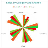
Clustered Polar Chart
Stacked Polar Chart
A Stacked Polar chart is a good option to split the data values into subcategories by dividing corresponding circular sectors into subsections. The Create Stacked Polar Chart walkthrough showcases plotting the Sales Amount for each Product Category per Sales Channel.
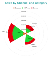
Clustered Polar Chart
Stacked Percentage Polar Chart
A Stacked Percentage Polar chart combines the stacked polar plot and the Percentage axis scale. This chart type indicates the contribution of each data values' sub-category to a total of the containing category. The Create Stacked Percentage Polar Chart walkthrough showcases plotting the percentage share of the Sales Amount of product categories for each Sales Channel.
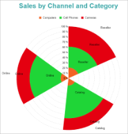
Percentage Stacked Polar Chart