
- Introduction
- Report Readers
-
Report Authors
- Standalone Designer
- WebDesigner
- Report Types
-
Report Controls
-
Report Controls in Page/RDLX Report
- BandedList
- Barcode
- Bullet
-
Chart
- Chart Wizard
- Chart Smart Panels and Adorners
-
Plots
- Column and Bar Charts
- Area Chart
- Line Chart
- Pie and Doughnut Charts
- Scatter and Bubble Charts
- Radar Scatter and Radar Bubble Charts
- Radar Line Chart
- Radar Area Chart
- Spiral Chart
- Polar Chart
- Gantt Chart
- Funnel and Pyramid Charts
- Candlestick Chart
- High Low Close Chart
- High Low Open Close Chart
- Range Charts
- Gauge Chart
- Axes
- Legends
- Customize Chart Appearance
- Trendlines
- Classic Chart
- CheckBox
- Container
- ContentPlaceHolder (RDLX Master Report)
- FormattedText
- Image
- InputField
- Line
- List
- Map
- Matrix
- Overflow Placeholder (Page report only)
- Shape
- Sparkline
- Subreport
- Table
- Table of Contents
- Tablix
- TextBox
- Report Controls in Section Report
-
Report Controls in Page/RDLX Report
- Report Wizard
- Data Binding
- Design Reports
- DevOps
- Developers
- Samples
- Troubleshooting
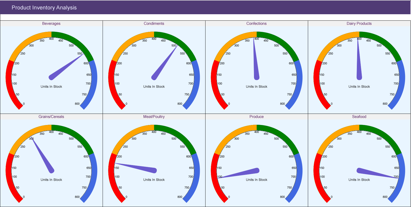
Create Gauge Chart
This walkthrough shows creating a Gauge chart. The Gauge chart is placed in a multi-column list to show the units in stock in each category of products. The final chart appears like this:
Create a Report and Bind Report to Data
In the ActiveReports Designer, create a new RDLX report and follow the New Report wizard to bind the report to data. You can also perform data binding later using the Report Data Source dialog accessed from the Report Explorer.
Connect to a Data Source
- In the Report Data Source dialog, select the General page and enter the name of the data source.
- Under Type, select 'Json Provider'.
- Go to the Content tab under Connection and set the type of JSON data to 'External file or URL'.
- In the Select or type the file name or URL field, enter the following URL:
https://demodata.mescius.io/northwind/api/v1/Products
For more information, see the JSON Provider topic. - Go to the Connection String tab and verify the generated connection string by clicking the Validate DataSource

icon. - Click OK to save the changes and open the DataSet dialog.
Add a Dataset
In the Dataset dialog, select the General page and enter the name of the dataset, 'Products'.
Go to the Query page and enter the following query to fetch the required fields:
$.[*]Click OK to save the changes.
Similarly, we will connect to another data source from where we will fetch [categoryName] corresponding to the [categoryId] in 'Products' dataset, in the Chart Header.
The data source URL is https://demodata.mescius.io/northwind/api/v1/Categories and the dataset query is $.[*]. Let's name this dataset, 'Categories'.
Design Report Layout
Drag-drop the List data region.
In the Properties panel, set the following properties:
Property Value DataSetName Products GrowDirection Column RowsOrColumnsCount 4 With List data region selected, click Property dialog.
Go to Detail Grouping page, and in the General tab, provide a Name to the group and in the Group on: Expression, select =[categoryId].
Go to the Sorting tab and add a sorting Expression =[categoryId] and Direction as 'Ascending'.
Create a Chart
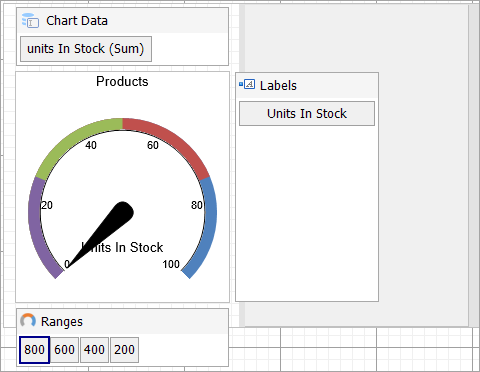
We will use the Chart Wizard dialog to configure chart data values and basic customization. If you have a dataset added to your report, on Chart's drag-drop operation, the wizard appears. See the topic on Chart Wizard for more information. You can make further adjustments to the chart after you exit the wizard by accessing the properties of chart elements through dialogs, property panels, and adorners.
- Drag-drop Chart data region onto the design area. The New Chart dialog appears with an option to select the query and the plot type.
- Select the Query as the dataset name (Products) and the Plot Type as 'Gauge'.
- Click Next to configure data values.
- Under Configure Gauge Pointers, add Field as [unitsInStock], Aggregate as 'Sum', and click Next.
- In the Specify Range Boundaries From Max To Min, add any field. We will add Ranges later.
- Click Next and Choose Report Colors from Theme and Style, and preview your chart.
You can also modify the chart palette and do other customizations as the last step in the process of chart creation. Or, you can exit the wizard and access these smart panels as explained below.
Add Customizations to Chart
Now that the chart is configured with data values, let us do some customizations on the chart elements using the smart panels.
Ranges
- Right-click the Ranges area and to define the constant data values to display the ranges on the gauge's dial, add four data values, and set Value and Caption as follows:
- 800
- 600
- 400
- 200
Set Aggregate as 'Max' for all the above fields.
type=note
Note: The first field should be the one with greater value.
Chart Palette
- To open the smart panel for advanced chart settings, right-click 'Chart' on the Report Explorer and choose Property Dialog.
- In Palette, select Custom from the drop-down and add the following four colors for each value.
- RoyalBlue
- Green
- Orange
- Red
- Click OK to complete setting up the custom chart palette.
Plot Settings
- To set a needle color, go to Gauge Pointers property.
- In the PointerDesigner Collection Editor, go to BackgroundColor property and set 'SlateBlue'.
Header
We want chart header to display the category name from another dataset, 'Categories'. For this, we will use Lookup expression.
To open the smart panel for the chart header, right-click 'Header' on the Report Explorer and choose Property Dialog.
Go to the General page and set Title to the following expression:
=Lookup(Fields!categoryId.Value,Fields!categoryId.Value,Fields!categoryName.Value,"Categories")Go to the Font page and set the properties as below.
- Size: 11pt
- Color: #551e5f
Click OK to complete setting up the chart header.
You may want to resize the chart and customize other chart elements. Once you are done, press F5 to preview the report.type=note
Note: We use stub data at design time and not real data. So to view the actual final chart, you need to view the chart on the preview.