
- Introduction
- Report Readers
-
Report Authors
- Standalone Designer
- WebDesigner
- Report Types
-
Report Controls
-
Report Controls in Page/RDLX Report
- BandedList
- Barcode
- Bullet
-
Chart
- Chart Wizard
- Chart Smart Panels and Adorners
-
Plots
- Column and Bar Charts
- Area Chart
- Line Chart
- Pie and Doughnut Charts
- Scatter and Bubble Charts
- Radar Scatter and Radar Bubble Charts
- Radar Line Chart
- Radar Area Chart
- Spiral Chart
- Polar Chart
- Gantt Chart
- Funnel and Pyramid Charts
- Candlestick Chart
- High Low Close Chart
- High Low Open Close Chart
- Range Charts
- Gauge Chart
- Axes
- Legends
- Customize Chart Appearance
- Trendlines
- Classic Chart
- CheckBox
- Container
- ContentPlaceHolder (RDLX Master Report)
- FormattedText
- Image
- InputField
- Line
- List
- Map
- Matrix
- Overflow Placeholder (Page report only)
- Shape
- Sparkline
- Subreport
- Table
- Table of Contents
- Tablix
- TextBox
- Report Controls in Section Report
-
Report Controls in Page/RDLX Report
- Report Wizard
- Data Binding
- Design Reports
- DevOps
- Developers
- Samples
- Troubleshooting
Create Range Bar Chart
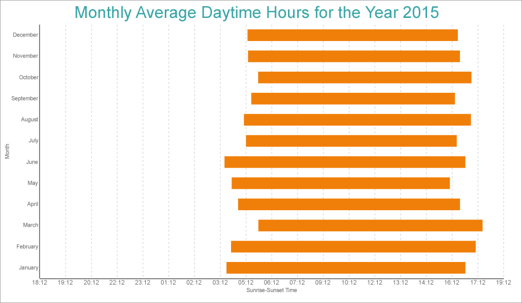
This walkthrough shows creating a Range Bar chart. The final chart appears like this:
Create a Report and Bind Report to Data
In the ActiveReports Designer, create a new RDLX report and follow the New Report wizard to bind the report to data. You can also perform data binding later using the Report Data Source dialog accessed from the Report Explorer.
Connect to a Data Source
In the Report Data Source dialog, select the General page and enter the name of the data source.
Under Type, select 'Csv Provider'.
For more information, see the CSV topic.Go to the Connection String tab and click Build
In the Path field, navigate to the CSV file with content: weatherdata.csv
Click Get from preview and edit the Data Type column for the following fields as shown.
Name Data Type DATE DateTime CITY String AVG MIN TEMP Float AVG MAX TEMP Float RAINFALL Min Float RAINFALL Max Float SUNRISE DateTime SUNSET DateTime Click OK to view the generated connection string, which will be similar to the following:
Path=C:\\Data\\weatherdata.csv;Locale=en-US;TextQualifier=";ColumnsSeparator=,;RowsSeparator=\r\n;Columns=DATE(DateTime),CITY,AVG MIN TEMP,AVG MAX TEMP,RAINFALL Min,RAINFALL Max,SUNRISE,SUNSET;HasHeaders=TrueClick OK to complete connecting to data.
Create Basic Structure of Chart
We will use the Chart Wizard dialog to configure chart data values and basic customization. If you have a dataset added to your report, on Chart's drag-drop operation, the wizard appears. See the topic on Chart Wizard for more information. You can make further adjustments to the chart after you exit the wizard by accessing the properties of chart elements through dialogs, property panels, and adorners.
Drag-drop Chart data region onto the design area. The New Chart dialog appears with an option to select the query and the plot type.
Select the Query as the dataset name (weatherdata) and the Plot Type as 'Range Bar'.
Click Next to configure data values.
Under Configure Chart Data Values, set the start and end fields. and click Next.
Start Field End Field Caption =Fields!SUNRISE.Value =Fields!SUNSET.Value Start, End In the Configure Chart Data Groupings, set the Categories > Group By to [Date] and Sorting to 'Ascending'
Click Next and Choose Report Colors from Theme and Style, and preview your chart.
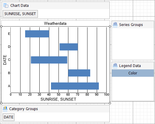
Add Customizations to Chart
Now that the chart is configured with data values, let us do some customizations on the chart elements using the smart panels. range-bar-design.png
Add Filter to Chart
Right-click the 'weatherdata' dataset and select Edit.
Go to Filters page and add following two filters:
S.no. Expression Operator Value 1. =Fields!CITY.Value Equal MelbourneAirport 2. =Year(Fields!DATE.Value) Equal 2015 Now that the filters are added in the dataset, click OK.
Chart Data
- From Category Groups area, right-click [DATE].
- In the General page, edit the expression to =MonthName(Month([DATE])).
- Go to the Categories page and in the Sorting > Sorting field, select =Fields!DATE.Value field and set the Sort direction to 'Ascending'.
- Click OK to complete setting up the plot.
Y-Axis
- To open the smart panel, right-click 'Y Axis' on the Report Explorer and choose Property Dialog.
- Go to the Title page. Enter the text in the Title field as 'Sunrise-Sunset Time' and set Color to 'DimGray'.
- Go to the Labels page > General tab and set Format to 'HH:MM'.
- Go to the Labels page > Appearance tab and set the following properties.
- Font > Size: 9pt
- Font > Color: DimGray
- Go to the Major Gridline page and set the following properties.
- Show grid: Check-on
- Grid appearance > Color: #cccccc
- Grid appearance > Width: 0.25pt
- Grid appearance > Style: Dashed
- Click OK to complete setting up the Y-axis.
X-Axis
- To open the smart panel, right-click 'X Axis' on the Report Explorer and choose Property Dialog.
- Go to the Title page and edit the text in the Title field to 'Month' and set Color to 'DimGray'.
- Go to the Labels page > Appearance tab and set Font > Color to DimGray.
Chart Palette
- To open the smart panel, right-click 'Chart' on the Report Explorer and choose Property Dialog.
- Go to the Palette page and select 'Aspect'
- Click OK to complete setting up the chart palette.
Header
To open the smart panel for the chart header, right-click 'Header' on the Report Explorer and choose Property Dialog.
Go to the General page and set the Title to the following expression:
="Monthly Average Daytime Hours for the Year " & Parameters!YearParameter.ValueGo to the Font page and set the properties as below.
- Size: 24pt
- Color: #3da7a8
Click OK to complete setting up the chart header.
You may want to resize the chart and customize other chart elements. Once you are done, press F5 to preview the report.type=note
Note: We use stub data at design time and not real data. So to view the actual final chart, you need to view the chart on the preview.