Shape
The Shape report control is used to display one of the available shape types on a report. You can add a shape report control to a report by dragging it from the toolbox and dropping it onto the report design surface.
In the Style property of the Shape report control, you can select Rectangle, RoundRect or Ellipse, or you can use an expression to assign fields, datasets, parameters, constants, operations or common values to it.
You can highlight different sections or parts of a report using a shape report control. For example, you can use a Rectangle as border around different report controls or the entire page or you can use an Ellipse to highlight a note on your report.
Important Properties
Clicking the Shape control reveals its properties in the Properties panel.
| Property | Description |
|---|---|
| LineColor | Gets or sets the color of the shape lines. |
| LineStyle | Gets or sets the pen style used to draw the line. |
| LineWeight | Gets or sets the pen width used to draw the shape. |
| Style | Gets or sets the shape type to draw. You can select from Rectangle, Ellipse and a RoundedRect. |
| RoundingRadius | Sets the radius of each corner for the RoundRect shape type. You can select Default, TopLeft, TopRight, BottomLeft or BottomRight. Selecting Default sets the radius of all the corners of the Shape control to a specified percentage. Default value = 10 (percent). |
Shape Dialog Properties
You can set the Shape properties in the Shape dialog. To open it, with the Shape selected on the report, under the Properties panel, click the Property dialog link.
General
Name: Enter a name for the shape that is unique within the report. This name is displayed in the Document Outline and in XML exports. You can only use underscore (_) as a special character in the Name field. Other special characters such as period (.), space ( ), forward slash (/), backslash (\), exclamation (!), and hyphen (-) are not supported.
Tag: Enter a string that you want to persist with the control. If you access this property in code, it is an object, but in the Properties panel or Property dialog, it is a string.
Visible: Clear this check box to hide the control.
Appearance
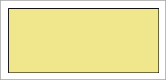
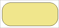
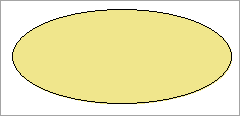
Shape type: Select the type of shape to display. You can choose from Rectangle, Ellipse, or RoundRect. For a circle, set the control width and height properties to the same value, and choose Ellipse, or choose RoundRect and set the Rounding radius to 100%.
| Rectangle | RoundRect | Ellipse |
|---|---|---|
 |
 |
 |
Rounded Rectangle: When the Shape type is set to RoundRect, you can specify the radius for each corner of the shape independently. Drag the handlers  available at each corner of the shape to set the value of the radius at each corner.
type=note
Note: To enable specific corners, select the checkbox available near each corner of the Shape control.
Use the same radius on specified corners: Select this option to apply the same radius to all selected corners of the shape.
Use different radius on specified corners: Select this option to apply a different radius to each selected corner of the shape.
Line style: Select a line style to use for the shape line. You can set it to Transparent, Solid, Dash, Dot, DashDot, DashDotDot, or Double.
Line weight: Enter the width for the shape line.
Line color: Select a color to use for the shape line.
Background style: Select a background style for the shape from Solid, Gradient, and Pattern. Depending on the style selected, other properties are available.
Background color: Select a color to use for the background of the shape.
Background color2: Select a color2 to use for the background of the shape. This property becomes available if the Background style is set to Gradient or Pattern.
Gradient style: Select a gradient style. This property becomes available if the Background style is set to Gradient.
Background pattern: Select a background pattern to hatch style. This property becomes available if the Background style is set to Pattern.


