
Bar Chart
The Bar Chart is a chart with rectangular bars where the lengths of bars are proportional to the values they represent. The bars can be plotted vertically or horizontally.
2D Bar Charts
Given below is the list of 2D charts that falls under the Bar Chart category (Chart Type ).
Bar Chart
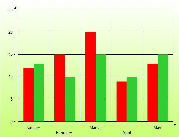
In a Bar Chart, values are represented by the height of the bar shaped marker as measured by the y-axis. Category labels are displayed on the x-axis. Use a bar chart to compare values of items across categories.
Gantt Chart
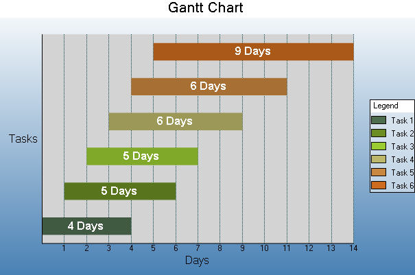
The Gantt chart is a project management tool used to chart the progress of individual project tasks. The chart compares project task completion to the task schedule.
type=warning
Caution: In a Gantt chart, the X and Y axes are reversed. AxisX is vertical and AxisY is horizontal.
Horizontal Bar Chart
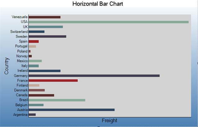
In a Horizontal Bar Chart, both the axes are swapped and therefore the bars appears horizontally. Although, values are represented by the height of the bar shaped marker as measured by the y-axis and the Category labels are displayed on the x-axis. Use a horizontal bar chart to compare values of items across categories.
Stacked Bar Chart
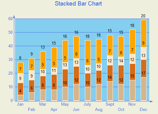
A stacked bar chart is a bar chart with two or more data series stacked one on top of the other. Use this chart to show how each value contributes to a total.
Stacked Bar Chart 100%
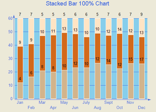
A StackedBAR110Pct chart is a bar chart with two or more data series stacked one on top of the other to sum up to 100%. Use this chart to show how each value contributes to a total with the relative size of each series representing its contribution to the total.
3D Bar Charts
Given below is the list of 3D charts that fall under the Bar Chart category.
type=note
Note: To view a chart in 3D, open the ChartArea Collection Editor in the ChartAreas property and set the ProjectionType property to Orthogonal.
Simple Bar Chart
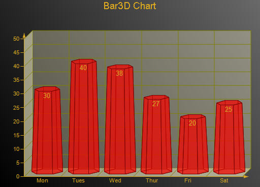
In a Bar Chart, values are represented by the height of the bar shaped marker as measured by the y-axis. Category labels are displayed on the x-axis. Use a 3D bar chart to compare values of items across categories, allowing the data to be viewed in a convenient 3D format.
Gantt Chart
The 3D gantt chart displays a gantt.
type=note
Note: In a 3D Gantt chart the X and Y axes are reversed. AxisX is vertical and AxisY is horizontal.
Horizontal Bar Chart
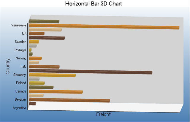
In a Horizontal Bar Chart, both the axes are swapped and therefore the bars appears horizontally. Although, values are represented by the height of the bar shaped marker as measured by the y-axis and the Category labels are displayed on the x-axis. Use a horizontal 3D bar chart to compare values of items across categories, allowing the data to be viewed in a convenient 3D format.
Stacked Bar Chart
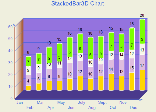
Use a 3D bar graph to compare values of items across categories, allowing the data to be viewed conveniently in a 3D format. A stacked bar graph is a bar graph with two or more data series stacked on top of each other. Use this graph to show how each value contributes to a total.
Stacked Bar Chart 100%
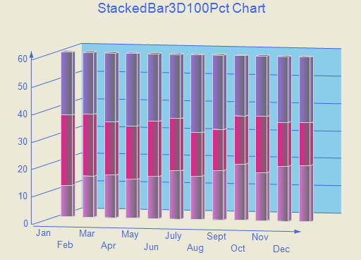
A Stacked Bar 3D 100% chart is a bar chart with two or more data series in 3D stacked one on top of the other to sum up to 100%. Use this chart to show how each value contributes to a total with the relative size of each series representing its contribution to the total.
Bar/Cylinder Chart
It is almost similar to a bar chart and values are represented by the height of the bar shaped marker as measured by the y-axis. Category labels are displayed on the x-axis. The only difference is that in a Bar/Cylinder Chart the data is represented through cylindrical shaped markers.
Bar/Pyramid Chart
In a Bar/Pyramid Chart the data is represented through pyramid shaped bars and values are represented by the height of the bars as measured by the y-axis. Category labels are displayed on the x-axis.
Clustered Bar Chart
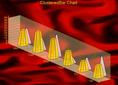
Use a 3D clustered bar chart to compare values of items across categories, allowing the data to be viewed in a convenient 3D format.