
- Introduction
- Report Readers
-
Report Authors
- Standalone Designer
- WebDesigner
- Report Types
-
Report Controls
-
Report Controls in Page/RDLX Report
- BandedList
- Barcode
- Bullet
-
Chart
- Chart Wizard
- Chart Smart Panels and Adorners
-
Plots
- Column and Bar Charts
- Area Chart
- Line Chart
- Pie and Doughnut Charts
- Scatter and Bubble Charts
- Radar Scatter and Radar Bubble Charts
- Radar Line Chart
- Radar Area Chart
- Spiral Chart
- Polar Chart
- Gantt Chart
- Funnel and Pyramid Charts
- Candlestick Chart
- High Low Close Chart
- High Low Open Close Chart
- Range Charts
- Gauge Chart
- Axes
- Legends
- Customize Chart Appearance
- Trendlines
- Classic Chart
- CheckBox
- Container
- ContentPlaceHolder (RDLX Master Report)
- FormattedText
- Image
- InputField
- Line
- List
- Map
- Matrix
- Overflow Placeholder (Page report only)
- Shape
- Sparkline
- Subreport
- Table
- Table of Contents
- Tablix
- TextBox
- Report Controls in Section Report
-
Report Controls in Page/RDLX Report
- Report Wizard
- Data Binding
- Design Reports
- DevOps
- Developers
- Samples
- Troubleshooting
Radar Scatter and Radar Bubble Charts
Radar Scatter and Radar Bubble charts are useful in showing ordered measurements of one or two variables across a category range. Radar Scatter and Radar Bubble plots arrange categories on a circle and link the corresponding points with straight lines. Data values are represented by value points called Symbols. The symbol size in a Radar Bubble plot can represent extra information about the data point. In Radar and Radar Bubble charts, the symbols are laid out along the radial lines. The major difference between the Radar Scatter plot and Radar Bubble plot is that the former visualizes a single variable measurement, while the latter encodes the size of data points.
Simple Radar Scatter Chart
A Simple Radar Scatter chart visualizes measurements of a single variable. For instance, the simple radar bubble plot can be used to display the average monthly temperature and precipitation in Paris, France.
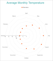
Simple Radar Scatter Chart
Simple Radar Bubble Chart
A radar bubble chart encodes surplus data using data point sizes. For instance, the simple radar bubble plot can be used to display the average monthly temperature and precipitation in Paris, France. See Create Simple Radar Bubble Chart walkthrough to learn how to create this chart.
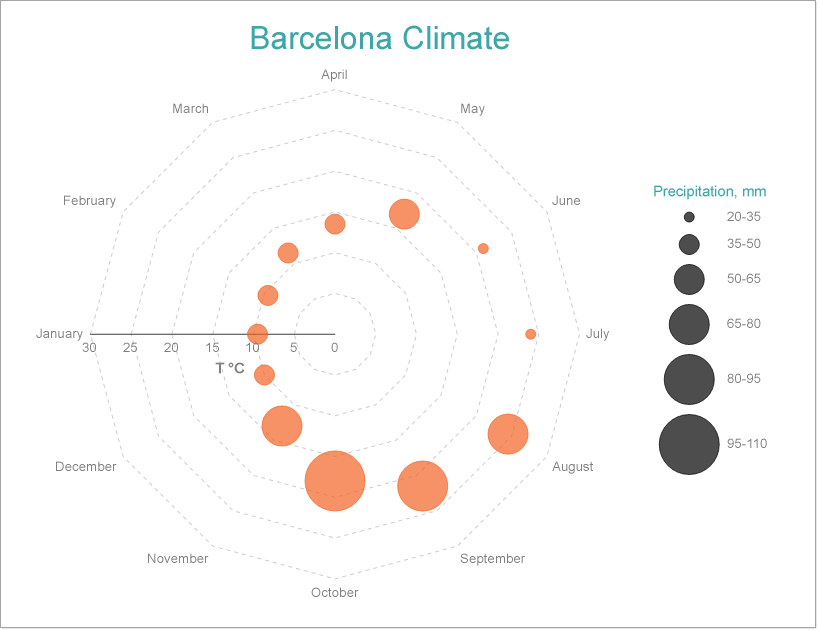
Simple Radar Bubble Chart
Multi-Category Radar Scatter and Bubble Charts
A Multi-Category Radar Scatter and Bubble charts can be used to configure Radar Scatter and Bubble charts to split data values into subcategories and depict them with symbols' colors, shapes, or both. For instance, the Multi-Category Radar Scatter and Bubble charts can be used to depict the average monthly temperature in three European cities that are distinguished by data points' colors. See Create Multi-Category Radar Scatter Chart walkthrough to learn how to create this chart.
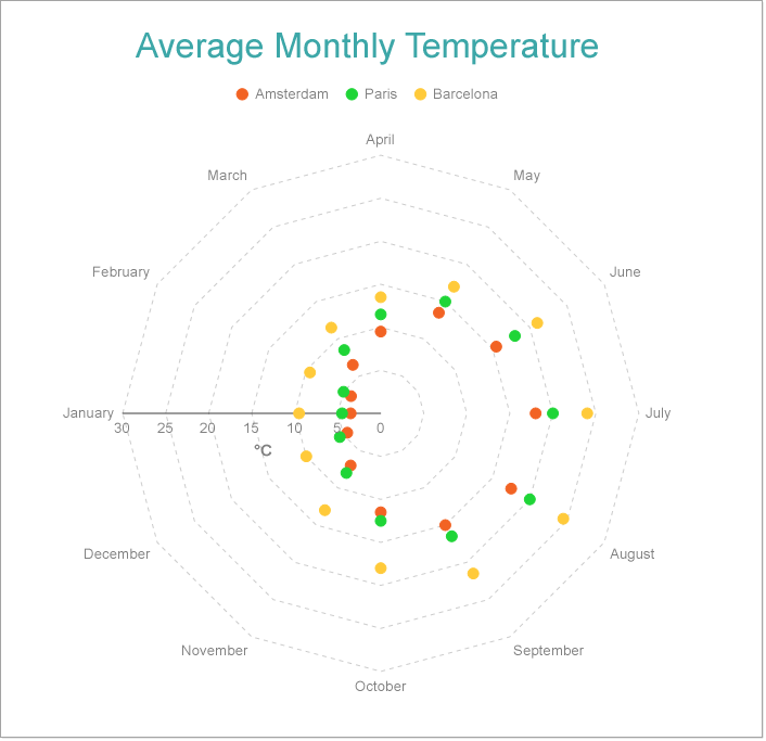
Multi-Category Radar Scatter Chart
Radar Scatter and Bubble Plot Properties
The Radar Scatter Plot properties discussed below can be accessed from the Properties Panel on selecting the Chart > Plot from the Report Explorer. You can access some of the important properties from the Plot's Smart Panel too. See Chart Smart Panels topic for more information. Both the Properties Panel and the Smart Panel can be accessed by right-clicking the plot in the design area.