
CheckBox
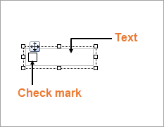
You can use the CheckBox control to represent a Boolean value in a report. By default, the CheckBox control appears as a small box inside an empty textbox. If the Checked value is set to True, the small box appears with a check mark; if False, the box is empty. By default, the checkbox is empty.
type=note
Note: There is a difference in how the text is rendered in the CrossPlatform and in the GDI compatibility modes. Some text in the CrossPlatform mode (for example, text without spacing, text with non-ASCII characters, etc.) may not appear correctly in the report preview. For the correct text rendering, you must manually update the report layout (for example, change the control's size).
Structure
Important Properties
Clicking the CheckBox control reveals its properties in the Properties window.
| Property | Description |
|---|---|
| Checked | Gets or sets a value indicating whether the check box is in the checked state. You can also set the Checked property of the check box in code or bind it to a Boolean database value. |
| Text | Gets or sets the printed caption of the check box. |
| CheckAlignment | Gets or sets the alignment of the check box text within the control drawing area. |
| DataField | Gets or sets the field from the data source to bind to the control. |
You can double-click the CheckBox control to enter edit mode and enter text directly in the control, or you can enter text in the Properties window or you can assign data to display in code through the Text property.
In edit mode, using the toolbar you can format text in the CheckBox control using the toolbar or you modify properties in the Properties window. Formats apply to all of the text in the control. Text formatting changes in the Properties window immediately appear in the control, and changes made in the toolbar are immediately reflected in the Properties window.
CheckBox Dialog Properties
You can set the CheckBox properties in the CheckBox dialog. To open it, with the CheckBox selected on the report, under the Properties window, click the Property dialog link.
General
Name: Enter a name for the checkbox that is unique within the report. This name is displayed in the Document Outline and in XML exports. You can only use underscore (_) as a special character in the Name field. Other special characters such as period (.), space ( ), forward slash (/), backslash (\), exclamation (!), and hyphen (-) are not supported.
Tag: Enter a string that you want to persist with the control. If you access this property in code, it is an object, but in the Properties window or Property dialog, it is a string.
Visible: Clear this check box to hide the control.
DataField: Select a field that returns a Boolean value from the data source to bind to the control. The value of this field determines how to set the Checked property at run time.
Text : Enter an expression or a static label, or choose a field expression from the drop-down list. You can access the expression editor by selecting <Expression...> in the list. The value of this expression or text is displayed in the report to the right of the checkbox.
Check Alignment: Drop down the visual selector to choose the vertical and horizontal position for the check box within the control.
Checked: Select this check box to have the CheckBox control appear with a check mark in the box.
Appearance
Background
Color: Select a color to use for the background of the checkbox.
Font
Name: Select a font family name or a theme font.
Size: Choose the size in points for the font.
Style: Choose Normal or Italic.
Weight: Choose from Normal or Bold.
Color: Choose a color to use for the text.
Decoration: Select check boxes for Underline and Strikeout.
GDI Charset: Enter a value to indicate the GDI character set to use. For a list of valid values, see MSDN Font.GDICharSet Property.
GDI Vertical: Select this checkbox to indicate that the font is derived from a GDI vertical font.
Alignment
Alignment: Alignment of the text inside the checkbox.
Wrap mode: Choose NoWrap, WordWrap, or CharWrap.
Padding: Amount of space (in Int32) to leave around report control.
Top padding: Set the top padding.
Left padding: Set the left padding.
Right padding: Set the right padding.
Bottom padding: Set the bottom padding.
Keyboard Shortcuts
In the edit mode, you can use the following keyboard shortcuts.
| Key Combination | Action |
|---|---|
| Enter | New line. |
| Alt + Enter | Saves modifications and exits edit mode. |
| Esc | Cancels modifications and exits edit mode. |
In Visual Studio Integrated Designer, you can disable this feature in the EditModeEntering Event and EditModeExit Event.