
- Introduction
- Report Readers
-
Report Authors
- Standalone Designer
- WebDesigner
- Report Types
-
Report Controls
-
Report Controls in Page/RDLX Report
- BandedList
- Barcode
- Bullet
-
Chart
- Chart Wizard
- Chart Smart Panels and Adorners
-
Plots
- Column and Bar Charts
- Area Chart
- Line Chart
- Pie and Doughnut Charts
- Scatter and Bubble Charts
- Radar Scatter and Radar Bubble Charts
- Radar Line Chart
- Radar Area Chart
- Spiral Chart
- Polar Chart
- Gantt Chart
- Funnel and Pyramid Charts
- Candlestick Chart
- High Low Close Chart
- High Low Open Close Chart
- Range Charts
- Gauge Chart
- Axes
- Legends
- Customize Chart Appearance
- Trendlines
- Classic Chart
- CheckBox
- Container
- ContentPlaceHolder (RDLX Master Report)
- FormattedText
- Image
- InputField
- Line
- List
- Map
- Matrix
- Overflow Placeholder (Page report only)
- Shape
- Sparkline
- Subreport
- Table
- Table of Contents
- Tablix
- TextBox
- Report Controls in Section Report
-
Report Controls in Page/RDLX Report
- Report Wizard
- Data Binding
- Design Reports
- DevOps
- Developers
- Samples
- Troubleshooting
Column and Bar Charts
The Column and Bar charts present the comparison of data values across categories. The plot settings of these two charts are similar, however, they represent the data differently.
Column Charts
Column Charts plot the data values as vertical columns against the categories that are arranged horizontally. The y-axis values determine the heights of the columns, while the x-axis displays the category labels. The Column charts are vertical versions of bar charts and use the x-axis as a category axis.
Clustered Column Chart
A Clustered Column chart is used to compare different values across different categories. See Create Clustered Column Chart walkthrough to learn how to create this chart.
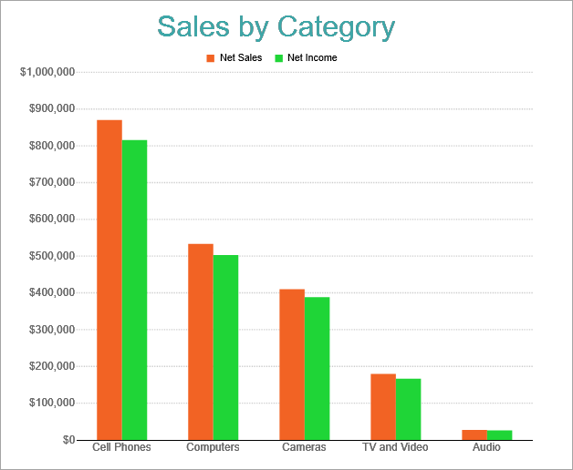
Clustered Column Chart
Stacked Column Chart
A Stacked Column chart is used to display the relationship of specific items to the whole across different categories and plot values. This chart stacks the data series vertically.
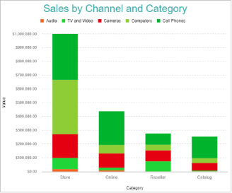
Stacked Column Chart
Stacked Percentage Column Chart
A Percentage Stacked Column chart is used to perform comparisons of percentages that each of the values are contributing to the total, across all your categories. This chart stacks the data series vertically and also equalizes the plotted values to meet 100%.
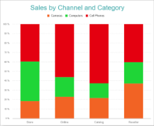
Percentage Stacked Column Chart
Bar Charts
Bar charts compare categorical data through horizontal bars, where the length of each bar represents the value of the corresponding category. In bar charts, categories are organized along the vertical axis and data values along the horizontal axis. For example, sales of various product categories can be presented through a bar chart. The Bar charts are preferred when the number of categories is too large to be used on an x-axis.
Clustered Bar Chart
A Clustered Bar chart can be used to display the comparisons of values across different categories. The Create Clustered Bar Chart walkthrough showcases plotting the chart comparing the Sales for different Product Categories and Sales Channel.
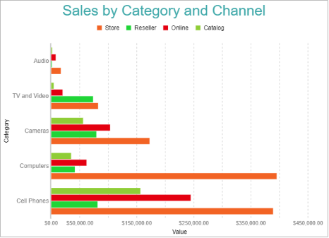
Clustered Bar Chart
Stacked Bar Chart
A Stacked Bar chart is used to display the relationship of each category to the whole.
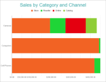
Stacked Bar Chart
Stacked Percentage Bar Chart
A Percentage Stacked Bar chart is used to display the comparisons of the percentage that each value contributes to the total across different categories.
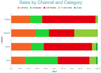
Percentage Stacked Bar Chart