
- Introduction
- Report Readers
-
Report Authors
- Standalone Designer
- WebDesigner
- Report Types
-
Report Controls
-
Report Controls in Page/RDLX Report
- BandedList
- Barcode
- Bullet
-
Chart
- Chart Wizard
- Chart Smart Panels and Adorners
-
Plots
- Column and Bar Charts
- Area Chart
- Line Chart
- Pie and Doughnut Charts
- Scatter and Bubble Charts
- Radar Scatter and Radar Bubble Charts
- Radar Line Chart
- Radar Area Chart
- Spiral Chart
- Polar Chart
- Gantt Chart
- Funnel and Pyramid Charts
- Candlestick Chart
- High Low Close Chart
- High Low Open Close Chart
- Range Charts
- Gauge Chart
- Axes
- Legends
- Customize Chart Appearance
- Trendlines
- Classic Chart
- CheckBox
- Container
- ContentPlaceHolder (RDLX Master Report)
- FormattedText
- Image
- InputField
- Line
- List
- Map
- Matrix
- Overflow Placeholder (Page report only)
- Shape
- Sparkline
- Subreport
- Table
- Table of Contents
- Tablix
- TextBox
- Report Controls in Section Report
-
Report Controls in Page/RDLX Report
- Report Wizard
- Data Binding
- Design Reports
- DevOps
- Developers
- Samples
- Troubleshooting
Line Chart
The Line Charts represent the data points connected using straight lines. A line chart arranges a period horizontally, encodes data points into Symbols, and connects them by line segments. As the most basic chart type, Line Chart is highly beneficial in visualizing data trends as they compare values against periodic intervals such as temperature, time, etc. Some of the good examples that can be conveniently demonstrated through a line chart are the monthly average sale of a product and the closing prices of a stock in a given time frame.
Single Line Chart
A Single Line chart helps you visualize the changes of a single data value. The Create Single Line Chart walkthrough showcases plotting the changes in Product Returns over a year.
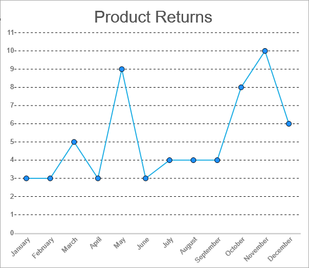
Single Line Chart
Multiple Line Chart
A Multiple Line chart lets you split the data values into subcategories for granular analysis of the total changes. The Create Multiple Line Chart walkthrough showcases plotting the change in the Net Sales of products over a year for two Sales Channels.
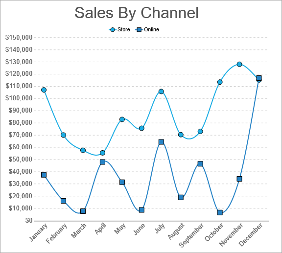
Multiple Line Chart
Multiple Values Line Chart
A Multiple Values Line chart lets you display changes of related or unrelated data values over the same period. For example, the Multiple Values Line Chart can be used to show the change of the Net Sales, the Cost of Goods Sold, and the Net Income for a product in a year as shown.
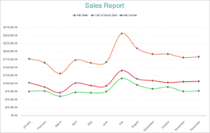
Multiple Values Line Chart