
- Introduction
- Report Readers
-
Report Authors
- Standalone Designer
- WebDesigner
- Report Types
-
Report Controls
-
Report Controls in Page/RDLX Report
- BandedList
- Barcode
- Bullet
-
Chart
- Chart Wizard
- Chart Smart Panels and Adorners
-
Plots
- Column and Bar Charts
- Area Chart
- Line Chart
- Pie and Doughnut Charts
- Scatter and Bubble Charts
- Radar Scatter and Radar Bubble Charts
- Radar Line Chart
- Radar Area Chart
- Spiral Chart
- Polar Chart
- Gantt Chart
- Funnel and Pyramid Charts
- Candlestick Chart
- High Low Close Chart
- High Low Open Close Chart
- Range Charts
- Gauge Chart
- Axes
- Legends
- Customize Chart Appearance
- Trendlines
- Classic Chart
- CheckBox
- Container
- ContentPlaceHolder (RDLX Master Report)
- FormattedText
- Image
- InputField
- Line
- List
- Map
- Matrix
- Overflow Placeholder (Page report only)
- Shape
- Sparkline
- Subreport
- Table
- Table of Contents
- Tablix
- TextBox
- Report Controls in Section Report
-
Report Controls in Page/RDLX Report
- Report Wizard
- Data Binding
- Design Reports
- DevOps
- Developers
- Samples
- Troubleshooting
Range Charts
Range Charts display a pair of values (low and high) for each data point to visualize a range of values rather than a single value. These charts emphasize the distance (range) between the two values.
Range Bar
Range Bar Chart is a variation of regular Bar Chart. While the Range Bar Chart visualizes two values along the horizontal axis at a time — a low value and a high value, in Bar chart, the values are plotted on the horizontal axis one by one. The Create Range Bar Chart walkthrough showcases plotting the average daytime hours across one year.
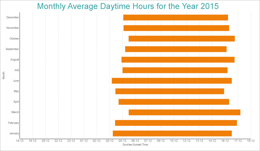
Range Bar Chart
Range Column
Range Column Chart is a variation of regular Column Chart. While the Range Column Chart visualizes two values on the vertical axis at a time — a low value and a high value, in Column chart, the values are plotted on the vertical axis one by one.
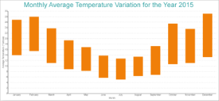
Range Column Chart
Range Area
Range Area chart is a variation of regular Area Chart. While the filled area in Range Area chart is between its lowest and highest values, in Area chart, the filled area is between the line segments plotted by data values and the horizontal axis.
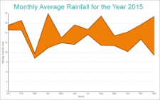
Range Area Chart
The Range Area Chart fills in the area between the top and the bottom value for each data point.