Style and Appearance
TreeView offers different ways of styling the UI of TreeView control. It allows you to use different styling properties available in the C1TreeView class which allows you to easily style all visual aspects of the control and use the CSS classes to style the control. Let us learn how we can style the TreeView control using different ways in the following sections.
Using Styling Properties and CSS
The following table lists all the styling properties available in the C1TreeView class:
| Properties | Description |
|---|---|
| ItemStyle | Changes the style for a node or item |
| SelectedItemStyle | Changes the style for the selected node or item |
| ExpandedIconStyle | Changes the style applied to the expanded/collapsed node or item |
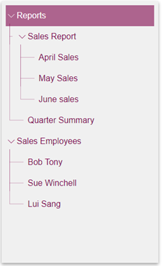
The following image showcases the TreeView control styled using the SelectedItemStyle property and various CSS classes.

The following code demonstrates how you can style the TreeView control using the SelectedItemStyle property and change the style of selected item and color of each node using the CSS classes.
@using System.Collections.ObjectModel
@using C1.Blazor.Core
@using C1.Blazor.TreeView
<style>
    .c1-treeview {
        box-shadow: 0 3px 6px rgba(0,0,0,0.16), 0 3px 6px rgba(0,0,0,0.23);
    }
    .vertical-line, .horizontal-line {
        border-color: rgba(128, 4, 77, 0.3) !important;
    }
</style>
<C1TreeView Class="c1-treeview p-2" ShowLines="true" ItemsSource="@_dataSource"
            ChildItemsPaths="Subdirectories" DisplayMemberPaths="Name"
            Style="@_c1Style" KeyboardNavigation="true"
            SelectionMode="C1SelectionMode.Extended"
            ExpandMode="TreeViewExpandMode.Multiple"
            SelectedItemStyle="@_selectedItemStyle" />
@code{
    readonly C1Style _c1Style = new C1Style
    {
        Height = 500,
        Width = 300,
        Color = C1Color.FromARGB(255, 128, 4, 77),
        BackgroundColor = C1Color.FromARGB(250, 240, 240, 240)
    };
    readonly C1Style _selectedItemStyle = new C1Style
    {
        Color = C1Color.White,
        BackgroundColor = C1Color.FromARGB(150, 128, 7, 77)
    };
    readonly ObservableCollection<CompanyRecord> _dataSource = new ObservableCollection<CompanyRecord>()
{
        new CompanyRecord()
        {
            Name = "Reports",
            Subdirectories = new ObservableCollection<CompanyRecord>
{
                new CompanyRecord
                {
                    Name = "Sales Report",
                    Subdirectories = new ObservableCollection<CompanyRecord>
        {
                        new CompanyRecord {Name = "April Sales"},
                        new CompanyRecord {Name = "May Sales"},
                        new CompanyRecord {Name = "June sales"}
                    }
                },
                new CompanyRecord
        {
            Name = "Quarter Summary",
        }
            }
        },
        new CompanyRecord
        {
            Name = "Sales Employees",
            Subdirectories = new ObservableCollection<CompanyRecord>
         {
                        new CompanyRecord {Name = "Bob Tony"},
                        new CompanyRecord {Name = "Sue Winchell"},
                        new CompanyRecord {Name = "Lui Sang"}
                    }
        }
    };
    public class CompanyRecord
    {
        public string Name { get; set; }
        public ObservableCollection<CompanyRecord> Subdirectories { get; set; }
    }
}
Node Borders
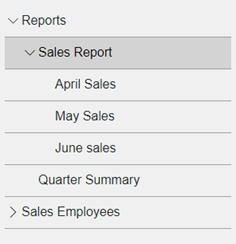
You can also add a bottom border to the tree nodes in the TreeView using CSS. The following image shows how the TreeView appears with borders at the bottom of each node.

The following code demonstrates how to add bottom borders to the tree nodes.
@using System.Collections.ObjectModel
@using C1.Blazor.Core
@using C1.Blazor.TreeView
<style>
    .c1-tree-view-item {
        border-bottom: 1px solid #a0a0a0;
    }
</style>
<C1TreeView Class="p-2" ShowLines="false" IsExpandedPath="Expanded"
            ItemsSource="@_dataSource" ChildItemsPaths="Subdirectories"
            DisplayMemberPaths="Name" SelectionMode="C1SelectionMode.Extended"
            KeyboardNavigation="true" Style="@_c1Style"
            ExpandMode="TreeViewExpandMode.Single" />
@code{
    readonly C1Style _c1Style = new C1Style
    {
        Height = 500,
        Width = 300,
        BackgroundColor = C1Color.FromARGB(250, 240, 240, 240)
    };
    readonly ObservableCollection<CompanyRecord> _dataSource = new ObservableCollection<CompanyRecord>()
{
        new CompanyRecord()
        {
            Name = "Reports",
            Subdirectories = new ObservableCollection<CompanyRecord>
    {
                new CompanyRecord
                {
                    Name = "Sales Report",
                    Subdirectories = new ObservableCollection<CompanyRecord>
            {
                        new CompanyRecord {Name = "April Sales"},
                        new CompanyRecord {Name = "May Sales"},
                        new CompanyRecord {Name = "June sales"}
                    }
                },
                new CompanyRecord
        {
            Name = "Quarter Summary",
        }
            }
        },
        new CompanyRecord
        {
            Name = "Sales Employees",
            Subdirectories = new ObservableCollection<CompanyRecord>
             {
                        new CompanyRecord {Name = "Bob Tony"},
                        new CompanyRecord {Name = "Sue Winchell"},
                        new CompanyRecord {Name = "Lui Sang"}
                    }
        }
    };
    public class CompanyRecord
    {
        public string Name { get; set; }
        public ObservableCollection<CompanyRecord> Subdirectories { get; set; }
    }
}
Accordion Trees
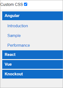
Accordions are multi-pane panels that keep only one panel expanded at a time. They are commonly used for navigation. You can use the TreeView control to implement accordions. This example creates an Accordion using TreeView and CSS by customizing the header display.
The following image shows an accordion created using the TreeView control.

The following code demonstrates how to create accordion using the TreeView control and CSS classes.
@using C1.Blazor.Core
@using C1.Blazor.TreeView
@using C1.Blazor.Input
<style>
    .msg {
        color: orange;
        margin-bottom: 15px;
    }
    .custom-css .header-item {
        font-weight: bold;
        padding: 6px 10px;
        color: white;
        background: #106cc8;
        margin-bottom: 4px;
    }
    .custom-css .c1-tree-view-item {
        background: none !important;
        grid-template-columns: 0 auto !important;
    }
        .custom-css .c1-tree-view-item > div:first-child {
            width: 0 !important;
        }
</style>
<div class="pb-2">Custom CSS <C1CheckBox @bind-IsChecked="@isCustomCss" /></div>
<C1TreeView Class="@("p-2" + (isCustomCss != null && isCustomCss.Value ? " custom-css" : ""))"
            ShowLines="false" IsExpandedPath="Expanded" ItemsSource="@_dataSource"
            ChildItemsPaths="Subdirectories" DisplayMemberPaths="Name"
            Style="@_c1Style" KeyboardNavigation="true" SelectionMode="C1SelectionMode.Single"
            ExpandOnClick="true" ExpandMode="TreeViewExpandMode.Single">
    <ItemTemplate>
        @if (context is TreeViewItem { DataItem: Directory dir } item)
        {
            if (dir.IsHeader)
            {
                <div class="header-item">
                    @dir.Name
                </div>
            }
            else
            {
                <a href="" @onclick="@(() => Navigation(dir.Url))" @onclick:preventDefault>
                    @dir.Name
                </a>
            }
        }
    </ItemTemplate>
</C1TreeView>
@code{
    string navigation = "Ready";
    bool? isCustomCss = true;
    readonly C1Style _c1Style = new C1Style
    {
        Height = 400,
        Width = 600,
        BackgroundColor = C1Color.FromARGB(250, 240, 240, 240)
    };
    readonly IList<Directory> _dataSource = new List<Directory>()
{
        new Directory()
        {
            Name = "Angular",
            Expanded = true,
            IsHeader = true,
            Subdirectories = new List<Directory>
    {
                new Directory {Name = "Introduction", Url = "ng/intro"},
                new Directory {Name = "Sample", Url = "ng/sample"},
                new Directory {Name = "Performance", Url = "ng/perf"}
            }
        },
        new Directory
        {
            Name = "React",
            IsHeader = true,
            Subdirectories = new List<Directory>
    {
                new Directory {Name = "Introduction", Url = "rc/intro"},
                new Directory {Name = "Sample", Url = "rc/sample"},
                new Directory {Name = "Performance", Url = "rc/perf"}
            }
        },
        new Directory
        {
            Name = "Vue",
            IsHeader = true,
            Subdirectories = new List<Directory>
    {
                new Directory {Name = "Introduction", Url = "vue/intro"},
                new Directory {Name = "Sample", Url = "vue/sample"},
                new Directory {Name = "Performance", Url = "vue/perf"}
            }
        },
        new Directory
        {
            Name = "Knockout",
            IsHeader = true,
            Subdirectories = new List<Directory>
    {
                new Directory {Name = "Introduction", Url = "ko/intro"},
                new Directory {Name = "Sample", Url = "ko/sample"},
                new Directory {Name = "Performance", Url = "ko/perf"}
            }
        }
    };
    public class Directory
    {
        public string Name { get; set; }
        public List<Directory> Subdirectories { get; set; }
        public bool Expanded { get; set; }
        public bool IsHeader { get; set; }
        public string Url { get; set; }
    }
    public void Navigation(string url)
    {
        navigation = string.Format("Navigate to <b>**https://www.yoururl.com/{0}**</b>", url);
    }
}


