- Blazor Overview
- Get Started with Blazor
- Free and Open Source Software (FOSS) License
- Section 508 Compliance
- Blazor Project Types
- Adding NuGet Packages to your App
- Controls
- Release History
Masked Text Box
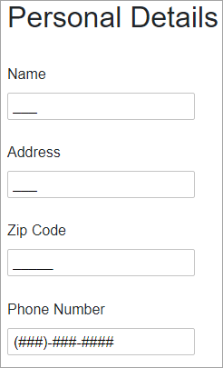
Validate input in your applications using MaskedTextBox for Blazor, an advanced data entry control. MaskedTextBox provides a text box with a mask that automatically validates entered input and prevents users from entering invalid characters. When you add the MaskedTextBox control to your application, it exists as a completely functional text box which includes a basic text input area and can be further customized with a mask.

Make the most of MaskedTextBox by taking advantage of the following key features:
- Validate Data and Enhance Your UI
MaskedTextBox provides input validation and format how the text is displayed with mask validation that automatically validates the input. It prevents end-users from entering invalid characters into the control. See Masks topic for details. - Include Prompts and Literals
Choose whether or not to show prompt characters and literals by simply setting one property. For detailed information and implementation of the prompts and literals, see Prompts and Literals topic for details. - Placeholder Support
MaskedTextBox allows you to add placeholder to provide contextual clues to let end-users know what type of information is expected. The placeholder is displayed in the control while no text has been entered. See Placeholder topic for details.


