Elements
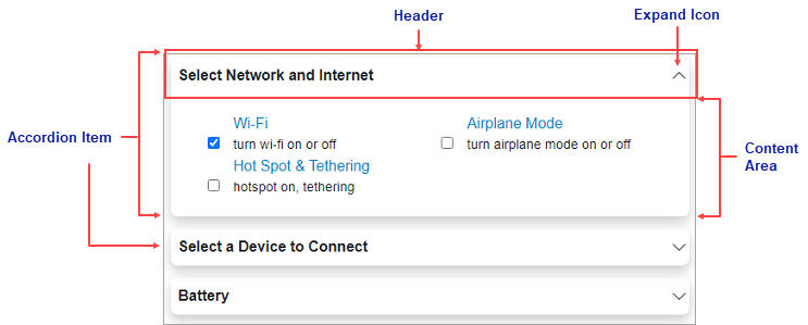
The Accordion control consists of elements like Accordion item, header, expand icon and content area as shown in the following image.

The elements of Accordion can be described as follows:
- AccordionItem - The item of Accordion that forms the body of the control.
- Header: The Accordion item has a Header element that appears at the top of the control.
- Expand/Collapse Icon: The expand icon appears by default on the right side of the header to enable expanding or collapsing the items within the Accordion control.
- Content Area: An accordion item's content area initially consists of an empty space. In the content area, you can add grids, text, images, and arbitrary controls.


