Radial Gauge Features
The Radial Gauge control uses a rotating indicator or pointer to display the value along a radial scale. Just like Linear Gauge, the value is represented in a Radial Gauge using the Value property and the range is defined by the Min and Max properties. The Min property sets the minimum value of the gauge, while the Max property sets the maximum value of the gauge. In addition, the current, maximum and minimum values can be displayed as text in gauges using the TextVisibility property and the interval of the values can be set using the Step property. For more information about the Value, Step, TextVisibility, Min and Max properties, see Linear Gauge Features topic.
The following code demonstrates how to set the Value, Step, TextVisibility, Min and Max properties for the Radial Gauge control.
<C1RadialGauge Value="50" TextVisibility="GaugeTextVisibility.All" Step="20" Min="10" Max="90"></C1RadialGauge>
AutoScale Gauge
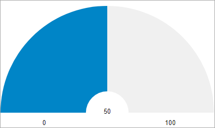
The Radial Gauge control also provides the AutoScale property in the C1RadialGauge class, which when set to true, automatically scales the Radial Gauge to fill its containing element as shown in the following image.

The following code shows how to set the AutoScale property:
<C1RadialGauge Value="50" AutoScale="true" TextVisibility="GaugeTextVisibility.All"></C1RadialGauge>
Reverse Gauge
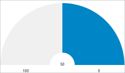
The RadialGauge control has a default clockwise direction, in which the value changes across the radial frame over the time. However, you can reorient the radial gauge so that it is drawn reversed (counter-clockwise) using the IsReversed property.
The following image showcases reversed Radial Gauge control.

The following code shows how to set a reversed Radial Gauge:
<C1RadialGauge Value="50" IsReversed="true" TextVisibility="GaugeTextVisibility.All"></C1RadialGauge>
Start and Sweep Angle
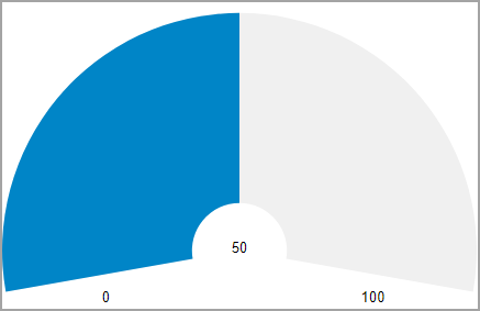
The radial frame or scale of the Radial Gauge control can be rotated using the StartAngle and SweepAngle properties. The StartAngle property sets the starting angle for the gauge, in degrees, and the SweepAngle specifies the rotation added to the StartAngle, in degrees, when the Value property is set to the Maximum value in the range.
The following image shows a Radial Gauge with a start angle of '-10 degrees' and sweep angle of '200 degrees'.

The following code shows how to set StartAngle and SweepAngle:
<C1RadialGauge Value="50" StartAngle="-10" SweepAngle="200" TextVisibility="GaugeTextVisibility.All"></C1RadialGauge>


