
- Blazor Overview
- Get Started with Blazor
- Free and Open Source Software (FOSS) License
- Section 508 Compliance
- Blazor Project Types
- Adding NuGet Packages to your App
- Controls
- Release History
Styling and Appearance
DateTimePicker provides various options to customize the appearance of the DateTimePicker control and all its elements individually, so that you can style and display the DateTimePicker control as per your requirement. The C1DateTimePicker class provides several properties such as HeaderStyle, CalendarStyle, TodayStyle, SelectedDateStyle, DropDownBehavior etc., which offers different ways of styling and customizing the appearance of the DateTimePicker control along with all its elements such as drop-down button, header, calendar, etc.
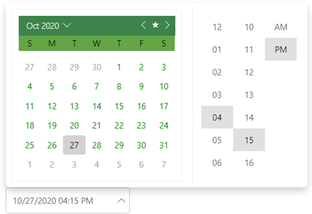
The following code demonstrates the use of the available styling and appearance customization properties in the C1DateTimePicker class to change the appearance of the DateTimePicker control:
<C1DateTimePicker Value="@DateTime.Today"
                  CalendarStyle="@(new C1Style(){ BackgroundColor = C1Color.White, ["border"]="1px solid #eeeeee", Width = 300, Margin = 11})"
                  HeaderStyle="@(new C1Style(){Color = "White", BackgroundColor ="#FF3D834B", FontWeight = "100!important"})"
                  DayOfWeekStyle="@(new C1Style(){BackgroundColor = "#FF63A646", Height = 27, LineHeight = 27, Color = C1Color.Black})"
                  DayStyle="@(new C1Style(){ Color = C1Color.Green})"
                  SelectedDateStyle="@(new C1Style(){BackgroundColor = "#FFD2D2D2", Color = "Black",})"
                  TodayStyle="@(new C1Style(){BackgroundColor = "#eeeeee", BorderColor = "#FFF2F2F2", BorderRadius = 0, Color = "Black",})"
                  AdjacentDayStyle="@(new C1Style() {Color = "#FFA5A5A3"})"
                  DropDownBehavior="@DropDownBehavior.HeaderTap" ViewMode="@DateTimePickerViewMode.SideBySide"></C1DateTimePicker>