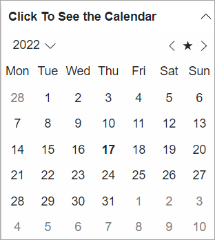
Header
By default, the header element of the Expander control appears at the top of the control and the expand icon appears on the right side of the header. The header element contains no text initially. However, you can add text to it using Header property of the C1Expander class.

To add text to the header element, you simply need to set the Header property to a string, say Click To See the Calendar, as illustrated in the following code.
<C1Expander Header="@("Click To See the Calendar")" Style="@("overflow:hidden;width:280px;box-shadow:0px 5px 5px rgba(0,0,0,0.2)")">
    <C1Calendar FirstDayOfWeek="@DayOfWeek.Monday"></C1Calendar>
</C1Expander>


