RangeSlider
The Input library provides the C1RangeSlider control that enables you to select a range of numeric data with lower value thumb and upper value thumb. These thumbs define start and end values of the range. Dragging the thumb towards the left on range bar reduces the value, and dragging it towards the right increases the value. The RangeSlider control has minimum and maximum bounds for thumb values so that the thumb value cannot be less than the minimum bound and more than the maximum bound.

RangeSlider Elements
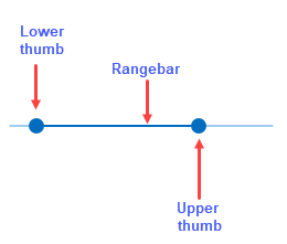
The RangeSlider control consists of a range bar, which lets you set the minimum and maximum values to be put on the range element and thumbs, which includes lower and upper thumb to adjust the values on the range element as per your requirements.
The elements of the RangeSlider control are displayed in the following image:

Set Range and Value for RangeSlider
The Maximum and Minimum properties available in the C1RangeSlider class enables you to set upper and lower allowable bounds, i.e., the maximum and minimum possible value of the range in the RangeSlider control. The UpperValue property allows you to set the current upper magnitude while the LowerValue property allows you to set the lower magnitude of the control. Both these values are linked with the movable thumbs which are used to set the numeric range on the control. Moreover, the RangeSlider control can be oriented horizontally or vertically using the Orientation property. However, the control is oriented horizontally, by default.
The following code illustrates how to set the range by setting Minimum and Maximum properties. In this example, the LowerValue and UpperValue properties are bound to the TextBlocks to show the changing values on the range bar at runtime.
<TextBlock Text="Range Slider:" Margin="0,5,0,0"/>
<c1:C1RangeSlider Orientation="Horizontal" Minimum="5" LowerValue="{Binding LowerValue,Mode=TwoWay,UpdateSourceTrigger=PropertyChanged}"
                  Maximum="75" UpperValue="{Binding UpperValue,Mode=TwoWay,UpdateSourceTrigger=PropertyChanged}" Margin="0,25,0,15"
                  HorizontalAlignment="Left" Width="250"/>
<StackPanel Orientation="Horizontal">
    <TextBlock Text="Lower Value:" Margin="0,5,0,0"/>
    <TextBlock Text="{Binding LowerValue,Mode=TwoWay,UpdateSourceTrigger=PropertyChanged}" Margin="0,5,0,0"/>
</StackPanel>
<StackPanel Orientation="Horizontal">
    <TextBlock Text="Upper Value:" Margin="0,5,0,0"/>
    <TextBlock Text="{Binding UpperValue,Mode=TwoWay,UpdateSourceTrigger=PropertyChanged}" Margin="0,5,0,0"/>
</StackPanel>


