Multiple Pie Chart
The FlexPie control allows you to create multiple pie charts based on the same data source. You can create multiple pie charts by simply specifying several comma-separated strings of field names in the Binding property. This means you don't have to add any additional FlexPie controls for multiple Pie Charts. Multiple Pie Charts can help compare data across different groups. It is also the right visualization choice to present key indicators/facts about your topic of interest.
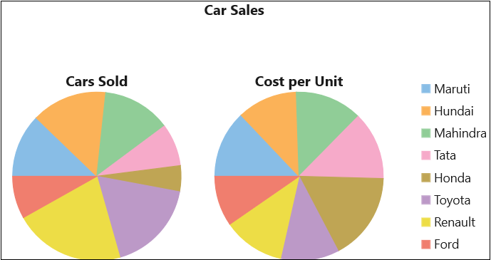
The image below displays two pie charts: one illustrating the number of cars sold and the other showing the cost of a car for each company.

Perform the following steps to add multiple pie charts:
In XAML view, add the FlexPie control by adding the following code inside the <Grid> tags:
<c1:FlexPie x:Name="flexPie" Height="350"></c1:FlexPie>Create a class named SalesItem containing the carname, costperunit and carssold properties:
class SalesItem
    {
      public string carname { get; set; }
      public double costperunit{ get; set; }
      public double carssold { get; set; }
}
Add the following code to connect FlexPie control with the datasource named Getcarsalesdata by using the ItemsSource property:
private static Random rnd = new Random();
public MainWindow()
{
    this.InitializeComponent();
    var Getcarsalesdata = new List<SalesItem>();
    var cars = "Maruti|Hundai|Mahindra|Tata|Honda|Toyota|Renault|Ford".Split('|');
    for (int i = 0; i < cars.Length; i++)
    {
        Getcarsalesdata.Add(new SalesItem
        {
            carname = cars[i],
            costperunit = rnd.Next(800000, 1500000),
            carssold = rnd.Next(10, 50),
        }); ;
    }
    //Connecting with data source
    flexPie.ItemsSource = Getcarsalesdata;
    flexPie.BindingName = "carname";
    flexPie.Binding = "carssold,costperunit";
    flexPie.Titles = new[] { "Cars Sold", "Cost per Unit" };
    flexPie.Header = "Car Sales";
    flexPie.HeaderAlignment = HorizontalAlignment.Center;
    flexPie.HeaderStyle = new C1.WinUI.Chart.ChartStyle { FontWeight = FontWeights.Bold, FontSize = 16 };
}
Run the application to display multiple pie charts.
Tooltip
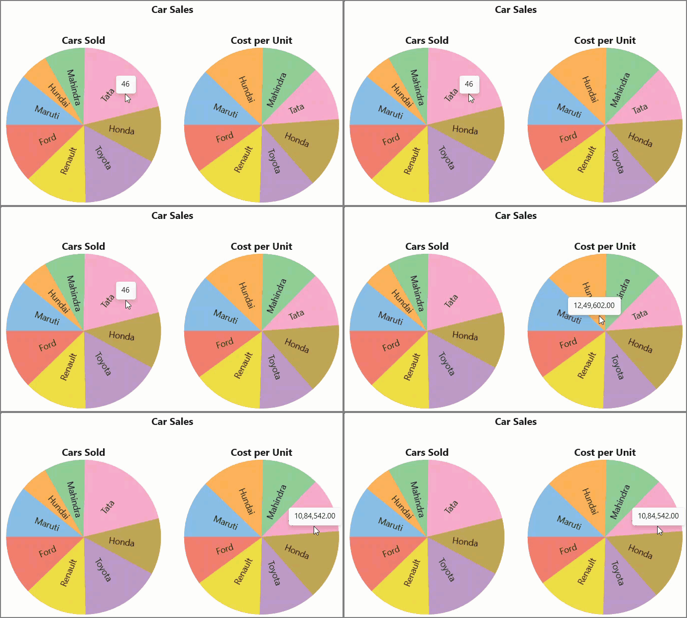
Tooltip offers additional context and detailed information about each segment when users hover over them, helping to clarify what each part represents. By displaying relevant data dynamically, tooltip make the chart more interactive and engaging, allowing you to explore data. You can display the tooltip content on multiple charts using the ToolTip property.
Additionally, you may need to apply different number formats to the tooltips of multiple pie charts. To do so, you can customize the tooltip format individually for each pie chart by using the ToolTipContent property. For instance, one pie chart may represent the total sales amount, while another might show the number of products sold. Since the formats for currency and numerical counts differ, you can easily customize the tool tip display using the ToolTipContent property. This allows for clear and relevant information to be presented to users when they hover over each pie chart.

The following code illustrates how to set different number formats for tooltip content in multiple pie charts. The "Cars Sold" pie chart uses the "N0" format that displays numbers without any decimal places, while the "Cost per Unit" pie chart uses the "N2" format to show numbers with two decimal places. This approach ensures that each piece of information is displayed in the most appropriate format.
flexPie.ToolTipContent = "{carssold:N0},{costperunit:N2}";


