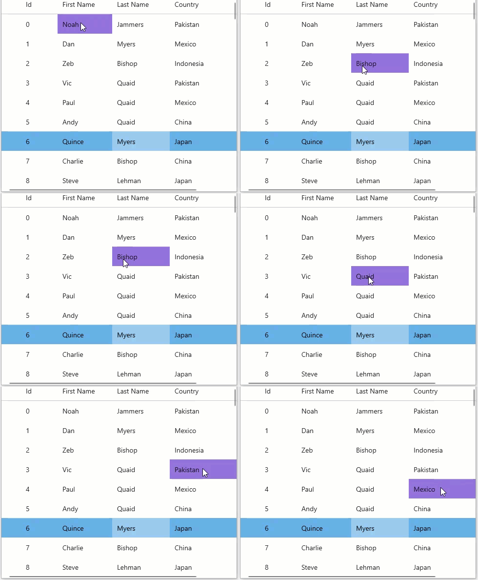
Hover Styles
Hover styles are applied to cells when the mouse hovers over the grid. It provides visual cues so that the user can apply styling to a cell, row, column or to a specific cell according to the GridMouseOverMode enumeration when they are hovered on prior to selection or editing.
The hover styles can make the FlexGrid appear more "alive" and interactive. The image below depicts the scenario when the GridMouseOverMode is set to the Cell option.

The image below depicts the scenario when the GridMouseOverMode is set to the Column option.

There are two essential properties to consider while performing hover styles, the MouseOverMode property and MouseOverBrush property in C1GridControl class. The MouseOverMode property helps to set how the mouse hovers over the grid, while the MouseOverBrush property sets a brush to paint the background of the selected cells. The MouseOverMode property calls the GridMouseOverMode enumeration. So, the user can easily set hover styles when the mouse moves over a cell, row, column etc.
Let us see how we can set the hover styling using these properties:
// Set MouseOverBrush and MouseOverMode
flexGrid1.MouseOverBrush = new SolidColorBrush(Colors.MediumPurple);
flexGrid1.MouseOverMode = GridMouseOverMode.Cell;


