Styling
You can use different ways of styling the UI of the Menu control to change its overall look. This enables you to change the visual aspects of the control according to your needs so that it can be easily used with your application.
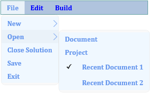
The following image showcases styling applied on the menu and menu items.

The following code demonstrates how you can style the Menu control and the items inside it.
<c1:C1Menu x:Name="WordMenu" Orientation="Horizontal" Background="LightSteelBlue"
           Foreground="Blue" FontWeight="Bold" FontFamily="Cambria" BorderThickness="1" BorderBrush="CadetBlue" VerticalAlignment="Top" Width="300">
    <c1:C1MenuItem Header="File" Background="AliceBlue" Foreground="CornflowerBlue">
        <c1:C1MenuItem Header="New" Background="AliceBlue" Foreground="CornflowerBlue">
            <c1:C1MenuItem Header="Document"/>
            <c1:C1MenuItem Header="Project"/>
        </c1:C1MenuItem>
        <c1:C1MenuItem Header="Open" Background="AliceBlue" Foreground="CornflowerBlue">
            <c1:C1MenuItem Header="Document"/>
            <c1:C1MenuItem Header="Project"/>
            <c1:C1MenuItem Header="Recent Document 1"
                GroupName="CheckedDocuments" IsCheckable="True" IsChecked="True">
            </c1:C1MenuItem>
            <c1:C1MenuItem Header="Recent Document 2" Height="Auto"
                Width="Auto" GroupName="CheckedDocuments" IsCheckable="True">
            </c1:C1MenuItem>
        </c1:C1MenuItem>
        <c1:C1MenuItem Header="Close Solution"/>
        <c1:C1MenuItem Header="Save"/>
        <c1:C1MenuItem Header="Exit"/>
    </c1:C1MenuItem>
    <c1:C1MenuItem Header="Edit">
        <c1:C1MenuItem Header="Undo"/>
        <c1:C1MenuItem Header="Redo"/>
    </c1:C1MenuItem>
    <c1:C1MenuItem Header="Build"></c1:C1MenuItem>
</c1:C1Menu>
Additionally, you can use Theme to style the menu.


