Accordion Layout
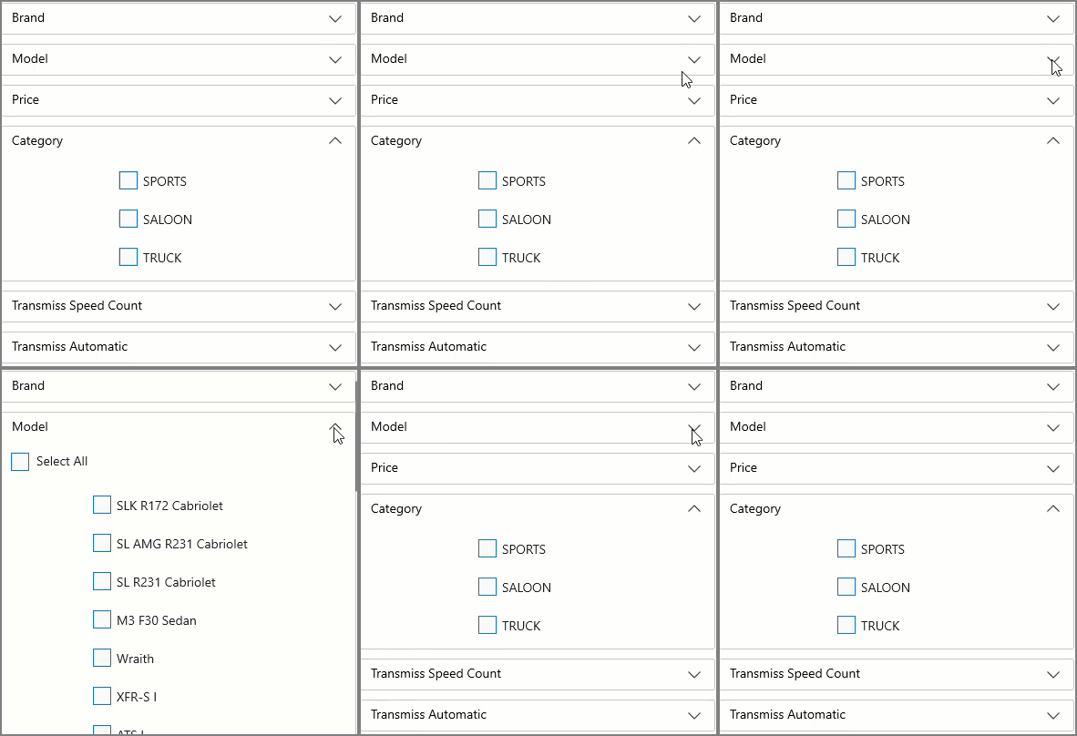
The DataFilter control enables you to create an interactive user interface by organizing the filter conditions (or filters) as a vertically stacked list of items, which gives it the look and feel of an accordion layout. You can easily toggle the display of the conditions associated with each filter separately using expand and collapse icons. The following GIF demonstrates the use of Accordion layout:

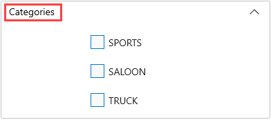
In DataFilter, you can customize the header text of filters using HeaderText property of the C1DataFilter class.
The following image shows the customized header text on using the HeaderText property.

The following code example demonstrates the use of HeaderText property to change the header text:
private void C1DataFilter_FilterAutoGenerating(object sender, FilterAutoGeneratingEventArgs e)
{
   var categoryFilter = (ChecklistFilter)e.Filter;
   categoryFilter.ShowSelectAll = false;
   categoryFilter.HeaderText = "Categories";
}


