Elements
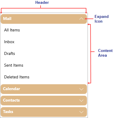
The Accordion control consists of elements like Header, Expand or Collapse icon and Content area.

- Header: The Accordion container has a Header element that appears at the top of the control.
- Expand/Collapse Icon: The expand icon appears by default on the right side of the header to enable expanding or collapsing the items within the Accordion pane.
- Content Area: An accordion pane's content area initially consists of an empty space. In the content area, you can add text, images, grids and arbitrary controls.


