AutoComplete TextBox
The Input library's AutoComplete TextBox is a control that can be used to display and edit plain text in a WinUI app.

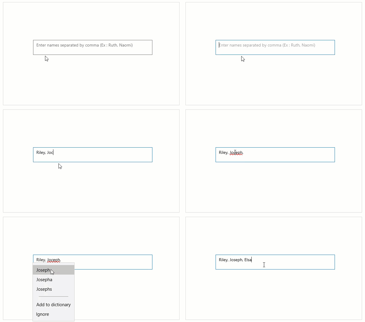
The snapshot above shows a user adding names to the AutoComplete TextBox. Note, how the textbox provides a watermark and spell-checking feature (latter is available by default).
Watermark Support
The AutoComplete TextBox provides the PlaceHolder property to add a text that is displayed in the control until the value is changed by a user action or some other operation.
The following code snippet demonstrates how to set a simple placeholder or watermark in an AutoComplete TextBox:
<c1:C1AutoCompleteTextBox Name="autoCompleteTextBox1" Placeholder="Enter names separated by comma (Ex : Ruth, Naomi)"  HorizontalAlignment="Left" Margin="100,126,0,0"   Height="50" Width="400" VerticalAlignment="Top" >
</c1:C1AutoCompleteTextBox>
Header Support
The AutoComplete TextBox provides the Header property that allows you to specify a heading or label on top of the control, which gives a hint about textbox's purpose in the UI.

The following code snippet depicts setting a header text for a label of AutoComplete TextBox using the Header property.
<c1:C1AutoCompleteTextBox Name="autoComplete" Header="This is a header" Height="60" Width="400" ></c1:C1AutoCompleteTextBox>
Delay
The Input library lets the user set the delay that occurs between the key strokes and the text changed event for the AutoComplete TextBox. The user can set this delay to something bigger than zero to allow skipping unnecessary events when the text box is used in filtering scenarios.
The following code snippet depicts setting a delay of value 2 for AutoComplete TextBox using the Delay property.
<c1:C1AutoCompleteTextBox Name="autoCompleteTextBox1" Delay="2">
</c1:C1AutoCompleteTextBox>


