Calendar allows you to customize its appearance in different ways based on your requirements. You can choose to change the first day of the week displayed in the calendar, show a limited set of days in the displayed calendar month, hide the calendar header, display a single and multiple selected date(s), disable adjacent dates, and change the calendar type. Let us dive into the details of how to implement all these features in the following sections.
By default, Calendar displays "Sunday" as the first day of the week. However, you can change it to display the first day of the week depending on your local culture using FirstDayOfWeek property of the C1Calendar class.
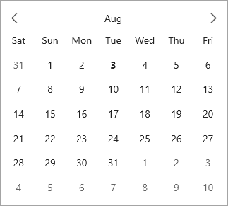
The following code uses the FirstDayOfWeek property to display "Saturday" as the first week in the Calendar:
| XAML |
Copy Code
|
|---|---|
<calendar:C1Calendar x:Name="calendar" FirstDayOfWeek="Saturday" HorizontalAlignment="Center" VerticalAlignment="Top"></calendar:C1Calendar> |
|
Calendar allows you to display a date range and disable the rest of the dates from the calendar which implies that you can restrict the selection to the specified range of dates from the calendar. This can be done using the MinDate and MaxDate properties of the C1Calendar class which allow you to set the earliest date that can be selected by the user and latest date available for selection by the user at runtime, respectively.
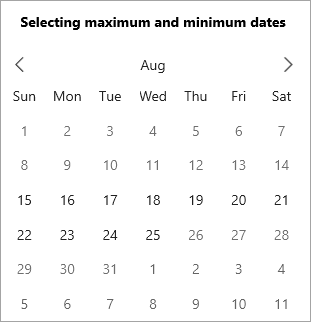
The following code uses the MinDate and MaxDate properties to restrict the selection of dates in the calendar:
| C# |
Copy Code
|
|---|---|
//Set minimum and maximum date for selection calendar3.MinDate = new DateTime(2021, 8, 15); calendar3.MaxDate = new DateTime(2021, 8, 25); |
|
In the Calendar control, the Header region has a huge significance. This is because, the Header when clicked expands the views, namely month, year and decade view. To elaborate, when you click the header in the 'month' (default) view, it expands to show the current year in the year view mode. Likewise, when the header of the 'year' mode is clicked, it expands to show the current 'decade' in the decade view mode. Also, when the header of the decade view is clicked, it expands back to the month view as demonstrated in the following GIF.
|
|
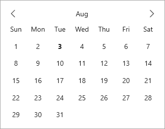
By default, the header is visible in the Calendar control. However, Calendar allows you to control the visibility of the header based on your requirements. It lets you choose whether to show or hide the header at runtime by setting the ShowHeader property to False.
The following image displays calendar with the hidden header.
The following code demonstrates how you can hide the calendar header.
| XAML |
Copy Code
|
|---|---|
<calendar:C1Calendar x:Name="calendar" ShowHeader="False" HorizontalAlignment="Center" VerticalAlignment="Top"></calendar:C1Calendar> |
|
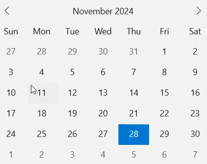
By default, the Calendar control allows you to select one date at a time. It also allows you to display a selected date in the Calendar when it loads by setting the SelectedDate property programmatically.
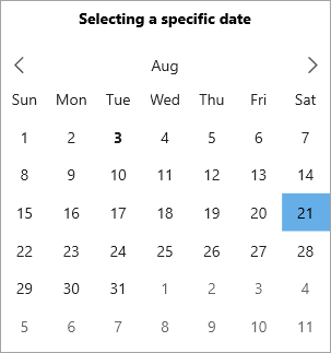
The following code shows how to set the SelectedDate property:
| C# |
Copy Code
|
|---|---|
//Select specific date calendar1.SelectedDate = new DateTime(2021, 8, 21); |
|
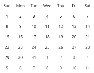
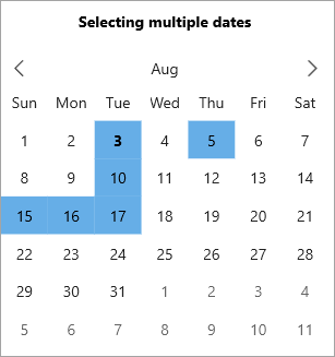
Calendar also allows you to display more than one selected dates by setting the SelectedDates property as shown in the following image and code:
| C# |
Copy Code
|
|---|---|
//Select multiple dates // Set array of dates which need to be selected DateTime[] dateTimes = new DateTime[] { new DateTime(2021, 08, 03), new DateTime(2021, 08, 05), new DateTime(2021, 08, 10), new DateTime(2021, 08, 15), new DateTime(2021, 08, 16), new DateTime(2021, 08, 17) }; // Set the list of selected dates calendar2.SelectedDates = dateTimes; |
|
The adjacent days can be selected in the Calendar control, by default. However, Calendar allows you to control the selection of the adjacent days by enabling or disabling them based on your requirements. It lets you choose whether to disable the adjacent days at runtime for selection by setting the ShowAdjacentDay property to False.
The following code demonstrates how you can disable the adjacent days.
| XAML |
Copy Code
|
|---|---|
<calendar:C1Calendar x:Name="calendar" ShowAdjacentDay="False" HorizontalAlignment="Center" VerticalAlignment="Top"></calendar:C1Calendar> |
|
The Calendar control lets you display different types of calendar using the CalendarType property. The CalendarType property specifies the type of calendar to be displayed using the CalendarType enumeration which allows you to set one of the following calendar types:
| Calendar Type | Snapshot |
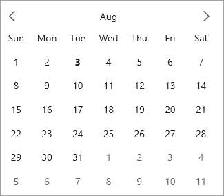
| Default |
|
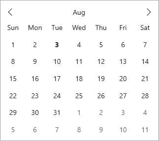
| Gregorian calendar |
|
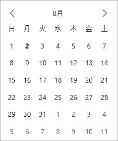
| Japanese calendar |
|
The type of calendar can be set using the CalendarType property as shown in the following code:
| XAML |
Copy Code
|
|---|---|
<calendar:C1Calendar x:Name="calendar" CalendarType="Japanese" HorizontalAlignment="Center" VerticalAlignment="Top"></calendar:C1Calendar> |
|
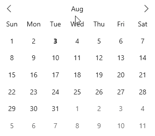
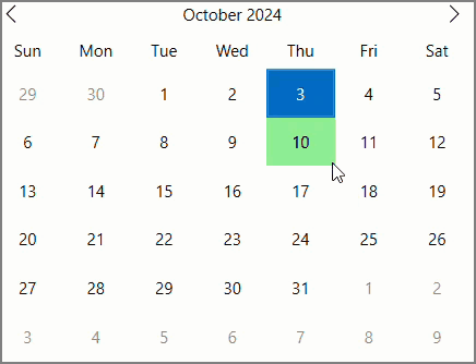
When the mouse pointer moves over the Calendar area, the mouse hover highlighting behavior is not visible on the slots by default. However, you can choose to display this mouse hover effect to enhance the usability of the Calendar control in your applications by using MouseOverMode property of the C1Calendar class. This property allows you to visualize the mouse hover highlighting behavior on the slots in the Calendar control at runtime. The MouseOverMode property specifies the mouse-over mode through the CalendarMouseOverMode enumeration which defines the following constants that specify calendar mouse-over mode.
| Options | Description |
| Slot | Mouse-over style applies to a single slot at a time |
| None | No style is applied |
The following image shows the mouse hover highlighting behavior in the Calendar control at runtime
 |
Additionally, Calendar provides the MouseOverBrush property that gives you the option to select a color of your choice to display on the slots when mouse pointer moves over them.
The following code showcases how to set the mouse-over mode and the highlighting color for the Calendar slots.