- Getting Started with Xamarin Edition
-
Controls
- Calendar
- DataCollection
- FlexChart
-
FlexGrid
- Quick Start: Add Data to FlexGrid
- Key Features
-
Features
- Reordering Rows and Columns
- Custom Cells
- Custom Icon
- Customize Appearance
- Clipboard and Keyboard Support
- Data Mapping
- Defining Columns
- Editing
- Export
- Filtering
- Formatting Columns
- Frozen Rows and Columns
- Grouping
- Material Theme
- Merging Cells
- Pull To Refresh
- Resizing Columns/Rows
- Row Details
- Sorting
- Selecting Cells
- Star and Auto Sizing
- Wordwrap
- FlexPie
- FlexViewer
- Gauge
- Input
- Sunburst Chart
- TreeMap
- Release History
Customize Appearance
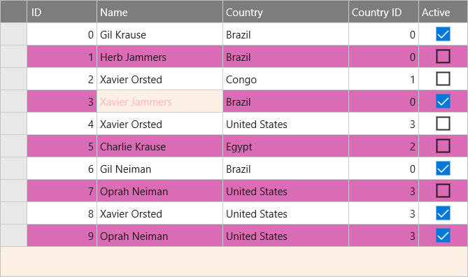
FlexGrid has various built-in properties to customize grid's appearance. A user can set attributes such as background color, alternating row color, text color, header color, font, selection mode, selected cell color, etc to customize the overall appearance of the FlexGrid control. Moreover, it also allows you to set individual properties for RowHeaderGridLinesVisibility, ColumnHeaderGridLinesVisibility, and TopLeftHeaderGridLinesVisibility that provides more granular styling capabilities that are more suited for Material themes.
The image below shows customized appearance in FlexGrid after these properties have been set.

The following code example demonstrates how to set this property in C# and XAML. The example uses the sample created in the Quick Start section.
In Code
grid.BackgroundColor = Color.FromHex("#FCF0E5");
grid.AlternatingRowBackgroundColor = Color.FromHex("#DA6CB5");
grid.SelectionMode = GridSelectionMode.Cell;
grid.SelectionTextColor = Color.FromHex("#FFB6C1");
grid.ColumnHeaderBackgroundColor = Color.FromHex("#7B7E7D");
grid.ColumnHeaderTextColor= Color.FromHex("#FFFFFF");
grid.SelectionBackgroundColor = Color.FromHex("#FCF0E5");
grid.RowHeaderGridLinesVisibility = GridLinesVisibility.Vertical;
In XAML
<c1:FlexGrid SelectionMode="Cell"
BackgroundColor="White" AlternatingRowBackgroundColor="Purple" SelectionMode=Cell
ColumnHeaderBackgroundColor="Silver" ColumnHeaderTextColor="White"
SelectionBackgroundColor="Navy" SelectionTextColor="LightPink" x:Name="grid"
AutoGenerateColumns="False" RowHeaderGridLinesVisibility="Vertical">


