Interaction Guide
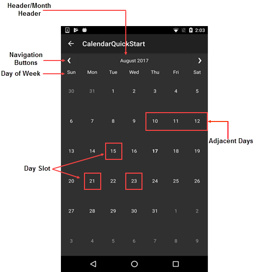
The Calendar control comprises of various functional parts such as Header, Day of Week, Day Slot, etc. These functional parts are illustrated below.
- Header - The Calendar comprises a header that displays the current month, year or decade along with navigation buttons. Users can hide the default header and create their own headers as illustrated in Customizing Header.
- Day Slot - The Calendar features day slots which can be customized to display custom content. See Customizing Day Content to understand how day slots can be used to insert and display custom content.
- Day of Week - The user interface of Calendar displays seven days of week corresponding to respective dates.
- Navigation Buttons - The navigation buttons enables users to traverse the selected month or year, forward or backward.

View Modes
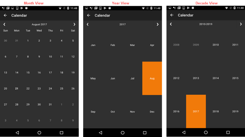
The Calendar control supports month, year and decade views as shown in the image below. The calendar switches from month to year view when the user taps the month header. On tapping the year header, the calendar switches to decade view. The calendar switches back to the month view on tapping the header on the decade view, completing a full circle from Month>Year>Decade>Month view.


