- Getting Started with Xamarin Edition
-
Controls
- Calendar
- DataCollection
- FlexChart
-
FlexGrid
- Quick Start: Add Data to FlexGrid
- Key Features
-
Features
- Reordering Rows and Columns
- Custom Cells
- Custom Icon
- Customize Appearance
- Clipboard and Keyboard Support
- Data Mapping
- Defining Columns
- Editing
- Export
- Filtering
- Formatting Columns
- Frozen Rows and Columns
- Grouping
- Material Theme
- Merging Cells
- Pull To Refresh
- Resizing Columns/Rows
- Row Details
- Sorting
- Selecting Cells
- Star and Auto Sizing
- Wordwrap
- FlexPie
- FlexViewer
- Gauge
- Input
- Sunburst Chart
- TreeMap
- Release History
Star and Auto Sizing
FlexGrid's Star and Auto Sizing feature allows you to set the width of columns in the FlexGrid by using both the star and auto sizing system instead of explicitly setting width of each column. Star sizing determines the width of each column automatically with respect to available screen space and in relation with other columns to avoid horizontal scrolling and display the entire data on the screen. Auto sizing determines the width of a column based on the size of the content. You can use both sizing options to implement flexible layouts with the FlexGrid. The sample below uses Star and Auto sizing to specify the width of columns.
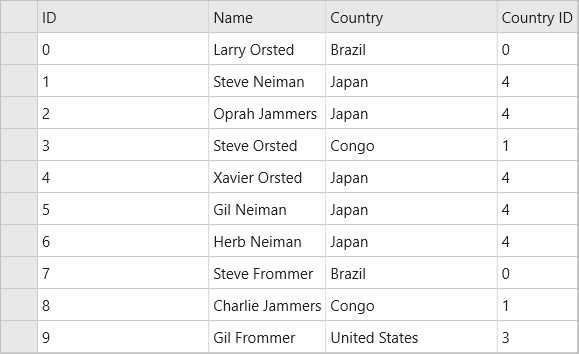
In this example, the grid has four columns. The width of first and third columns are set to *, and the width of the second column is set to 2*. The fourth column is set to Auto.
The image below shows how the FlexGrid appears, after star sizing is applied to columns' width:

The following code example demonstrates star sizing in FlexGrid in XAML. The example uses the sample created in the Quick Start section.
In XAML
<Grid>
    <c1:FlexGrid x:Name="grid" AutoGenerateColumns="False">
      <c1:FlexGrid.Columns>
        <c1:GridColumn Binding="ID" Width="*"/>
        <c1:GridColumn Binding="Name" Width="Auto"/>
        <c1:GridColumn Binding="Country" Width="*"/>
        <c1:GridColumn Binding="CountryID" Width="Auto"/>
      </c1:FlexGrid.Columns>
    </c1:FlexGrid>
  </Grid>


