
- Getting Started with Xamarin Edition
-
Controls
- Calendar
- DataCollection
- FlexChart
-
FlexGrid
- Quick Start: Add Data to FlexGrid
- Key Features
-
Features
- Reordering Rows and Columns
- Custom Cells
- Custom Icon
- Customize Appearance
- Clipboard and Keyboard Support
- Data Mapping
- Defining Columns
- Editing
- Export
- Filtering
- Formatting Columns
- Frozen Rows and Columns
- Grouping
- Material Theme
- Merging Cells
- Pull To Refresh
- Resizing Columns/Rows
- Row Details
- Sorting
- Selecting Cells
- Star and Auto Sizing
- Wordwrap
- FlexPie
- FlexViewer
- Gauge
- Input
- Sunburst Chart
- TreeMap
- Release History
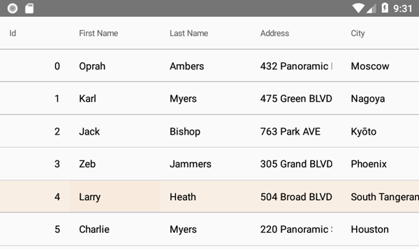
Material Theme
From 2018v3 onwards, the default appearance of FlexGrid has changed to the material design pattern. So, for users using 2018v3 or beyond, FlexGrid appears as follows:
In order to revert to the classic style which was there until 2018v2, use the following code:
XAML
Style="{x:Static c1:FlexGrid.ClassicStyle}"
C#
grid.Style = FlexGrid.ClassicStyle;
We have also added following features to support the material design in the FlexGrid control:
Checklist behavior
To further support the material design, you can now enable the checklist like selection. This kind of selection lets you select the non-consecutive rows of data. You can enable it by using the following code:XAML
<c1:FlexGrid x:Name="grid">
        <c1:FlexGrid.Behaviors>
            <c1:CheckListBehavior SelectionBinding="Selected"/>
        </c1:FlexGrid.Behaviors>
</c1:FlexGrid>
C#
var details = new CheckListBehavior();
details.SelectionBinding = "Selected";
details.Attach(grid);
Header grid lines
Also, to provide more garnular styling capabilities suited for Material design, FlexGrid supports RowHeaderGridLinesVisibility, ColumnHeaderGridLinesVisibility, and TopLeftHeaderGridLinesVisibility properties to display or hide the individual header grid lines.