- Getting Started with Xamarin Edition
-
Controls
- Calendar
- DataCollection
- FlexChart
-
FlexGrid
- Quick Start: Add Data to FlexGrid
- Key Features
-
Features
- Reordering Rows and Columns
- Custom Cells
- Custom Icon
- Customize Appearance
- Clipboard and Keyboard Support
- Data Mapping
- Defining Columns
- Editing
- Export
- Filtering
- Formatting Columns
- Frozen Rows and Columns
- Grouping
- Material Theme
- Merging Cells
- Pull To Refresh
- Resizing Columns/Rows
- Row Details
- Sorting
- Selecting Cells
- Star and Auto Sizing
- Wordwrap
- FlexPie
- FlexViewer
- Gauge
- Input
- Sunburst Chart
- TreeMap
- Release History
Defining Columns
With automatic column generation as one of the default features of FlexGrid, the control lets you specify the columns, allowing you to choose which columns to show, and in what order. This gives you control over each column's width, heading, formatting, alignment, and other properties. To define columns for the FlexGrid, ensure that the AutoGenerateColumns is set to false (by default this property is true).
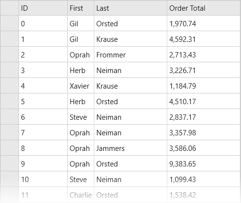
The image below shows how the FlexGrid appears, after defining columns.

The following code example demonstrates how to define FlexGrid columns in C# and XAML. The example uses the sample created in the Quick start section.
Add the following code to the MainPage.xaml page for defining columns in the FlexGrid.
<Grid VerticalOptions="FillAndExpand">
   <c1:FlexGrid x:Name="grid" AutoGenerateColumns="False">
      <c1:FlexGrid.Columns>
        <c1:GridColumn Binding="ID" Width="100"/>
        <c1:GridColumn Binding="First" Width="Auto"/>
        <c1:GridColumn Binding="Last"/>
        <c1:GridColumn Binding="OrderTotal" Format="N2"/>
      </c1:FlexGrid.Columns>
    </c1:FlexGrid>
</Grid>
Open MainPage.xaml.cs and add the following code to display data in the FlexGrid control.
var data = Customer.GetCustomerList(100);
grid.ItemsSource = data;


