Chart Types
You can change the type of the FlexChart control depending on your requirement. Chart type can be changed by setting the ChartType property of the FlexChart control. In this case, if multiple series are added to the FlexChart, all of them are of the same chart type. To know how to add multiple series and to set a different ChartType for each series, see Mixed charts. FlexChart supports various chart types including Line and LineSymbol chart, Area chart, Bar and Column chart, Bubble chart, Scatter chart, Candlestick chart, etc.
In Code
chart.ChartType = ChartType.LineSymbols;
In XAML
<c1:FlexChart x:Name="chart" ChartType="LineSymbols" ItemsSource="{Binding Data}" BindingX="Name">
  <c1:FlexChart.Series>
    <c1:ChartSeries x:Name="Sales2014" Binding="Sales" ></c1:ChartSeries>
  </c1:FlexChart.Series>
</c1:FlexChart>
Line and LineSymbol chart
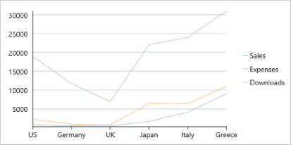
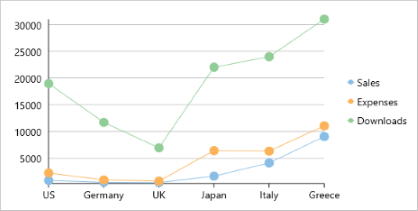
A Line chart draws each series as connected points of data, similar to area chart except that the area below the connected points is not filled. The series can be drawn independently or stacked. It is the most effective way of denoting changes in value between different groups of data. A LineSymbol chart is similar to line chart except that it represents data points using symbols.
These charts are commonly used to show trends and performance over time.
 |
 |
|---|---|
| Line Chart | LineSymbol Chart |
Area chart
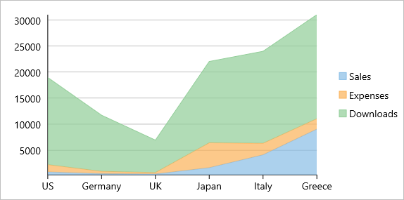
An Area chart draws each series as connected points of data and the area below the connected points is filled with color to denote volume. Each new series is drawn on top of the preceding series. The series can either be drawn independently or stacked.
These charts are commonly used to show trends between associated attributes over time.
Bar and Column chart
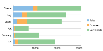
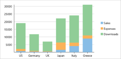
A Bar chart or a Column chart represents each series in the form of bars of the same color and width, whose length is determined by its value. Each new series is plotted in the form of bars next to the bars of the preceding series. When the bars are arranged horizontally, the chart is called a bar chart and when the bars are arranged vertically, the chart is called column chart. Bar charts and Column charts can be either grouped or stacked.
These charts are commonly used to visually represent data that is grouped into discrete categories, for example age groups, months, etc.
 |
 |
|---|---|
| Bar Chart | Column Chart |
Bubble chart
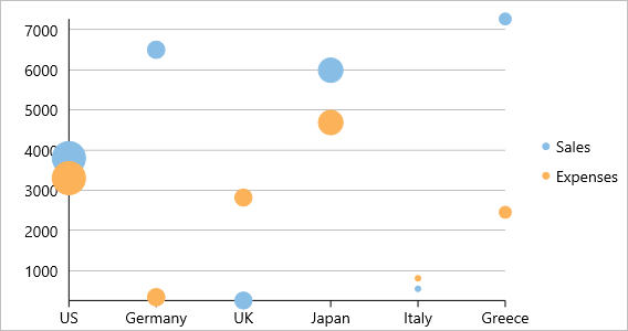
A Bubble chart represents three dimensions of data. The X and Y values denote two of the data dimensions. The third dimension is denoted by the size of the bubble.
These charts are used to compare entities based on their relative positions on the axis as well as their size.
Scatter
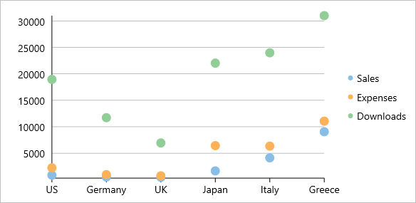
A Scatter chart represents a series in the form of points plotted using their X and Y axis coordinates. The X and Y axis coordinates are combined into single data points and displayed in uneven intervals or clusters.
These charts are commonly used to determine the variation in data point density with varying x and y coordinates.
Candlestick chart
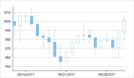
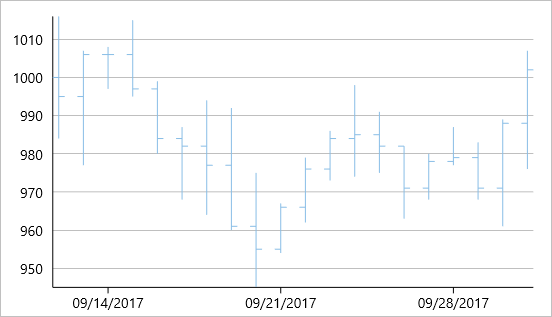
A Candlestick chart is a financial chart that shows the opening, closing, high and low prices of a given stock. It is a special type of HiLoOpenClose chart that is used to show the relationship between open and close as well as high and low. Candle chart uses price data (high, low, open, and close values) and it includes a thick candle-like body that uses the color and size of the body to reveal additional information about the relationship between the open and close values. For example, long transparent candles show buying pressure and long filled candles show selling pressure.
Elements of a Candlestick chart
The Candlestick chart is made up of the following elements: candle, wick, and tail.
- Candle: The candle or the body (the solid bar between the opening and closing values) represents the change in stock price from opening to closing.
- Wick and Tail: The thin lines, wick and tail, above and below the candle depict the high/low range.
- Hollow Body: A hollow candle or transparent candle indicates a rising stock price (close was higher than open). In a hollow candle, the bottom of the body represents the opening price and the top of the body represents the closing price.
- Filled Body: A filled candle indicates a falling stock price (open was higher than close). In a filled candle the top of the body represents the opening price and the bottom of the body represents the closing price.
In a Candlestick there are five values for each data point in the series.
- x: Determines the date position along the x axis.
- high: Determines the highest price for the day, and plots it as the top of the candle along the y axis.
- low: Determines the lowest price for the day, and plots it as the bottom of the candle along the y axis.
- open: Determines the opening price for the day.
- close: Determines the closing price for the day.
The following image shows a candlestick chart displaying stock prices.
High Low Open Close chart
HiLoOpenClose are financial charts that combine four independent values to supply high, low, open and close data for a point in a series. In addition to showing the high and low value of a stock, the Y2 and Y3 array elements represent the stock's opening and closing price respectively.
Histogram Chart
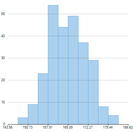
Histogram chart plots the frequency distribution of data against the defined class intervals or bins. These bins are created by dividing the raw data values into a series of consecutive and non-overlapping intervals. Based on the number of values falling in a particular bin, frequencies are then plotted as rectangular columns against continuous x-axis.
These charts are commonly used for visualizing distribution of numerical data over a continuous, or a certain period of time.
Spline and SplineSymbol chart
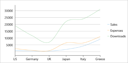
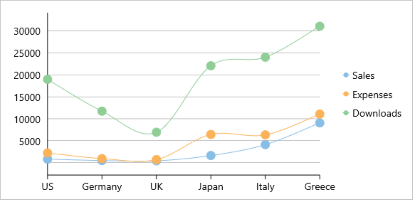
A Spline chart is a combination of line and area charts. It draws a fitted curve through each data point and its series can be drawn independently or stacked. It is the most effective way of representing data that uses curve fittings to show difference of values. A SplineSymbol chart is similar to Spline chart except that it represents data points using symbols.
These charts are commonly used to show trends and performance over time, such as product life-cycle.
 |
 |
|---|---|
| Spline Chart | SplineSymbol Chart |
Step Chart
Step charts use horizontal and vertical lines to present data that show sudden changes along y-axis by discrete amount. These charts help display changes that are sudden and irregular but stay constant till the next change. Step charts enable judging trends in data along with the duration for which the trend remained constant.
Consider a use case where you want to visualize and compare weekly sales and units downloaded of a software. As both of these values vary with discrete amounts, you can use step chart to visualize them. As shown in the image below, apart from depicting the change in sales these charts also show the exact time of change and the duration for which sales were constant. Moreover, you can easily identify the magnitude of respective changes by simply looking at the chart.
FlexChart supports Step chart, StepSymbols chart, and StepArea or filled step chart. The following table gives detailed explanation of these chart types.
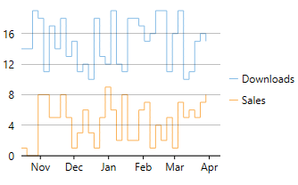 Step Chart Step Chart |
Step chart is similar to the Line chart, except that Line chart uses shortest distance to connect consecutive data points, while Step chart connects them with horizontal and vertical lines. These horizontal and vertical lines give the chart step-like appearance. While the line charts depict change and its trend, the Step charts also help in judging the magnitude and the intermittent pattern of the change. |
|---|---|
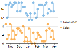 StepSymbols Chart StepSymbols Chart |
StepSymbols chart combines the Step chart and the Scatter chart. FlexChart plots data points by using symbols and connects those data points with horizontal and vertical step lines. Here, the data points are marked using symbols and, therefore, help mark the beginning of an intermittent change. |
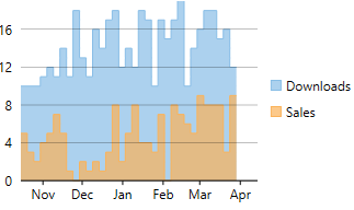 StepArea Chart StepArea Chart |
StepArea chart combines the Step chart and the Area chart. It is similar to Area chart with the difference in the manner in which data points are connected. FlexChart plots the data points using horizontal and vertical step lines, and then fills the area between x-axis and the step lines. These are based on Step charts, and are commonly used to compare discrete and intermittent changes between two or more quantities. This gives the chart stacked appearance, where related data points of the multiple series seem stacked above the other. For example, number of units downloaded and sales of a software for a particular time duration can be easily compared as shown in the image. |
SplineArea chart
SplineArea charts are spline charts that display the area below the spline filled with color. SplineArea chart is similar to Area chart as both the charts show area, except that SplineArea chart uses splines and Area chart uses lines to connect data points.
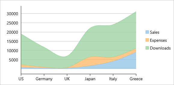
SplineArea Chart


