Custom Appearance
The ComboBox control comes with various properties to customize its appearance. The C1ComboBox class provides a set of properties listed below to achieve customization in the control's overall look and feel.
- DropDownBackgroundColor - sets the background color in drop-down list
- DropDownBorderColor - sets the color of drop-down border
- DropDownMode - sets the display mode in which the drop-down opens, accepting values from the DropDownMode enumeration
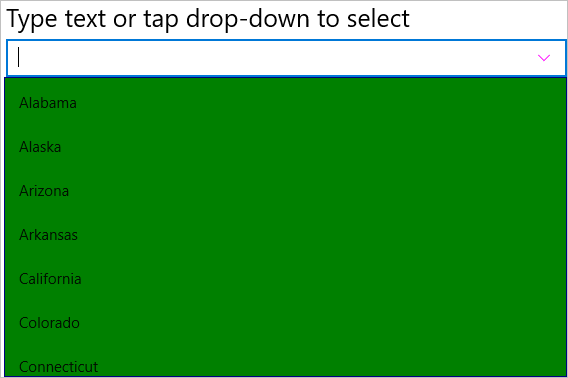
The image given below shows a customized combo box control.

The given code illustrates how to set the above properties and render a customized combo box control. This code example uses the sample created in the Quick Start.
In Code
cbxEdit.ButtonColor = Xamarin.Forms.Color.Magenta;
cbxEdit.DropDownBackgroundColor = Xamarin.Forms.Color.Green;
cbxEdit.DropDownBorderColor = Xamarin.Forms.Color.Navy;
cbxEdit.DropDownMode = C1.Xamarin.Forms.Input.DropDownMode.ForceBelow;
In XAML
<c1:C1ComboBox x:Name="cbxEdit" HorizontalOptions="FillAndExpand" DisplayMemberPath="Name"
    ButtonColor="Magenta" DropDownBackgroundColor="Green" DropDownBorderColor="Navy"
    DropDownMode="ForceBelow"/>


